M. Henry Linder, Richard Peach, and Sarah Stein
Correction: This post was updated on April 25 to correct the label on the y-axis in the top panel of the “Gauging Hurricane Impact” chart. We also corrected the explanatory text in the preceding paragraph.
The Bureau of Economic Analysis (BEA) of the U.S. Department of Commerce has reported that real Gross Domestic Product (GDP) increased at a very sluggish 0.4 percent annual rate in the final quarter of 2012. A natural question to ask is to what extent, if any, did superstorm Sandy contribute to this weak performance. While not a particularly intense storm, it was the largest Atlantic storm on record with a diameter of roughly 1,100 miles. The storm severely disrupted economic activity from late October until well into November along the eastern seaboard from the Mid-Atlantic region into New England, an area that is densely populated and that represents a significant portion of total economic activity of the entire country. Nonetheless, we suggest that superstorm Sandy likely had a relatively modest impact on the fourth-quarter growth rate, and that we cannot even be certain of the sign of that impact.
The logic of this conclusion is straight forward. As discussed in this blog post on the costs of Sandy, much of the economic activity disrupted by the storm was likely made up later in the calendar quarter or shifted geographically; moreover, rebuilding and restoration of key services constitute economic activity that otherwise would not have occurred. Indeed, we provide evidence that suggests that any effect superstorm Sandy may have had on aggregate economic activity in the fourth quarter of 2012 was well within the bands of the normal amount of “noise” in quarterly GDP growth rates. This analysis also suggests that this conclusion is true of most hurricanes, even ones considerably more intense than superstorm Sandy.
Note that in this analysis we are referring to potential losses in the flow of economic activity as opposed to damage to and destruction of the stock of physical capital. Recent estimates place the loss of physical capital in the United States at around $75 billion, second only to Hurricane Katrina in 2005.
What Happened in the Fourth Quarter?
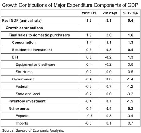
As mentioned above, growth of real GDP in 2012:Q4 was a quite sluggish 0.4 percent (annual rate). This followed a relatively strong 3.1 percent growth rate in the third quarter. To get some insight into the source of the fourth-quarter weakness, the following table presents the growth contributions of the major expenditure components of GDP for the first half, the third quarter, and the fourth quarter of 2012. Generally speaking, a component’s growth contribution is its real growth rate, expressed at an annual rate, times its share of nominal GDP. The sum of all of the individual growth contributions equals the growth rate of real GDP.
The first thing to note about the fourth quarter is the large drag on growth from inventory investment. In the third quarter, the real change in total business inventories contributed 0.7 percentage points to growth, despite a significant drought-related decline of farm inventories. This growth of nonfarm inventories was associated with an increase of inventory-sales ratios and a decline of manufacturing output, suggesting that the inventory investment was undesired. In the fourth quarter, the pace of inventory accumulation slowed sharply, resulting in a minus 1.5 percentage point drag on growth.
A second major source of weakness was a steep decline of federal government consumption and gross investment, led by a 22 percent (annual rate) plunge in defense spending. As a result, the growth contribution from federal spending was minus 1.2 percentage points.
Aside from these two temporary developments, the rate of growth of expenditures in the fourth quarter was actually pretty encouraging. Real consumer spending, real residential investment, and real business fixed investment all increased faster than in the third quarter and in the first half of the year. Indeed, among those analysts forecasting the U.S. economy, there was a general consensus that private final domestic demand entered 2013 with somewhat more momentum than previously anticipated.
The Sandy Story?
Of course, this decomposition of the sources of fourth-quarter growth tells us nothing about the effect of superstorm Sandy. In fact, there simply is no way to convincingly determine either the magnitude or sign of that effect. As mentioned above and highlighted in the costs of Sandy post, much of the disrupted economic activity was merely shifted geographically or postponed until later in the quarter, while restoration, replacement and repair of damaged capital—largely public infrastructure, but also damaged roofs, windows, and vehicles—likely generated a great deal of economic activity that otherwise would not have occurred.
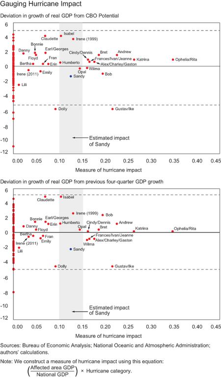
We can, however, look at circumstantial evidence to at least shed some light on the issue. To do so, we present two charts below. On the horizontal axis of each chart we present a measure of “hurricane impact,” which is defined as a hurricanes category on the Saffir-Simpson scale, as determined by the National Oceanic and Atmospheric Administration (NOAA), times the economic activity of the state or states impacted by the storm—also as determined by NOAA—expressed as a share of national GDP in the calendar quarter in which the storm occurred. Also, while the post uses the term “superstorm” to describe Sandy because it was not of hurricane strength when it made landfall, NOAA has classified the storm as Category 1 on the Saffir-Simpson scale (sustained wind speeds between 74 and 95 miles per hour at peak intensity) while off the east coast of the United States. Thus, we will use this NOAA classification in the subsequent analysis.
On the first panel of the chart below, the vertical scale is the actual quarterly growth rate of real GDP minus the Congressional Budget Office’s (CBO) estimate of the potential growth rate of real GDP, both expressed at an annual rate, during the quarter of impact. In the second panel, the vertical axis is the actual quarterly growth rate of real GDP during the quarter of impact, expressed at an annual rate, minus the growth rate of real GDP over the four quarters preceding the quarter of impact. Each red dot to the right of zero on the horizontal axis represents calendar quarters since 1990 when a hurricane struck the United States. The red dots clustered above zero on the horizontal axis are calendar quarters in which a hurricane did not strike the country. The blue dot represents Hurricane Sandy. Based on the final estimate, real GDP grew at a 0.4 percent annual rate in the fourth quarter. The shaded zone of from 0.1 to 0.15 on the horizontal axis represents the fact that Sandy was a Category 1 storm that affected an area of the country representing between 10 and 15 percent of total GDP. Finally, the dashed horizontal lines are two standard deviations above and below the mean of the distribution of red dots which represent calendar quarters in which a hurricane did not occur. Thus, 95 percent of all observations are likely to fall within these dashed lines.
There are a few key take away points from this analysis. First, measured in this way the impact of Hurricane Sandy was in the moderate range, well below that of much more powerful storms such as Hurricanes Andrew (1992) and Katrina (2005). Second, measured as the deviation from potential growth or from the four-quarter growth rate of the immediately prece
ding four quarters, the effect of hurricanes on GDP growth is as likely to be positive as it is negative. Third, given the fact that nearly all of the red dots associated with hurricanes fall within the dashed horizontal lines, it is only very rarely the case that the deviation of GDP growth associated with a hurricane exceeds the normal amount of noise of quarterly GDP growth rates.
Final Caveats
We want to emphasize that this analysis is crude and cannot prove or disprove whether superstorm Sandy had a measurable impact on the fourth quarter growth rate of real GDP. Nor does this analysis diminish in any way the toll that superstorm Sandy has imposed on the lives and property of the people affected—an issue addressed in “The Welfare Costs of Superstorm Sandy” post. Rather, the point is that the U.S. economy is so large and so resilient that even storms of the magnitude of Andrew and Katrina are not likely to be significant macroeconomic events.
Disclaimer
The views expressed in this post are those of the authors and do not necessarily reflect the position of the Federal Reserve Bank of New York or the Federal Reserve System. Any errors or omissions are the responsibility of the authors.
M. Henry Linder is a research associate in the Research and Statistics Group of the Federal Reserve Bank of New York.
 Richard Peach is a senior vice president in the Research and Statistics Group of the Federal Reserve Bank of New York.
Sarah Stein is a research associate in the Research and Statistics Group of the Federal Reserve Bank of New York.


 RSS Feed
 Follow Liberty Street Economics