Joshua Abel, Richard Peach, and Joseph Tracy
In this post, we examine a number of important housing market “vital signs” that collectively help to indicate the health status of local markets at the county level. The post also serves as an introduction to a set of interactive maps, based on home price index data from CoreLogic, that we will regularly update on the New York Fed’s website for readers interested in continuing to track the convalescence of the U.S. housing markets. The maps show the year-over-year change in home prices for nearly 1,200 counties through May and include a video sequence tracking these price changes since 2003.
Over the past few months, some national housing market indicators have begun to look a bit brighter. As of May, the CoreLogic national home price index had risen three months in a row. While still at a relatively low level, housing starts now have a clear upward trend. These developments have led some analysts to declare that, after five years of generally declining prices and activity, the housing market has finally bottomed out. While the national statistics are encouraging, whether or not the housing market has bottomed out is actually a much more difficult question to address for a couple of reasons. First, the United States is not a single housing market but rather a collection of numerous local housing markets. Second, the health of a local housing market is determined by a variety of indicators in addition to prices.
Price Change
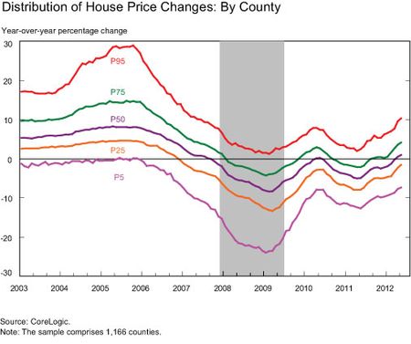
The most important vital sign for a local housing market is the change in house prices. It is hard to imagine a recovery in a local housing market being under way when house prices are still falling in that market. Our first chart presents the distribution of year-over-year changes in house prices from 2003 to the present. To construct this chart, we compute for each month the year-over-year house price change for all 1,166 counties for which CoreLogic reports overall house price indexes. Those price changes are ranked from highest to lowest and then reported as percentiles based on this ranking. For example, the 5th percentile (P5) tracks the 58th-lowest county-level house price change in each month. Note that an individual county can be, and often is, in different percentiles over time.
Several important features should be noted. First, the most recent data show that roughly half of the counties have measured house prices that are still declining, while half have stable-to-rising prices. In contrast, at the height of the housing market crash, more than 75 percent of the counties were experiencing falling house prices. Second, looking at the tails of the distribution, prices are rising for the 95th percentile county (P95) at a slightly faster rate than they are falling for the 5th percentile county. While the existence of stable-to-rising house prices in a county today does not guarantee that prices will continue to rise as the year progresses (look, for example, at early 2010), this finding does indicate that our most important sign of housing market recovery is evident in half of the reporting counties. A second point to note from the chart is the tremendous variation in house price changes across the country at each point in time, reinforcing the notion that the U.S. housing market is in fact a collection of smaller markets. At the height of the boom, the top 5 percent of counties experienced annual rates of house price appreciation that exceeded 25 percent while the lowest 5 percent of counties experienced essentially flat house prices. Similarly, during the most intense period of falling house prices, the 5 percent worst-performing counties recorded annual house price declines of 20 percent while the top 5 percent of counties were still experiencing house price increases.
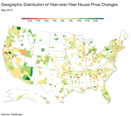
The geography of this variation in house price changes for May is shown in the map below. Dynamic versions of this map at the national and regional levels are also available. While the “sand states” of Arizona, California, Florida, and Nevada experienced the largest swings in house prices during the housing boom and bust, there are counties in each of these states that are now reporting stable-to-rising house prices. Overall, however, house prices have stabilized to a greater degree in Arizona and Florida than in California and Nevada. In addition, the counties that are still experiencing year-over-year price declines of 10 percent or more are not concentrated in any particular part of the country. This is in contrast to the boom and bust years, when large increases (and then decreases) in home values were observed much more frequently near the coasts than in the middle of the country. (We will update the dynamic map each month as new house price data are released.)
Transaction Volume
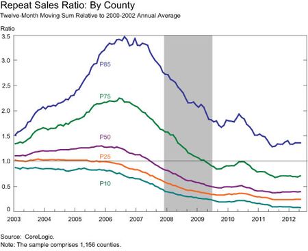
No diagnostic exam would be complete without measuring the patient’s pulse. The blood flow of a housing market is the transaction volume of its housing stock. Our next vital sign, then, is a measure of the repeat-sales transaction volume in each county. These are the same housing transactions that are used to construct the price changes. Repeat sales do not include new home sales, so this measure abstracts from what is happening to local housing supply. Rather, it is a measure of the degree of turnover in the existing housing stock. Given the vastly different sizes of the counties, we measure the repeat-sales transaction volume in each county relative to the average for that county from 2000 through 2002. To get a good reading on this transaction flow, we use a twelve-month moving count. Values above 1 indicate higher transaction volumes relative to 2000-2002, while values below 1 indicate lower volumes. The chart below indicates that more than three-quarters of counties are still experiencing reduced transaction flows relative to the flows in the 2000-2002 period. For the median county, the transaction volume today is less than 50 percent of the county’s baseline flow rate. However, it does appear that, for most counties, the decline in transaction flows has abated. This low pulse, however, indicates that most housing markets are still far from being normalized.
Percentage of Transactions That Are Distressed
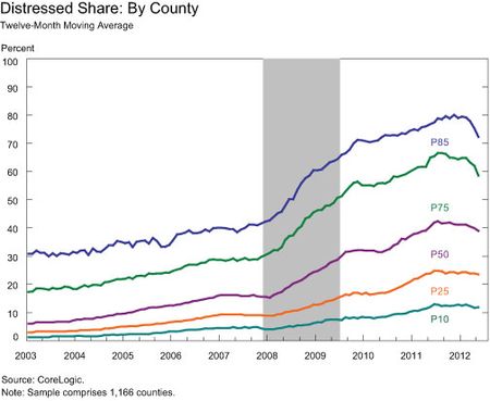
Our final vital sign for local housing market health is the percentage of transaction volume claimed by distressed sales. In our data, distressed sales include foreclosure sales, short-sales, and deeds-in-lieu. In the chart below, we show for each month the distressed-sale share of county repeat sales over the prior twelve months. Distressed sales are a constant presence in local housing markets. For example, even in the strong 2003 market, distressed sales accounted for around 5 percent of repeat sales in the median county. However, as the housing bust set in, the fraction of distressed sales rose steadily, and the median county now reports roughly 40 percent distressed sales. It appears that across the distribution, the distressed-sale share peaked in mid-2011 and has started to decline. Distressed sales may be akin to a patient having a fever—a defensive reaction that, while painful, speeds recovery—as unsustainable mortgages are withdrawn from the mar
ket. And the data may be indicating that the fever is beginning to break.
Overall Health Assessment
The stabilization of the housing market suggested by various national indicators is corroborated by looking at a number of indicators disaggregated to the county level. Importantly, the median county is now experiencing stable house prices on a year-over-year basis. Transaction volumes in most markets, while still far below normal, have steadied. Finally, the share of distressed sales, although still very high in many markets, appears to have peaked. If these trends continue, then local housing markets are making progress in their convalescence. However, our analysis indicates that most local housing markets still have a way to go to achieve a clean bill of health.
Disclaimer
The views expressed in this post are those of the authors and do not necessarily reflect the position of the Federal Reserve Bank of New York or the Federal Reserve System. Any errors or omissions are the responsibility of the authors.

Joshua Abel is a research analyst in the Regional Analysis Function of the Research and Statistics Group.

Richard Peach is a senior vice president in the Macroeconomic and Monetary Studies Function of the Research and Statistics Group.

Joseph Tracy is an executive vice president and senior advisor to the president at the Federal Reserve Bank of New York.


 RSS Feed
 Follow Liberty Street Economics