Tobias Adrian, Richard K. Crump, and Emanuel Moench
Some commentators have expressed concern that Treasury yields might rise sharply once the Federal Open Market Committee (FOMC) begins to raise the federal funds rate (FFR), worrying, in particular, about a sudden increase in Treasury term premia. In this post, we analyze the dynamics of Treasury term premia over the last fifty years and discuss their evolution around recent tightening cycles, paying special attention to the 1994 episode when bond prices dropped sharply around the world. We find that term premia don’t typically rise when monetary policy tightens. We also conclude, based on the behavior of term premia and survey evidence, that the sharp rise in Treasury yields in 1994 was in large part due to an upward shift in the expected path of future short-term interest rates.
According to standard economic theory, the yield on a ten-year Treasury bond is composed of the expected path of short-term Treasury yields over the next ten years and the Treasury term premium. The term premium is the compensation demanded by investors for bearing interest rate risk, which is the risk that interest rates will change over the life of the bond. Since the term premium isn’t a directly observable variable, it must be estimated, most often from financial and macroeconomic variables. Here, we use a statistical model to describe the joint evolution of Treasury yields and term premia across time and maturities (see Adrian, Crump, and Moench [2012] for more details).
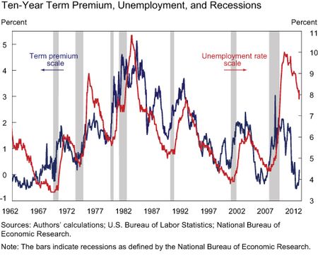
We start by plotting the estimated term premium along with observable variables to build some intuition about the economic underpinnings of the term premium. As a point of reference, the correlation between daily changes in our ten-year Treasury term premium and daily changes in the ten-year Treasury yield is about 70 percent. In the chart below, we plot the ten-year Treasury term premium along with the unemployment rate over the last fifty years; the chart shows a strong positive correlation. (The shaded bars represent recessions as defined by the National Bureau of Economic Research.) The chart indicates that the term premium is a countercyclical variable that tends to rise during downturns (when unemployment rises) and fall during upswings (when unemployment falls). This is consistent with standard asset pricing theory, according to which risk premia are higher in “bad states” of the world and lower in “good states.”
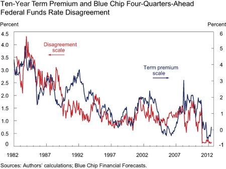
The ten-year Treasury term premium is also associated with disagreement between professional forecasters about the level of future bond yields. In the next chart, we plot the same term premium series against disagreement about the level of the federal funds rate four quarters ahead (as measured by the average forecast of the highest ten responses minus that of the lowest ten responses in the Blue Chip Financial Forecasts survey). The latter series is only available from 1982 onward. Both series show a pronounced downward trend in the early part of the sample along with broadly similar short-term dynamics across the sample. This suggests that more dispersion of professional forecasts seems to be associated with higher Treasury term premia.
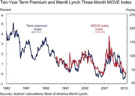
It’s also instructive to compare the term premium with investors’ uncertainty about future Treasury yields (see chart below). We can measure this uncertainty by the Merrill Lynch three-month MOVE index, which summarizes options-implied expected volatility of Treasury yields of different maturities. Over the period when data are available on the index, the term premium is highly correlated with it. Hence, the level of uncertainty about future Treasury yields appears to be associated with the level of term premia.
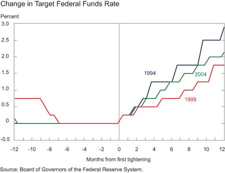
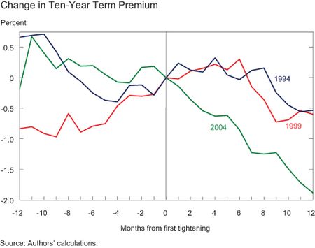
We next explore the dynamics of the term premium around the last three monetary policy tightening cycles (1994-95, 1999-2000, and 2004-06). A simple way to explore the dynamics across several historical episodes is to use a “spider” chart, as we do below.
The vertical line in the chart indicates the month when the tightening cycle began, so we can compare the evolution of the target federal funds rate before and after the beginning of tightening across episodes. The 1994 example stands out as the steepest rise in the target rate over the first twelve months. Against this backdrop, how did the Treasury term premium evolve over these same periods?
Our measure of the term premium rose modestly in the first six months of the 1994 and 1999 tightening cycles before declining by approximately 50 basis points in the following six months. This contrasts with the 2004 tightening cycle, dubbed “the conundrum period,” when term premia dropped steadily in the face of rising short-term interest rates. However, in all three episodes term premia rose, if at all, only modestly during the first year after the FOMC began to tighten policy. This is consistent with our earlier evidence that term premia tend to decline in expansions.
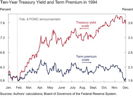
Going one step further, we show in the next chart the decomposition of the ten-year Treasury yield (red line) into its associated term premium (blue line) and the expected path of future short-term rates (the difference between the lines) in 1994. There’s a small rise in the term premium in the first couple of months after the FOMC meeting on February 4. However, throughout the rest of the year, the term premium is little changed while the ten-year yield climbs steadily. The vast majority of the rise in yields is thus attributable to expectations about future interest rates.
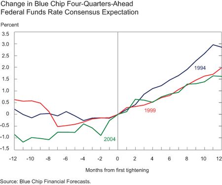
Extracting term premia from Treasury yields is an indirect way to gauge from asset prices expectations about future short-term interest rates. Alternatively, we can gauge expectations directly from surveys of professional forecasters. The next chart shows that there was relatively little change in the one-year-ahead forecast of the federal funds rate, as measured by the Blue Chip Financial Forecasts survey, before the tightening cycles began (to the left of the vertical line). However, professional forecasters changed their interest rate projections quickly once tightening began. This is a more general feature of the behavior of professional forecasters (see this Liberty Street Economics post for more details). The 1994 episode, in particular, stands out because forecasters raised their expectations by a greater degree than they did in the other two tightening cycles.
We can also use the Blue Chip survey to assess changes in the long-term forecasts of the federal funds rate. In February 1994, the average expected level of the federal funds rate over the following ten years was 4.3 percent; one year later, at the end of the tightening cycle, the average was 1.25 percentage points higher, at 5.55 percent. Over that period, the ten-year Treasury yield rose by about 1.5 percentage points, implying that the term premium increased by only 25 basis points. Thus, the survey evidence tells the same story for the 1994 episode as our estimated term premium measure does.
Judging by the last three tightening episodes, there’s no evidence that term premia rise sharply when the stance of monetary policy is shifted toward raising short-term interest rates. This is true even for the 1994 tightening cycle, when interest rates and interest rate volatility rose appreciably during the first half of that year. The bulk of the rise in longer-term interest rates in 1994 is attributable to changes in expectations about future short-term interest rates.
While our term premium measure (as any other) is an estimate and so is subject to uncertainty, our conclusions are consistent with the survey evidence available. That said, we can’t necessarily extrapolate from past experiences to say what will happen in the next tightening cycle. For example, the current size and composition of the Federal Reserve’s balance sheet are much different than they were in the past. Expectations about changes in its future size and composition will also have an effect on term premia, whereas this channel was absent from the historical episodes we consider.
Disclaimer
The views expressed in this post are those of the authors and do not necessarily reflect the position of the Federal Reserve Bank of New York or the Federal Reserve System. Any errors or omissions are the responsibility of the authors.
 Tobias Adrian is a vice president in the Federal Reserve Bank of New York’s Research and Statistics Group.




 RSS Feed
 Follow Liberty Street Economics