Jaison R. Abel and Richard Deitz
Over recent decades, the U.S. workforce has undergone a dramatic restructuring in response to changes in technology, trade, and consumption patterns. Some sectors, such as health care, have expanded, while others, such as manufacturing, have contracted. These changes have altered the composition of the workforce, leading to a phenomenon often referred to as “job polarization,” an important factor contributing to economic inequality in the nation. In this post, we show that the wage gap between high- and low-paid occupations has widened over the past three decades. Further, we show that the share of jobs in both high- and low-paying occupations has grown, leaving a shrinking middle.
Many policymakers and commentators have recently commented on rising economic inequality within the United States (for example, see Federal Reserve Governor Daniel K. Tarullo speech, Robert Reich editorial). As recent research has established, job polarization is an increasingly common phenomenon in developed economies (for examples, see Autor, Katz, and Kearney [2006], Goos and Manning [2007], Acemoglu and Autor [2010]) that has contributed to this inequality. Following the growing trend toward occupation-based analysis, we utilize occupational employment data, which groups workers with similar education, skills, and wages, instead of industry employment data, which groups what are often a diverse set of workers from very different types of jobs, to analyze this phenomenon. This approach allows us to examine how economic restructuring has affected workers of different skill levels.
Widening Dispersion in Wages
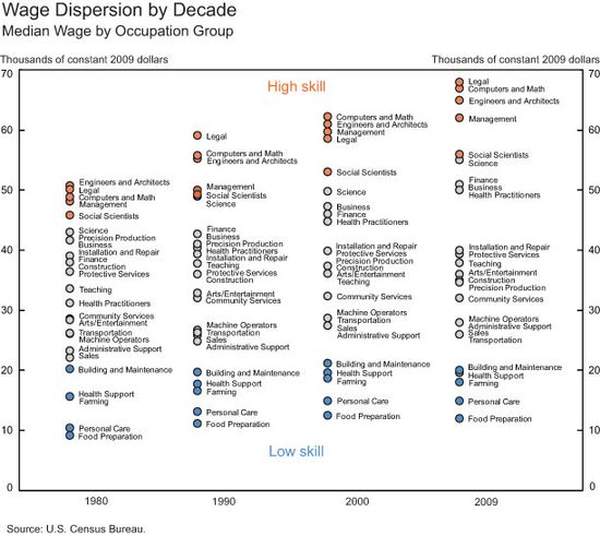
The chart below plots the median wage in 1980, 1990, 2000, and 2009 (in constant 2009 dollars) for twenty-five occupational categories identified by the U.S. Census Bureau. We classify all nonmilitary workers with a positive wage into one of these occupational categories. Focusing on occupations instead of industries allows us to group individuals based on the type of work they do, rather than on what they produce, which allows a more homogenous grouping of workers based on skills and wages. The chart shows that the dispersion in wages among occupations is clearly growing, with the gap being driven primarily by rising wages in occupations at the top of the distribution. The top five occupational categories—Legal, Computer and Math, Engineers and Architects, Management, and Social Scientists—have each seen rapid wage growth since 1980. For example, the median wage for Computer and Math occupations was roughly $49,000 in 1980, rising to $67,000 in 2009. By contrast, wages in the middle and lower portion of the wage distribution have been more stagnant, and for some occupational categories, wages have even declined over this period, particularly between 2000 and 2009. For example, the median wage of Construction jobs fell from $38,000 in 1980 to $35,000 in 2009. While the wages of the bottom five occupational categories—Building and Maintenance, Farming, Health Support, Personal Care, and Food Preparation—generally increased over this period, the dollar value of the wage gains were relatively modest. As a result, wage dispersion across occupations has steadily increased since 1980.
Growth at the Top and Bottom
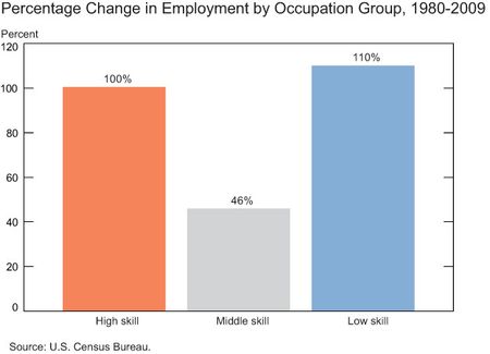
In which occupations did jobs grow the most between 1980 and 2009? As it turns out, job growth occurred disproportionately at the upper and lower ends of the wage distribution. To show this, we split occupations into three groups. Using wages to proxy for skill, the top five occupational categories are classified as “high skill” jobs, the bottom five occupational categories are classified as “low skill” jobs, and the remaining categories are classified as “mid-skill” jobs. The next chart plots percentage change in total employment for each of these categories between 1980 and 2009. While each job category witnessed some growth during this period, reflecting general growth in the U.S. economy, the U-shaped pattern indicates that job growth was strongest in the tails of the distribution—the high and low skill jobs.
A Hollowing Out of the Middle
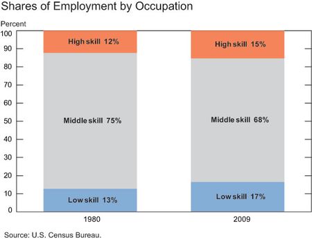
Not surprisingly, these patterns have shifted the distribution of jobs among these groups. The chart below indicates the share of workers in each of the wage groups in 1980 and in 2009. In 1980, three-quarters of all workers were employed in mid-skill occupations. Among the occupations included in this group, Machine Operators accounted for 10 percent of the U.S. workforce, and Administrative Support accounted for 18 percent. By 2009, the share of jobs in the mid-skill category had shrunk to two-thirds, with Machine Operators accounting for just 4 percent of all jobs and Administrative Support for 14 percent. Over this same period, there was an increase in the share of jobs in the high and low skill groups. High skill jobs increased their share from 12 percent to 15 percent, while low skill jobs grew from 13 percent to 17 percent. As a result, the share of jobs at the upper end and lower end of the distribution increased between 1980 and 2009, while the share of jobs in the middle group fell.
Clearly, the U.S. workforce has undergone a significant occupational restructuring since the 1980s. Along with an increase in the share of high skill jobs and low skill jobs, there has been a growing wage gap between workers in jobs that pay the most and those that pay the least. With a rising share of jobs at the upper and lower ends of the wage distribution and a wider gap in wages among occupations, jobs have become more polarized in the United States over the past three decades.
Disclaimer
The views expressed in this blog are those of the authors and do not necessarily reflect the position of the Federal Reserve Bank of New York or the Federal Reserve System. Any errors or omissions are the responsibility of the authors.


 RSS Feed
 Follow Liberty Street Economics
This shows the impact and trend towards technology expansion in our society and resulting in higher skilled occupations. It also should emphasize the importance with continued skill and knowledge building beyond high school rather than just finishing high school or dropping out (taking the presumed “easy” road) for a life of employment in low skilled jobs for most that take this path. As for wage disparity, there are more people entering the workforce for low skilled jobs thereby keeping the wage down than there are vying for the high skilled jobs driving the wages higher. The moral here is the “easy” road when your young often leads to the “hard” road through life! Everyone has the same opportunities in life choices, there are no real barriers just those you choose to claim or throw up yourself. Nobody promised a “free” ride.