Meryam Bukhari, Alyssa Cambron, Marco Del Negro, and Julie Remache
Note: On August 15, 2013, the data files associated with this post and with the post “The SOMA Portfolio through Time” were expanded to include historical data in nominal dollars. In addition, the estimated value for 1996 in the chart “Total Portfolio Unrealized Gains and Losses” was revised and the associated data file was updated.
Historically, the Federal Reserve has held mostly interest-bearing securities on the asset side of its balance sheet and, up until 2008, mostly currency on its liability side, on which it pays no interest. Such a balance sheet naturally generates income, which is almost entirely remitted to the U.S. Treasury once operating expenses and statutory dividends on capital are paid and sufficient earnings are retained to equate surplus capital to capital paid in. The financial crisis that began in late 2007 prompted a number of changes to the balance sheet. First, the asset side of the balance sheet increased dramatically, a result of both the various liquidity facilities and the Large-Scale Asset Purchase programs (LSAPs) (see yesterday’s post on the history of the Fed’s balance sheet). Second, this expansion of the balance sheet was financed in large part by issuing interest-bearing reserves instead of additional noninterest-bearing currency. As a consequence of these changes, future net income from the Fed’s portfolio will depend on a wider range of factors and may be more variable for a period of time—a topic that has generated increased discussion (see papers by Carpenter et al., Hall and Reis,and Greenlaw, Hamilton, Hooper, and Mishkin).
This post aims to provide historical perspective to this debate by showing how the Fed’s income has evolved over time. We’ll focus on income from the domestic System Open Market Account (SOMA) portfolio, that is, the portion of the portfolio held in U.S. dollar assets and used to support implementation of the Federal Open Market Committee’s (FOMC)
monetary policy objectives. The Fed also maintains a portfolio of foreign
currency reserves, but at approximately $24 billion as of March 31, 2012, it comprises a much smaller portion of the total SOMA portfolio, and therefore a much smaller fraction of the total income generated.
In reading this post, recall that the purpose of monetary policy, as stated in the Federal Reserve Act, is to promote “the goals of maximum employment, stable prices and moderate long-term interest rates,” not to generate income from its portfolio. Net income is a byproduct of actions taken to pursue the economic objectives given to the Federal Reserve by Congress. Moreover, as we will discuss later in this series of posts, the issues of income and remittances should be understood in a broader fiscal context. From this vantage point, the income generated by the Fed is a relatively narrow part of this larger picture.
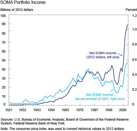
The chart below shows SOMA net income (income generated from securities held in the domestic SOMA portfolio, including realized gains and losses, net of interest expense), from 1915 to the present, both in 2012 dollars (dark blue) and as a fraction of GDP (light blue; we use GNP before 1947). In the chart, you can see that income on the portfolio has always been positive. While this may seem unsurprising, at least for the period before 2008 when the Fed’s liabilities consisted mainly of currency, it didn’t have to be the case. Securities in the SOMA portfolio are accounted for on an amortized cost basis. Under amortized cost accounting, a premium or discount is recorded on the balance sheet as the difference between a security’s purchase value and its par value.
Over the life of the security, the premium or discount is amortized through
income, with a corresponding decrease or increase in the amortized cost of the security. Under this treatment, the income on the security is
consistent with the market yield of the security at the time of purchase. When the Fed sells a security from the portfolio, if the market price is lower than the amortized cost of the security, it would result in a realized loss reflecting the difference between the price received and the remaining
amortized cost. Since realized losses (or gains) on the portfolio are included in net income calculations, income would be negative if the SOMA incurred large-enough realized losses to offset the interest income. But given that asset sales have been historically small, this has never occurred.
You can also see that net SOMA income was relatively small until the
early 1970s, at which point it grew to approximately $20 billion. From the
1970s through 2007, income fluctuated modestly, but averaged around $30 billion per year. More recently, net SOMA income has increased dramatically, mainly a result of the expansion of the size and duration of the portfolio with the LSAPs, with interest income on the additional securities exceeding the low interest rate paid on liabilities. When we compute net SOMA income as a fraction of the GDP (and therefore scale it by the size of the economy), the level of income in recent years is still the highest ever reached, at almost 0.6 percent of GDP, but it no longer appears to be such an outlier relative to its prior peak in the early 1980s.
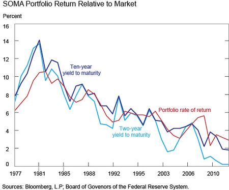
The chart below shows the rate of return on the SOMA portfolio—roughly speaking, the ratio of net SOMA income over the par value of the portfolio—together with the yields on the two- and ten-year Treasury securities. When Treasury yields were high in the late 1970s and early 1980s, coupons on Treasury securities were also high, and as a result so was income. Looking at this in combination with the previous chart, we can see that income as a percent of GDP is similar in these periods—in the earlier period, the portfolio was smaller, but the yield was high; more recently, the portfolio is large, and the yield is much lower.
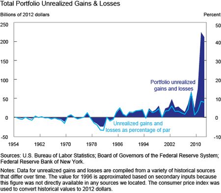
The market value of the SOMA portfolio—and therefore the related unrealized gains and losses—fluctuates with changes in interest rates. These unrealized gains (or losses) are defined as the difference between the market value of a security and the value at which the security is held on the books (the amortized cost) and are considered unrealized until the security is sold. All else equal, as rates rise the portfolio’s market value generally decreases, and vice versa as rates fall. This value reflects the difference between the portfolio yield and the current market yield. While not relevant for a central bank that uses an amortized cost basis for accounting (the Fed discloses, but does not base its financial statements upon, mark-to-market accounting), it is still interesting to put unrealized gains or losses in context with historical values.
The chart above shows the amount of unrealized gains and losses,
both in 2012 dollars and as a fraction of the portfolio, and makes two key points. First, the SOMA did reflect unrealized losses in the past, peaking in the early 1980s. At that time, the SOMA contained some long-term securities, and their market value plunged as interest rates shot up because of inflation. As noted, these unrealized gains or losses have no impact on SOMA income, and therefore did not affect remittances. Second, in recent years, the unrealized gain of the SOMA portfolio has reached historical highs, peaking at nearly $225 billion. This figure
is driven by growth in the size of the portfolio and the increasing value of
longer-term securities previously acquired when rates were higher, and comes despite an overall decline in the yield of the portfolio. Looking head, as interest rates rise during a period of normalization of the stance of monetary policy, the market value of the portfolio is likely to fall, and it is possible that this could result in unrealized losses on the SOMA portfolio. Nevertheless, even if these unrealized losses are large, they will only affect income if and when assets are sold from the portfolio.
In conclusion, we have seen that SOMA net income has fluctuated over time with changes in (1) yields and (2) the size and composition of the balance sheet. In recent years, net income has been very large by historical standards, but it is important to keep in mind that changes in the size and composition of the SOMA portfolio were intended to promote the FOMC’s mandate to foster maximum employment and price stability, not to produce a financial return. As interest rates will likely rise in the future, income is expected to decline for a while from the current levels (see the projections in Chart 22 of the New York Fed’s recent report Domestic Open Market Operations during 2012). What will happen after that will again depend on yields and the size and composition of the balance sheet in the long run, and forecasting these figures is well beyond the scope of this post.
Disclaimer
The views expressed in this post are those of the authors and do not necessarily reflect the position of the Federal Reserve Bank of New York or the Federal Reserve System. Any errors or omissions are the responsibility of the authors.
Meryam Bukhari is a senior analyst in the Federal Reserve Bank of New York’s Markets Group.
Alyssa Cambron is an associate in the Markets Group.

Marco Del Negro is a vice president in the Bank’s Research and Statistics Group.


 RSS Feed
 Follow Liberty Street Economics