Uncertainty is of considerable interest for understanding the behavior of individuals as well as the movements in key macroeconomic and financial variables. Despite its importance, direct measures of uncertainty aren’t widely available. Because of this data limitation, a common practice is to use survey-based measures of forecast dispersion—reflecting disagreement among respondents—to proxy for uncertainty. Is this a reliable practice? Here, we review the distinction between disagreement and uncertainty as concepts, and show that this conceptual distinction carries over to their empirical counterparts, suggesting that disagreement is not generally a good proxy for uncertainty.
The terms “disagreement” and “uncertainty” refer to very different concepts. Disagreement refers to a collection of forecasts or point predictions and the nature of their clustering around each other—the more disperse the forecasts, the greater the extent of disagreement among the survey respondents. On the other hand, uncertainty refers to the distribution of the probabilities that a respondent attaches to the different possible outcomes of the forecasted variable—the more confidence held by a respondent, the tighter this distribution is and the lower the respondent’s uncertainty.
Although disagreement and uncertainty are different concepts, some commentators have drawn a connection between the two. That is, episodes characterized by high (low) disagreement are viewed as indicative of high (low) uncertainty shared by the respondents. This assumption provides the basis to use disagreement as a proxy for uncertainty when measures of the latter magnitude aren’t available.
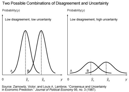
Is the assumed positive association between disagreement and uncertainty plausible? Yes. Is it necessarily true? No. To understand why either case is possible, we can look at the following figure previously discussed in this paper by Victor Zarnowitz and Louis Lambros:
The illustration on the left shows the forecasts and associated probability distributions of two hypothetical survey respondents—respondent A and respondent B. The close proximity of the forecasts (ŷA and ŷB) indicates low disagreement, while the tight distributions around each forecast indicate low uncertainty. However, the illustration on the right depicts another possible situation. Here the forecasts are unchanged, so disagreement remains low. But the probability distributions around each forecast are now much wider, indicating high uncertainty. The figure is important for two reasons. First, it bears directly on the question of the reliability of disagreement as a proxy for uncertainty. While the conditions depicted in the left illustration might justify this practice, the conditions depicted in the right illustration would not. Second, it shows that the dispersion of forecasts by itself is not necessarily informative about the level of uncertainty across respondents. Because most surveys only report the respondents’ forecasts, observing the degree to which the forecasts cluster together can’t tell you whether the illustration on the left or on the right in the figure is the more relevant situation.
So, is it possible to say something more definitive about which of the two illustrations may be a better description of the relationship between disagreement and uncertainty? The answer is yes, because there are a few surveys that have the unique feature of asking respondents to report both a forecast and their uncertainty—the latter being represented by a histogram in which respondents assign probabilities to pre-specified bins that provide a range of possible outcomes for the forecasted variable. The best-known of these surveys are the U.S. Survey of Professional Forecasters (US-SPF), the European Central Bank Survey of Professional Forecasters (ECB-SPF), and the Bank of England Survey of External Forecasters (BOE-SEF).
There are various techniques, such as calculating the variance/standard deviation or interquartile range, that can be used with these histograms to derive an estimate of each respondent’s uncertainty, which can then be used to construct a measure of aggregate uncertainty. The degree of disagreement across the respondents’ forecasts can be measured in the same way. If disagreement is a useful proxy for uncertainty, then the two variables should display a meaningful positive association.
As it turns out, there are several studies that have used data from the aforementioned surveys to investigate the relationship between disagreement and uncertainty. These studies include work by Boero, Smith, and Wallis (2008) for the BOE-SEF; Rich and Tracy (2010) for the US-SPF; and Rich, Song, and Tracy (2012) for the ECB-SPF. The conclusions from the analyses are quite similar—disagreement is a poor proxy for uncertainty.
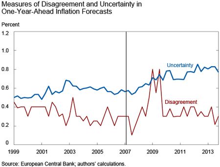
To help understand this finding, the following graph uses ECB-SPF data from the first quarter of 1999 through the fourth quarter of 2013 and plots measures of disagreement and uncertainty for one-year-ahead inflation forecasts. Details on the construction of the variables are provided in the Rich, Song, and Tracy paper cited above.
The average uncertainty measure shows a clear upward drift since the second quarter of 2007, denoted by the vertical line, and remains nearly 50 percent higher today than in the pre-crisis period. The disagreement measure shows a noticeable increase starting in 2008, with some fairly dramatic spikes evident during the global financial crisis. More recently, and in contrast to uncertainty, disagreement has declined and returned to levels more consistent with the range observed over most of the pre-2007 period. When we examine the series more formally, the correlation is essentially zero. If we limit the analysis to data through the second quarter of 2007 to avoid any concerns that the results may be unduly influenced by the global financial crisis, then the correlation becomes negative.
There is a relatively straightforward explanation for the weak relationship—the uncertainty measure displays relatively smooth behavior while disagreement is more volatile. These features of disagreement and uncertainty depicted in the graph are very representative of the relationship for other variables, such as growth and unemployment, and other forecast horizons. In particular, while most of the other observed correlations for the ECB-SPF data were higher than zero, they were still quite low and could generally be described as weak.
Our discussion focuses on the question posed in the title of our post: what does disagreement tell us about uncertainty? While we recognize that disagreement could be strongly and positively related to uncertainty, and that it has been common practice in many analyses to assume such a relationship, we find that there is little empirical evidence to support this view. A better approach is to use measures of uncertainty when they are available, as well as to design more surveys that would have the capability to directly measure respondents’ uncertainty.
Disclaimer
The views expressed in this post are those of the authors and do not necessarily reflect the position of the Federal Reserve Bank of New York or the Federal Reserve System. Any errors or omissions are the responsibility of the authors.
Matthew Ploenzke is a research associate in the Federal Reserve Bank of New York’s Research and Statistics Group.
Robert Rich is an assistant vice president in the Research and Statistics Group.
Joseph Tracy is an executive vice president and senior advisor to the Bank president at the Federal Reserve Bank of New York.


 RSS Feed
 Follow Liberty Street Economics
Dan – We may not have fully understood your first point. Even though a person may report a single value for a point forecast, that forecast is based on an assessment of the different possible values that the target variable may take on along with an associated probability of each possible value. With regard to your second question, respondents are not instructed how to calculate their point forecast and do not necessarily provide the mean of their density (histogram) forecast. However, research by Joseph Engelberg, Charles Manski and Jared Williams in a 2009 article showed that the calculated means from the US-SPF density forecasts were consistent with the associated point forecasts. Also, in a special questionnaire fielded by the ECB-SPF, the vast majority of respondents indicated that their reported point forecast reflects the mean of their density forecast. Chris – We’re glad you found the post interesting. We have not calculated the disagreement and uncertainty measures we describe in this blog for the US-SPF post-2002. While we can make no comment on whether the same pattern holds, there are a couple of points worth mentioning. First, without getting into technical details, disagreement and uncertainty measures from the US-SPF can only be consistently compared for the same quarter. That is, looking at the pattern for observations such as 1992Q1, 1993Q1, . . . , 2014Q1, then the pattern for observations such as 1992Q2, 1993Q2, . . . , 2014Q2 and so on. This is because the forecast horizon in the US-SPF declines from the 4th quarter of a year to the 3rd quarter of the subsequent year, resulting in both disagreement and uncertainty generally declining together during this survey cycle. So, this source of the observed co-movement between the series is an artifact of the survey design. Another point is that it will be important to consider the pre-2008 period to make sure that any correlation between disagreement and uncertainty is not unduly sensitive to the incidence of the Great Recession.
Does this hold for the US in the last decade? The sample in the study by Robert Rich and Joseph Tracy ends 2002. See figure 2, using US-SPF, from Nick Bloom’s 2014 JEP paper is at least suggestive that disagreement is a helpful proxy for true uncertainty in forecasts: http://pubs.aeaweb.org/doi/pdfplus/10.1257/jep.28.2.153. This roughly the same time frame you present using the ECB-SPF and it looks very different. Thanks for the interesting post!
Might there be a difference between a forecast for an interest rate, say, and for a report of a subjective assessment of uncertainty? A forecast of 1.0 percent, say, refers to a prediction of something observable, something that means the same thing over time and for each respondent. But can we know that subjective probabilities assigned to various bins mean the same thing over time, and even across respondents, in the same sense? 1.0% is a guess, but it’s a guess about something real and observable; but a report of a 10% subjective probability of an 0.2% rate seems more of a subjective sensation, and the metric may be more “flexible” across respondents or even for a given respondent over time… no? (A related question: are the survey respondents asked both for the points in the probability distribution and for the mean of the distribution (point estimate)? Are they forced to make probability distribution estimates consistent with their point estimates, and if not, how consistent do they turn out?) (I’m just wondering whether we can reliably compare over time reports of subjective uncertainty the same way we can measure dispersions of point forecasts.)