In an earlier post, we showed that Treasury market liquidity appears reasonably good by historical standards. That analysis focused on the most liquid benchmark securities, largely because data availability is best for those securities. However, some studies, such as this one and this one, report that market liquidity is concentrating in the most liquid securities at the expense of the less liquid, so that looking only at the benchmark securities gives a misleading impression. In this post, I look at trading volume information reported by the Federal Reserve to test whether liquidity is becoming more concentrated.
Analyzing Liquidity Concentration in the Treasury Market
I assess liquidity concentration in the Treasury market using the Federal Reserve’s FR 2004 data. The data are collected from the primary dealers every week and released in aggregated form. Such data have been used in numerous prior analyses of dealer positions, financing activities, and settlement fails.
My focus here is on trading volume. For decades, the Fed has released volume data aggregated across both dealers and broad categories of securities, such as Treasury bills as a group. Since April 2013, the Fed has also released information on trading in certain specific Treasury securities, namely the most recently issued notes and bonds of a given original maturity. See this post for more information on the specific issue data and this other post for an analysis of dealer positions over the auction cycle.
To assess the degree of concentration in trading, I compare trading in the most recently issued notes and bonds to aggregate trading volume. I can compare for coupon securities both as a group and by sector, as described below. One complication is that the aggregate Treasury data are reported on an average daily basis for each week, whereas the specific issue data are reported on a cumulative basis for each week. I therefore first adjust the specific issue series for the number of trading days in each week, taking holidays into account.
Most Trading Is in the Benchmark Notes and Bonds
Over my two-and-a-half-year sample period, daily trading volume in all Treasury securities as reported by the primary dealers averages $517 billion. (This figure reflects some double-counting because trades between dealers are reported by both dealers.) Of this activity, $435 billion (84.3 percent) occurs in nominal Treasury notes and bonds, $68 billion (13.2 percent) in bills, and $12 billion (2.4 percent) in Treasury Inflation-Protected Securities. Floating Rate Notes—introduced in January 2014—account for 0.4 percent of activity since January 1, 2015, averaging $2 billion per day, and were grouped with nominal notes and bonds before then.
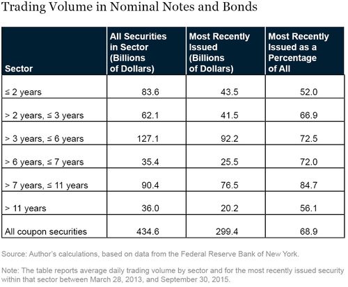
Of the trading in nominal notes and bonds, roughly $300 billion took place in the most recently issued securities, accounting for 68.9 percent of volume in such securities, as shown in the table below. This is striking because there were roughly 275-300 nominal notes and bonds outstanding over the sample period, implying that $135 billion in trading, accounting for 31.1 percent of volume, took place in the 270-295 securities that were not the most recently issued securities. It follows that the turnover ratio for the benchmark securities is roughly 100 times greater than it is for the nonbenchmark securities (that is, $300 billion divided by six securities is roughly 100 times greater than $135 billion divided by 270 securities).
The table also reports volume for each sector and specific issue for which data are reported (there is a one-to-one correspondence between the two) and the percentage volume in that sector that is accounted for by the most recently issued security. The latter tends to increase with maturity, so that it is 52.0 percent for the two-year note but 84.7 percent for the ten-year note. That is, activity seems to be especially concentrated in the most liquid long-term notes. The thirty-year bond stands out as an exception, which is perhaps explained by the wide maturity range (from eleven to thirty years)—and hence large number of securities—covered by that sector.
Is Trading Becoming More Concentrated?
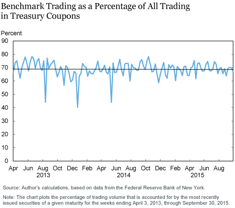
To assess whether trading activity is becoming more concentrated, I plot the percentage of trading volume in notes and bonds that is accounted for by the most recently issued securities on a weekly basis along with a trend line (see the chart below). The line is essentially flat, suggesting that the concentration of trading volume has neither increased nor decreased over the past two and a half years.
Dips in Trading Concentration and New Issuance
Aside from the flat trend line, the chart above also reveals notable dips in the share of trading that is accounted for by the most recently issued securities. These dips arise from the particularities of the data collection process. The most actively traded Treasury securities tend to be the on-the-run securities (the most recently auctioned securities of a given maturity). However, the Fed releases data for the most recently issued securities of a given maturity. The most recently auctioned and most recently issued securities coincide most of the time, but not in the days following auction (except in the rare cases in which an issuance day immediately follows an auction day).
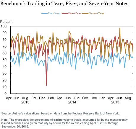
These dips are more evident in the time series of trading concentration in the most recently issued securities in different sectors. In the chart below, the share of activity in the two- and five-year sectors that is accounted for by the benchmark security plunges in the week ending December 25, 2013. That week was unusual in that the most recently issued two- and five-year notes were off the run the entire week (new two- and five-year notes were auctioned the preceding week but not issued until the following week). Trading activity plummets when securities go off the run (as shown in Figure 1 of this paper), so trading in the specific two- and five-year notes for which data were collected was commensurately low.
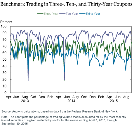
Similar circumstances explain why the benchmark security shares in the three-, ten-, and thirty-year sectors plunge in the weeks ending August 14, 2013, and May 14, 2014, as shown in the following chart.
Trading Concentration and Volatility
Another notable feature of the first chart is the peak and near peak (third-highest) in concentration during the 2013 selloff in fixed-income markets—examined here and here—in the weeks that included former Fed Chairman Bernanke’s May 22, 2013, congressional testimony and the June 18-19, 2013, Federal Open Market Committee meeting. Such concentration attains its second-highest value in the week including October 15, 2014, when Treasury securities exhibited a rapid round-trip in yields amid seemingly little news, as explained in
this post and the associated report. It seems, then, that trading concentration is positively correlated with volatility, a relationship I plan to explore further in future work.
Why Don’t the Data Show Increasing Concentration?
While I uncover some interesting features about liquidity concentration in the Treasury market, I do not find that liquidity is becoming more concentrated. One caveat is that I only look at trading volume and not at other liquidity measures—but one might think that volume should reflect any concentration of liquidity. Another caveat is that I only examine trading by primary dealers—although it is largely through dealer behavior that liquidity is thought to have become concentrated. Lastly, it’s possible that the sample period I study is too short to identify liquidity concentration—even though much of the commentary on the phenomenon is fairly recent. In sum, it seems puzzling that liquidity could have become more concentrated, and yet the data analyzed here don’t show it.
Disclaimer
The views expressed in this post are those of the author and do not necessarily reflect the position of the Federal Reserve Bank of New York or the Federal Reserve System. Any errors or omissions are the responsibility of the author.

Michael Fleming is a vice president in the Federal Reserve Bank of New York’s Research and Statistics Group.


 RSS Feed
 Follow Liberty Street Economics