The study of the business cycle—fluctuations in aggregate economic activity between times of widespread expansion and contraction—is one of the foremost pursuits in macroeconomics. But even distinguishing periods of expansion and recession can be challenging. In this post, we discuss different conceptual approaches to dating the business cycle, study their past performance for the U.S. economy, and highlight the informativeness of labor market indicators.
In the United States, the official designation of peaks and troughs in economic activity is provided by the NBER business cycle dating committee (BCDC). Recessions are defined as the periods from peak to trough whereas expansions are the periods from trough to peak. The BCDC was initiated by Arthur Burns (who later became Federal Reserve Chair in 1970) and Wesley Mitchell in the 1940s. Burns and Mitchell explored many different time series (as pioneers of “big data”), and discovered the “business cycle,” one of the most robust empirical facts in economic history, defining it as “…[the] type of fluctuation found in the aggregate economic activity of nations that organize their work mainly in business enterprises: a cycle consists of expansions occurring at about the same time in many economic activities, followed by similarly general recessions….” In other words, recessions are times of pervasive declines in economic activity affecting different industries and regions. For a modern take, the NBER dating committee observes: “During a recession, a significant decline in economic activity spreads across the economy and can last from a few months to more than a year. Similarly, during an expansion, economic activity rises substantially, spreads across the economy, and usually lasts for several years.”
From a mathematical perspective, turning points in the business cycle are nothing more than local maxima (peaks) and minima (troughs). The challenge is identifying peaks and troughs from heterogeneous and noisy data. Burns and Mitchell and later, the NBER dating committee, rely on visual inspection for the identification of turning points (in what might be called “human learning”). Bry and Boschan (1971) introduced a formal algorithm, the Bry-Boschan (BB) algorithm, to automate the identification of peaks and troughs in a time series. In this post, we follow their procedure (as implemented by Stock and Watson [2014]) in the analysis of monthly data, and the Bry-Boschan quarterly (BBQ) algorithm of Harding and Pagan (2002) for quarterly data.
With this method, determining business cycle turning points is a two-step process: first, to identify turning points in each of the data series using the BB algorithm and, second, to construct turning points in “economic activity” by aggregating information from the individual series’ turning points. This approach is typically called “date then aggregate” (Stock and Watson [2014]). Specifically, we will use clusters of turning points as a signal of a turning point in the aggregate economy. We apply this approach to a workhorse panel data set of economic time series originally constructed by Stock and Watson (2014) for the empirical analysis of big data in macroeconomics. This monthly, 130-variable data set, complete with real-time vintages since 1999, is maintained by the Federal Reserve Bank of St. Louis. We exclude data on money, credit, interest rates, exchange rates, and prices from our analysis, and focus on economic variables related to business cycle fluctuations: output and income (17 series); the labor market (32 series); housing (10 series); and consumption, orders, and inventories (14 series).
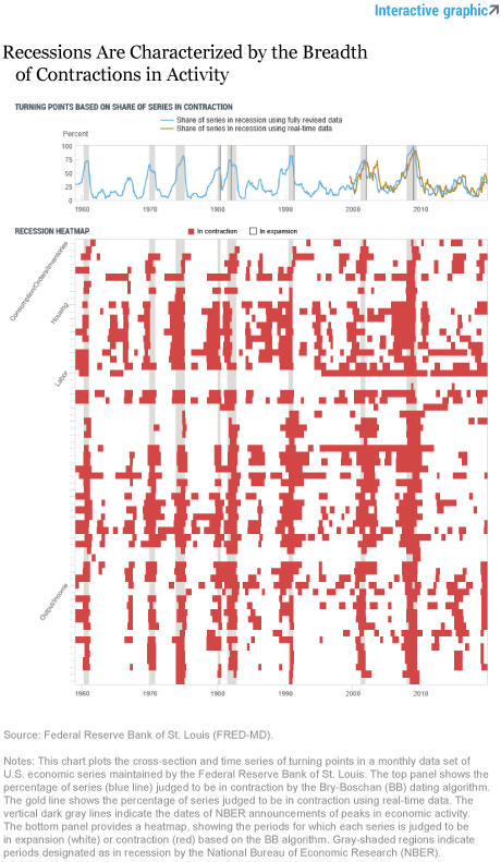
The bottom panel of the interactive chart below illustrates the results of the “date then aggregate” approach for these data series. Rows indicate individual series grouped by the four categories. Red pixels identify months in which the series was in contraction (peak-to-trough) whereas white pixels denote expansions (trough-to-peak). The business cycle is clearly evident by the bunching of red pixels over time. For example, in the last recession, almost every series was simultaneously in contraction producing a vertical red stripe in the plot.
The top panel of the chart shows the percentage share of series designated to be in contraction for each month. The “share” series rises sharply around NBER recessions, which are roughly characterized by about 60 percent of the underlying series deemed to be in contraction. The gold line repeats the exercise using real-time vintages of the data beginning in 1998, that is, using the data that would have been publicly available at the time. The plot shows that the signal is similarly informative in real time as it is using fully revised data (with the exception of the 2003 period when economic activity slowed but did not contract). We can also observe that at the end of last year, the current share of series in contraction was at a similar level as that of the slowdown in 2015-16.
An alternative approach to “date then aggregate” is to “aggregate then date,” which is to identify peaks and troughs in a small number of representative measures of economic activity. The most comprehensive and well-known measure of economic activity is the gross domestic product (GDP). It was developed by Simon Kuznets in the 1930s by using economic theory and accounting principles to combine a large set of information about different sectors of the economy and different economic agents. This is the most followed and widely understood measure of economic conditions and has been referred to as one of the greatest inventions of the twentieth century.
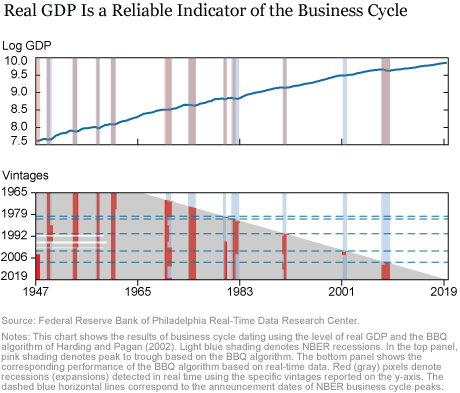
The next chart shows the results from business cycle dating based on the level of real GDP using the BBQ algorithm. The top panel shows the natural logarithm of the level of real GDP (blue line) along with the NBER recessions (light blue shading) and the recessions implied by the BBQ algorithm (pink shading) based on current vintage real GDP data. The peaks and troughs in this single indicator are very close to those identified by the BCDC. This result is remarkable since it highlights the robustness of business cycle dating, allowing general audiences to understand the concept. Indeed, specialized press have coined their own dating: the technical recession, defined as two consecutive quarters of negative GDP growth, which is a simplified and heuristic version of peak detection by the BCDC or based on the BBQ algorithm.
Although the dating provided by real GDP aligns well with NBER-defined recessions, there are notable exceptions. First, the 1981-82 recession is seen to be much more short-lived using revised data than the BCDC designated at the time. Second, the 2001 recession is not identified by the algorithm at all. The bottom panel of the chart shows how these results change based on the vintage of real GDP series that is used. Since the national accounts are subject to revisions and changes in definitions, “by vintage” (noted on the y-axis) indicates how the peaks and troughs of the real GDP series would have looked at that date. If we look horizontally for a chosen vintage, red (gray) shading indicates periods of recession (expansion) based on the BBQ algorithm and those vintage data. This chart shows that, using real-time data, the algorithm fails to identify the 1980 recession until the revisions of the real GDP series available in the mid-1990s. In contrast, the 1981-82 recession is determined to be much longer with earlier vintages but over more quickly when later vintages are used to date the cycle. Finally, we can observe that the 2001 recession was apparent only in vintages of the early aughts, and absent in subsequently revised data.

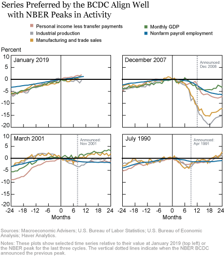
While real GDP is a preferred measure, differences in dating when using the BBQ algorithm and NBER-dated recessions in the above chart show that real GDP growth is not the only measure that the BCDC considers. Studying many data series guards against model uncertainty, data revisions, and other measurement issues which arise in a comprehensive series such as real GDP. The BCDC identifies a number of other series as informative indicators including real personal income less transfer payments, real manufacturing and wholesale-retail trade sales, and industrial production. The BCDC views the payroll employment measure as the most reliable comprehensive estimate of employment but also tracks employment estimates based on the household survey from the Bureau of Labor Statistics Employment Situation Report. In the chart below, we show the time series of each of these indicators relative to the BCDC-designated peak in economic activity. In examining these four panels, note that most of the time these monthly series are peaking at exactly the date designated by the BCDC as the peak in overall economic activity.

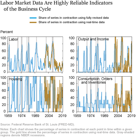
These series used by the NBER place particular emphasis on measures of manufacturing activity as they have historically captured the movements in aggregate economic activity in the United States. However, recent evidence suggests that that this empirical regularity has diminished in relevance. In the 2014-16 period, the manufacturing sector experienced a sustained contraction (as judged by year-over-year industrial production growth) but broader U.S. economy activity continued to expand. This divergence was the first such occurrence over the whole history of this series (available beginning in 1920). It provides suggestive evidence that perhaps other indicators—such as labor market indicators—may prove more reliable going forward as compared to manufacturing indicators. With this observation in mind, we can revisit our “big data” exercise, but study the share of turning points for each of four segments of the U.S. economy shown in the chart below.

As is clear from the illustrations, labor market indicators appear to be the most reliable as they are less noisy and have fewer “false positives” (indicating a recession when one did not occur). Real-time performance is also almost indistinguishable from the full-sample performance, suggesting that the signal we may extract is far less sensitive to revisions than real GDP. In our forthcoming post, we focus specifically on labor market variables and demonstrate the appealing properties they possess for designating expansions and recessions in the U.S. economy.

Richard Crump is a vice president in the Federal Reserve Bank of New York’s Research and Statistics Group.
Domenico Giannone was formerly an assistant vice president in the Bank’s Research and Statistics Group. This work was completed while he was an employee.
David Lucca is an assistant vice president in the Bank’s Research and Statistics Group.
How to cite this post:
Richard Crump, Domenico Giannone, and David Lucca, “Reading the Tea Leaves of the U.S. Business Cycle—Part One,” Federal Reserve Bank of New York Liberty Street Economics, February 10, 2020, https://libertystreeteconomics.newyorkfed.org/2020/02/reading-the-tea-leaves-of-the-us-business-cyclepart-one.html.
Disclaimer
The views expressed in this post are those of the authors and do not necessarily reflect the position of the Federal Reserve Bank of New York or the Federal Reserve System. Any errors or omissions are the responsibility of the authors.


 RSS Feed
 Follow Liberty Street Economics