Does health insurance improve health? This question, while apparently a tautology, has been the subject of considerable economic debate. In light of the COVID-19 pandemic, it has acquired a greater urgency as the lack of universal health insurance has been cited as a cause of the profound racial gap in coronavirus cases, and as a cause of U.S. difficulties in managing the pandemic more generally. However, estimating the effect of health insurance is difficult because it is (generally) not assigned at random. In this post, we approach this question in a novel way by exploiting a natural experiment—the adoption of the Affordable Care Act (ACA) Medicaid expansion by some states but not others—to tease out the causal effect of a type of health insurance on COVID-19 intensity.
The Oregon Health Insurance Experiment—in which Medicaid in Oregon was assigned at random to some eligible individuals—found that the Medicaid recipients faced much lower financial pressure and had better mental health than nonrecipients, but did not find improvement on any short-term metrics of physical health. However, another literature has noted that when people are sent to the hospital in serious condition shortly after they turn sixty-five (and qualify for Medicare) rather than shortly before, their health outcomes, including their probability of survival, tend to improve. Therefore, whether health insurance improves health is still an open question, and the answer may vary with the exact nature of health insurance and the exact definition of “health.”
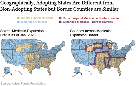
We exploit the fact that Medicaid expansion under the ACA was up to the states, and many states did not adopt the expansion. While the nonadopting states are clearly different from the adopting states (they are in the South and West, and are more conservative and more rural than the expansion states, on average), the counties on the borders of these states probably differ little from their neighboring counties whose state governments did expand Medicaid.
We illustrate these similarities in the maps below. The map on the left shows all states expanding and not expanding Medicaid as of January 2020; the regional tilt of the Medicaid expansion is apparent. The map on the right shows counties on both sides of the borders between Medicaid-expanding states and Medicaid-nonexpanding states in red and dark blue. By definition, the bordering counties are next to each other, so restricting our analysis to this sample of counties removes the bias arising from differing geography that we would have if we were to compare expanding and non-expanding states. We have also observed that many variables that are correlated with COVID-19 incidence—such as minority share, population density, public transit use, and home crowding—are continuous across the Medicaid expansion border, and we show some of these results later in the post.

To make our natural experiment more convincing, we consider plots of the outcomes of interest (health insurance rates, coronavirus cases per capita, potential confounders) against distance to the border between Medicaid-nonexpanding and Medicaid-expanding states. Places within Medicaid-nonexpanding states are assigned a negative value for distance while places in Medicaid-expanding states are assigned a positive value for distance. Although there is much spatial variation in outcomes that we care about, this variation should evolve continuously across space without major jumps unless some policy factor that affects these variables should change abruptly from one state to another. Our main assumption in this analysis is that the only reason for the value of any outcome to jump at the Medicaid expansion border is that states on one side of the border have expanded Medicaid and states on the other side of the border have not. If there are other systematic policy differences between states that have expanded Medicaid and states that have not, our assumption would be violated. However, as can be seen from the maps, the Medicaid expansion border largely runs within the South and the West (for example, between Louisiana and Mississippi, or between Kentucky and Tennessee, or South Dakota and Nebraska) and therefore does not coincide with major political divisions between red and blue states.
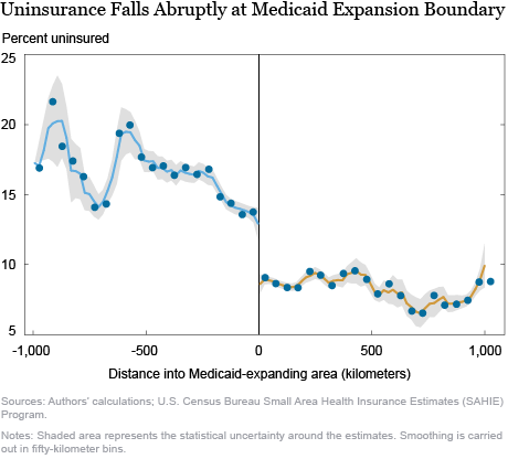
The chart below shows the fundamental reason for using our empirical strategy, by plotting county uninsurance rates against distance from the Medicaid expansion border. The gray region around the dots represents the statistical uncertainty around the estimates. We see that the fraction of uninsured in counties that have not expanded Medicaid is between 13 and 15 percent close to the border, at which point it drops precipitously to about 10 percent and remains there for most counties in states that have expanded Medicaid. Therefore, which side of the Medicaid expansion border someone lives on materially affects their chances of being insured. While counties far away from the Medicaid expansion border in the nonexpanding region are very different from counties far away from the border in the expanding region, counties very close to the border are likely similar (as evidenced above in the continuity of observable characteristics at the border). Therefore, we can compare outcomes between nearby counties on different sides of the border as though they have been randomly assigned. It is important to note, though, that all of our comparisons are representative of the areas around the Medicaid expansion border and effects in other parts of the country may be different.

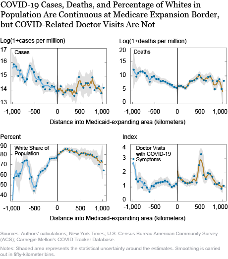
If health insurance improves health, and in particular, weakens the COVID-19 pandemic, we should expect that COVID-19 cases and deaths per person would show the same pattern: continuous evolution with distance to the border and a precipitous drop as one goes from the Medicaid-nonexpanding to the Medicaid-expanding region. The first two panels of the chart below show that this is not the case. Instead, both cases and deaths per person evolve continuously through the Medicaid expansion border, with no jumps at all. The statistical uncertainty around the estimates is modest, suggesting little potential for Medicaid expansion—and therefore, uninsurance rates—to affect reported COVID-19 intensity. The third panel of the chart shows the plot for the fraction of the county’s residents who are white, which is an important correlate of COVID-19 intensity given that minorities have been hit harder by the pandemic than whites. We see that it is also continuous through the COVID-19 border. More generally, all the potential confounders that we have considered—population density, use of public transit, pollution, the number of people per room, comorbidities such as hypertension and obesity, ICU bed availability, as well as many others—have not exhibited any jumps at the Medicaid expansion border.

Based on this evidence, we would be tempted to conclude that the availability of health insurance, most specifically Medicaid, does not affect the intensity of COVID-19. This result would be consistent with the Oregon Health Insurance Experiment described above, which shows no short-term effects of Medicaid on physical health. However, we are not completely convinced. The problem is that reported COVID-19 case and death counts suffer from considerable underreporting—studies of excess deaths suggest that as many as half of the deaths attributable to COVID-19 may be classified as coming from another disease, while cases may be underreported by as much as ten times, and this underreporting may be differential across states and counties. It is likely that with such staggering rates of underreporting, some of this underreporting may be correlated with the availability of Medicaid.
The last panel of the chart above presents a plot of the number of doctor visits for COVID-19 symptoms against distance to the Medicaid expansion border. This data is obtained from Carnegie Mellon’s COVID Tracker database and is available for a smaller set of counties, which includes most areas east of the Mississippi. We find that there is a small upward jump in doctor visits for COVID-19 symptoms as one goes from the Medicaid-nonexpanding to the Medicaid-expanding states. Does Medicaid then cause coronavirus? The answer is more prosaic: people with health insurance are much more likely to avail themselves of the medical system than people without insurance (a robust finding of the Oregon Health Insurance Experiment). Individuals in the Medicaid-expanding region were more likely to have Medicaid and to use it to have their symptoms checked out. However, this behavior would also make them more likely to be diagnosed as a coronavirus case (and, potentially, as a coronavirus death) than people just on the other side of the border who did not have Medicaid. Therefore, it is possible that 1) Medicaid reduced true COVID-19 cases and deaths but 2) increased the reporting rate of COVID-19 for individuals who were infected, 3) making the overall effect appear to be zero.
We are currently exploring this hypothesis by applying for access to data on digital thermometers distributed across the United States by Kinsa Inc. This data has been used in various papers to document the influence of public health measures such as lockdowns on COVID-19. Finding no discontinuity in Kinsa thermometer temperatures across the Medicaid expansion boundary would be convincing evidence that Medicaid really does not do anything to reduce true COVID-19 prevalence, while finding a discontinuity could help us disentangle the medical and utilization effects of Medicaid on reported COVID-19 rates.
We look forward to updating readers on what we find as our research progresses.

Rajashri Chakrabarti is a senior economist in the Federal Reserve Bank of New York’s Research and Statistics Group.

Maxim Pinkovskiy is a senior economist in the Research and Statistics Group.
Will Nober was a senior research analyst in the Research and Statistics Group.
Lindsay Meyerson was an economics student at Columbia University.
How to cite this post:
Rajashri Chakrabarti, Maxim Pinkovskiy, Will Nober, and Lindsay Meyerson, “Investigating the Effect of Health Insurance in the COVID-19 Pandemic,” Federal Reserve Bank of New York Liberty Street Economics, September 25, 2020, https://libertystreeteconomics.newyorkfed.org/2020/09/investigating-the-effect-of-health-insurance-in-the-covid-19-pandemic.html.
Disclaimer
The views expressed in this post are those of the authors and do not necessarily reflect the position of the Federal Reserve Bank of New York or the Federal Reserve System. Any errors or omissions are the responsibility of the authors.


 RSS Feed
 Follow Liberty Street Economics