Adam Copeland, Todd Keister, and Parinitha Sastry*
Federal Reserve Statistical Release H.8 provides aggregate data on the assets and liabilities of commercial banks in the United States. Two types of data are provided: one in which each series is adjusted to offset regular, seasonal movements, and another in which no adjustment is made. Recently, a striking pattern has emerged in one particular data series: the cash assets of foreign-related banking institutions.[1] In the seasonally adjusted data, this value has fallen 36 percent since its peak in June 2011—a sharp movement that has generated concern among market observers. The nonseasonally adjusted data present a different picture, however, with a decline of only 16 percent over this period. Which of these numbers more accurately represents recent events? In this post, we argue that the seasonally adjusted data are misleading in this case and should not be used. More generally, we use this episode to highlight the need for caution when using and interpreting seasonally adjusted data.
Why Use Seasonally Adjusted Data?
Some economic data series display recurring patterns over the course of the year, and researchers often want to “smooth out” these variations to focus more clearly on longer-term trends. Seasonally adjusted data are created by using statistical methods to identify and remove the typical seasonal pattern in the underlying data.
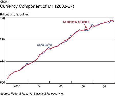
Chart 1, which shows the amount of currency held by the public from mid-2003 through mid-2007, illustrates the usefulness of seasonal adjustment. The blue line depicts the underlying data, which spike up during the winter holiday shopping season each year. These spikes can make it difficult to identify changes in the underlying trend. An observer in January 2007, for example, might wonder if the sharp decrease that month indicated a new, downward trend in currency holdings. A look at the pattern from previous years suggests that such an outcome is unlikely, since the series always resumed growing again in February. Seasonal adjustment is a way of formalizing this idea and assigning a value to each month that aims to capture the underlying trend. The red line in the chart shows the seasonally adjusted data, which are calculated using an X12 ARIMA algorithm. Notice how these data smooth out the spikes and make it easier to identify longer-term trends.
What Can Go Wrong with Seasonal Adjustment?
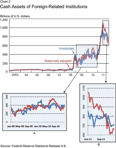
While seasonally adjusted data can be extremely helpful, they should be used with care. In particular, the statistical methods used for seasonal adjustment may generate misleading results when applied to data with structural breaks, where the underlying properties of the data change significantly during the period studied. Chart 2 depicts the cash assets of foreign-related banking institutions in the United States from January 1, 2003, to December 21, 2011. The blue line again represents the underlying data, while the red line is the seasonally adjusted data (see the bottom of this description for information on how this series is adjusted). Notice the two clear structural breaks in the underlying data: one in the autumn of 2008 and the other in early 2011. In both cases, the cash assets held by these institutions increased dramatically and remained significantly above the previous level. The series is also more variable in the post-2008 period.
The first of these structural breaks occurs in the weeks following the collapse of Lehman Brothers, while the second coincides with the Federal Reserve’s most recent round of large-scale asset purchases. The large increases in cash assets during these periods are not surprising: In both episodes, the Federal Reserve’s actions substantially increased the quantity of reserve balances that are held within the banking system (see Keister and McAndrews [2009] for more information). These reserve balances represent the bulk of the cash assets depicted in the chart.
Structural breaks create serious difficulties for the seasonal adjustment process for two reasons. First, the seasonal patterns in the data may be different before and after each break. The statistical methods used to make seasonal adjustments rely on long time series to identify patterns in the data across years, such as the December spike in currency illustrated in Chart 1. If the seasonal patterns change, it takes time to accumulate enough data to accurately identify the appropriate adjustments under the new regime. Second, these methods may incorrectly attribute to seasonal effects some of the sharp changes associated with the structural breaks. If the seasonal factors identified by these methods are inaccurate for either reason, applying them may generate a distorted view of the underlying trends in the data.
Which Data Series Should Be Used?
The differences between the two series in Chart 2 are striking, particularly in recent months. As highlighted in panel B, the seasonally adjusted value has fallen 36 percent since peaking at over $1.1 trillion on June 22. The nonadjusted value, in contrast, remained below $1 trillion at all times and has fallen only 16 percent over this period. Which of these series more accurately represents the recent trend?
To answer this question, it’s helpful to look at panel A, which details the period between the two structural breaks. Notice that the seasonally adjusted series is as volatile as the underlying data—the process is not “smoothing out” the data, as it did in Chart 1. In addition, the seasonally adjusted series rose well above the underlying data in the summer of 2010 and then declined rapidly through the autumn months. This same pattern was repeated in 2011. In fact, the seasonally adjusted series appears to exhibit stronger seasonal variation than the underlying data throughout the entire period in Chart 2, a perverse outcome indicating that the adjustment process is not having the desired effects in this case.
For these reasons, we believe the seasonally adjusted numbers are not a reliable measure of the underlying trends in this data series. In other words, the sharp decline in the cash assets of foreign-related banking institutions depicted in panel B appears to be partly an artifact of a seasonal adjustment process that is misrepresenting these trends. The more modest decline in the nonseasonally adjusted data provides a better view of recent events. More generally, this example serves as a reminder that using nonseasonally adjusted data may be more appropriate in some situations. While there is no set formula for determining when seasonally adjusted data should be used, sometimes a simple comparison of the series like the one presented in Chart 2 can be informative.
*Parinitha Sastry is a research associate at the Federal Reserve Bank of New York.
Disclaimer
The views expressed in this blog are those of the authors and do not necessarily reflect the position of the Federal Reserve Bank of New York, or the Federal Reserve System. Any errors or omissions are the responsibility of the authors.


 RSS Feed
 Follow Liberty Street Economics
Hi, X12-Arima do have tools (e.g. level shift adjustment) to adjust for simple breaks. If you need to adjust for more complex breaks e.g. Dec peak becomes Jun peak, X12-Arima allows the insertion of regime change regressors. Maybe, if the series is adjusted with some adjustment for structural breaks, the seasoanlly adjusted series will turn out better.