Kathleen McKiernan
The visual representation of information, knowledge, or data has been around since the time of the caveman. But it wasn’t until 1786,
when William
Playfair, a Scottish engineer, published The Commercial and Political
Atlas, illustrating for the first time how economic data could be represented by charts. Playfair’s work preceded
that of Florence
Nightingale—broadly
acknowledged as the founder of modern nursing—who used information graphics
in the 1850s to convince Queen Victoria that reform was needed in the British
military health service. Nightingale developed the Coxcomb chart—a combination of stacked pie and bar charts—to assess
mortality among soldiers during the Crimean War.
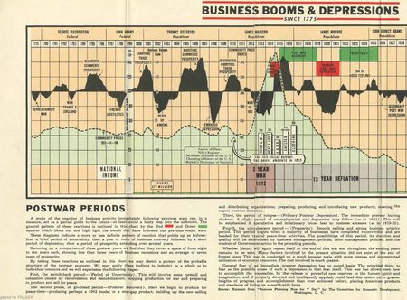
Excerpted below from a report by the Committee
for Economic Development, a Washington, D.C., nonprofit think-tank, this 1943 chart presents a long-range record of booms and depressions (the chart is available through the
Federal Reserve Archival System for Economic Research, or FRASER). It offers a picture of the
more important events that have tended to shape our economic and fiscal curves
since 1775. Business activity, price inflation, federal debt, national income, and
stock and bond yields are traced in a single spread. The study of “postwar
periods” is spotlighted in this edition. (A 1947 release features a special
section, “How Much Is One Billion Dollars?”)
Evidently, the charts weren’t
marketed directly to the consumer; rather, they were sold to banks,
manufacturers, and companies like Tension Envelope Corp. to promote goodwill
among customers. The ad below, from the January 1944 issue of Industrial Marketing (p. 156), illustrates
the publisher’s outreach efforts.
Plan your UPSWING IN
GOODWILL with this Long Range Business Chart“Get the new 1944 edition of
“Business Booms & Depressions .. since 1775”—a timely long range Business Chart
that ties in with your customers’ thinking today about post war tomorrow! This
goodwill builder won’t find its way into waste baskets—instead
it will be kept, preserved and referred to for the next year and beyond!
Especially now—with the European War in its final stage—this Chart’s value
will be appreciated by all who receive it. It is used exclusively as a high-class dignified medium of goodwill
advertising. It has never been offered for sale through any retail channel. Ideal
for manufacturers, banks, investment houses, publishers, other businesses. Write
or wire for sample and prices.”The Century Press
West Toledo Station 61
Toledo 12, Ohio
Modern technology allows for very
complex data to be represented quite compactly. For examples, view the interactive
charts that accompany the Liberty
Street Economics post Is
Job Polarization Holding Back the Labor Market?
Disclaimer
The views expressed in this post are those of the author and do not necessarily
reflect the position of the Federal Reserve Bank of New York or the Federal
Reserve System. Any errors or omissions are the responsibility of the author.

Kathleen
McKiernan is research library director in the Federal Reserve Bank of New
York’s Research and Statistics Group.


 RSS Feed
 Follow Liberty Street Economics