At the New York Fed, we follow the repo market closely and, with some of my colleagues, I’ve tried to keep readers of this blog informed about how the market works, how it’s being reformed, and what risks remain. We’re always encouraged when others share our interest in this market, so we read a recent Fitch report—“Repo Emerges from the ‘Shadow’”—closely (the report is available at www.fitchratings.com). At first glance, the report is a bit worrisome, as it argues that the repo market has recently seen a large increase in riskier types of collateral. So we decided to take a close look at some data to see if we could validate this finding. In this post, I use data made publicly available by the Tri-Party Repo Infrastructure Reform Task Force (the Task Force) to show that there is in fact no evidence of a broad-based increase in riskier types of collateral. The Task Force’s objective in publishing the data was to give a comprehensive view of the market, so the data represent 100 percent of the market’s volume. In contrast, the Fitch study is based on data from a sample of prime funds, representing only 5 percent of the market’s size.
Let me first provide a short overview of the Fitch report. It collects data from a sample of financial transactions of the ten largest U.S. prime money market mutual funds. Based on these data, Fitch makes several observations about haircuts and the type of collateral financed in the market. I want to focus on the observation that there’s recently been a gradual recovery in the share of riskier collateral financed through repos and, in particular, a large increase in the share of “structured finance” collateral—a type of collateral that had almost completely disappeared from the market during the financial crisis. This is a key finding of the report, which was published in a recent Financial Times article.
To determine whether there’s been a broad-based increase in riskier types of collateral, I look at monthly data provided by the Task Force. The data provide information about the amount of different types of collateral financed in the tri-party repo market as well as the 10th, median, and 90th percentiles of haircuts applied to that collateral. The data have been published monthly since May 2010. This relatively short horizon does not allow for comparisons with the state of the market during or before the financial crisis, but it does make it possible to look at recent trends.
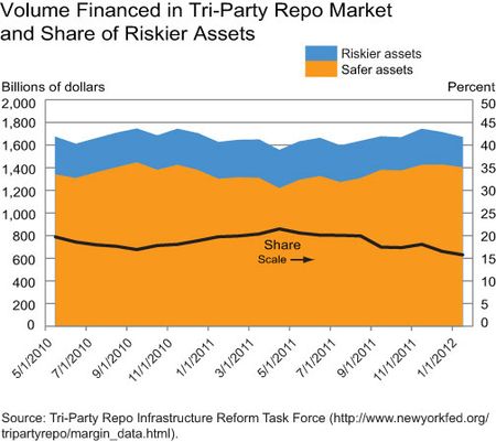
One way to look at collateral trends in the market is to separate the safer collateral (securities issued by the U.S. government or by government-sponsored enterprises) from riskier collateral (securities not issued by these institutions). Based on the asset classes for which data are available on the Task Force’s website, securities issued by the U.S. government or by government-sponsored enterprises include U.S. Treasuries and STRIPS, agency debentures and STRIPS, agency mortgage-backed securities, and agency collateralized mortgage obligations (CMOs).
The chart below displays the quantity of safer and riskier assets serving as collateral in the tri-party repo market (left axis) and the share of riskier assets (right axis). It shows that the share of riskier assets has been on a downward trend since mid-2011.
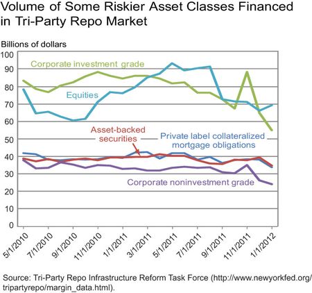
It’s also possible to look at specific categories of riskier assets. The Fitch report looks at corporate bonds, equities, and structured finance. The next chart displays the volume of collateral financed in the tri-party repo market for the corresponding asset classes available on the Task Force’s website. The corporate bond category is split between investment grade and noninvestment grade. Private label CMOs and asset-backed securities are considered “structured finance.” Again, the chart shows that the overall amount of these riskier assets being financed in the tri-party repo market has generally been decreasing slightly.
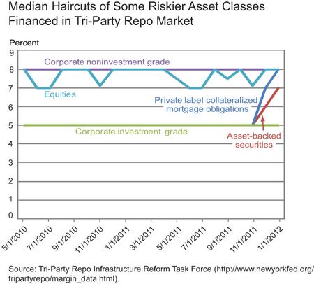
I can also look at haircuts applied to these riskier assets. A haircut is the difference between the value of the collateral and the amount of cash received against it in a repo transaction. It’s meant to protect investors from the possible loss of a security’s value if the counterparty defaults and the investors claim the collateral. A decrease in haircuts for riskier assets would be of concern, as it may indicate a loosening of risk management standards by investors. The next chart shows the median haircut for different categories of risky assets. Median haircuts have been roughly flat, with the exception of haircuts for structured products, which have recently increased sharply.
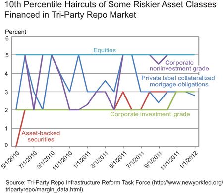
The large prime funds considered in the Fitch study are likely to lend disproportionately to large, high-quality dealers. So it’s possible that the median haircut shown in the Task Force data is not representative of the haircut these large funds typically ask for, as high-quality dealers may be able to provide a smaller haircut than other dealers can. The Task Force data also provide information on the 10th percentile haircuts, and these may be more representative of the haircut posted by the prime fund counterparties. These haircuts are displayed in the chart below for the riskier assets of interest. The chart shows no discernible pattern for the 10th percentile haircuts.
In conclusion, I don’t want to overstate the safety of the tri-party repo market or understate the usefulness of the Fitch study. The recent release of the final report of the Task Force shows that much work remains to be done to reduce systemic risk in this market. Nevertheless, available evidence indicates that, in aggregate, the composition of collateral being financed in the tri-party repo market is not decreasing in quality. This suggests that the real news from the Fitch report is not about the tri-party repo market, but may be more about how prime funds are reacting to a low-yield environment by reaching for yield and taking on riskier collateral. Given that these funds have little capacity to hold on to these assets in a stress event—and may therefore have strong incentives to run from these trades at the first sign of dealer stress—this practice is problematic from a systemic risk perspective, and deserves greater scrutiny by policymakers.
Disclaimer
The views expressed i
n this post are those of the author and do not necessarily reflect the position of the Federal Reserve Bank of New York or the Federal Reserve System. Any errors or omissions are the responsibility of the author.


 RSS Feed
 Follow Liberty Street Economics