Tobias Adrian and Michael J. Fleming
Long-term Treasury yields have risen sharply in recent months. The yield on the most recently issued ten-year note, for example, rose from 1.63 percent on May 2 to 2.74 percent on July 5, reaching its highest level since July 2011. Increasing yields result in realized or mark-to-market losses for fixed-income investors. In this post, we put these losses in historical perspective and investigate whether the yield changes are better explained by expectations of higher short-term rates in the future or by investors demanding greater compensation for holding long-term Treasuries.
Increase in Yields = Decrease in Returns
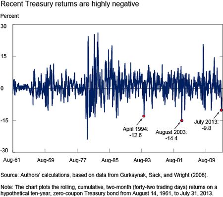
As yields and prices move inversely, the recent sharp rise in yields has resulted in losses to the owners of Treasury securities. The chart below shows that returns based on the ten-year, zero-coupon yield were -9.8 percent for the two-month (forty-two-day) period ending July 5 (zero-coupon yields are from Gurkaynak, Sack, and Wright [2006]). The decline is large by historical standards, but somewhat smaller than that observed in two-month windows in 1994 (‑12.6 percent), 2003 (-14.4 percent), and other recent periods (for example, -10.3 percent in late 2010).
Selloffs Defined
Because the length of a bond market selloff may be shorter or longer than two months, we adopt a flexible approach to defining selloffs. Our procedure is to first cumulate returns for a hypothetical ten-year, zero-coupon Treasury security from June 1961, identifying each time cumulative returns reach a maximum for the period-to-date. We then go through the data a second time, cumulating returns from the maximum-to-date. Whenever a cumulative return drops 1.2 percent below the maximum (corresponding to a loss of two standard deviations of daily returns), we say that a selloff has started. When the cumulative return later passes the two-standard-deviation threshold on the way up, we say the selloff has ended.
Our algorithm identifies thirty-one selloffs in which the cumulative return for the ten-year, zero-coupon bond drops below -5 percent. The average cumulative loss for such selloffs is 11.9 percent, and the worst selloff resulted in a 38.0 percent loss (for an episode between June 1980 and August 1982). The average length of a 5 percent or larger selloff is 303 calendar days (excluding the recent selloff for which the end date isn’t yet known), the minimum is 16 days (for an episode between June and July 1985), and the maximum is 1,309 days (for an episode between April 1967 and November 1970).
Recent Selloff Comparable to 1994 and 2003 Episodes
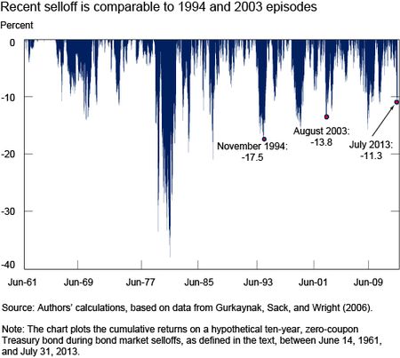
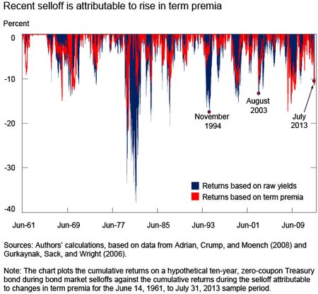
The chart below plots the selloffs, showing that the recent one is comparable in magnitude, albeit somewhat smaller, to those seen in 1994 and 2003. In particular, the recent selloff reached a trough on July 5 with a cumulative return of -11.3 percent, versus -13.8 percent in August 2003 and -17.5 percent in November 1994. None of these episodes compares with the steep losses seen in the two Volcker era selloffs of 1979-80 and 1980-82.
Pace of Selloff Comparable to 1994 and 2003 . . .
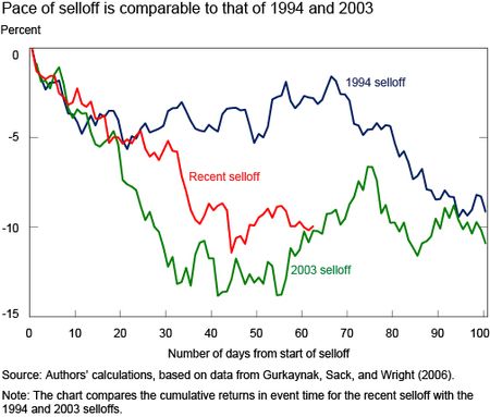
The chart below plots the cumulative returns of three selloffs over time, relative to the start of each selloff, showing that the pace of the recent selloff is comparable to that observed in 1994 and 2003. Returns are quite similar over most of the first month in all three episodes. At the end of the first month through the second month, negative returns continue in the recent selloff and in 2003, but remain flat for some time in 1994. Returns in 1994 continue their downward trend after that, and bottom out about a year after the selloff starts, well after the end of the plotted event interval.
. . . And Steeper than Most Historical Episodes
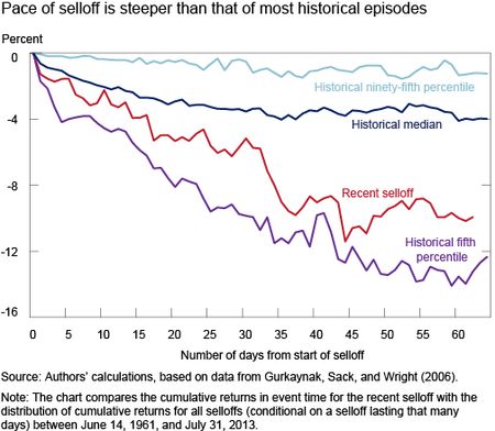
The next chart plots the cumulative returns of the recent selloff over time, relative to the distribution of returns for all selloffs over time, showing that the recent selloff is fairly steep by historical standards. That is, since the recent selloff started, cumulative returns are between the median and fifth percentile of returns for all selloffs at a comparable stage. As of July 5, the returns for the recent selloff were just above the fifth percentile of returns compared with all selloffs at a similar stage. Over the rest of July, yields decreased modestly and cumulative returns increased somewhat as a result.
What Explains the Selloff?
What explains the recent selloff? Are investors expecting higher short-term rates in the future than just a short time ago? Or can some, or all, of the rise in yields be explained by an increase in the term premium, so that investors are demanding greater compensation for the risk of holding longer-term Treasuries? To answer these questions, we use the ten-year, zero-coupon term premium estimates from Adrian, Crump, and Moench (2008) and—for each selloff—cumulate the returns that can be explained by changes in the term premium alone.
Our findings, reported in the chart below, suggest that nearly all of the recent increase in yields can be explained by a rising term premium. That is, the cumulative returns based on the term premium alone (the red line) are almost as large as the cumulative returns based on the raw yields (the blue area). The finding that the selloff can be attributed nearly entirely to movements in the term premium is in stark contrast to decompositions of yield movements in the tightening cycles of 1994 and 2004, when yield movements were nearly entirely due to changes in the future path of policy, as explained in a recent blog post by Adrian, Crump, and Moench.
Selloffs Compared
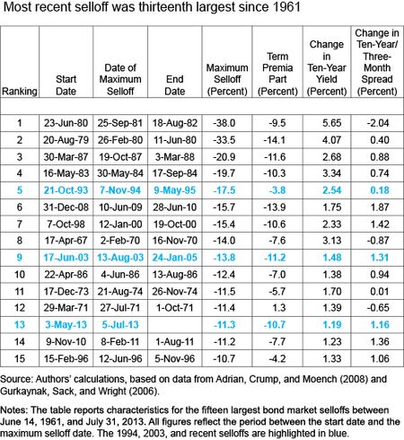
Lastly, we present a table listing attributes of the fifteen largest bond market selloffs since 1961. The three selloffs highlighted in this post—1994, 2003, and 2013—are ranked fifth, ninth, and thirteenth, respectively, and are highlighted in blue. Beyond reporting figures behind the earlier discussion, the table shows the change in the ten-year, zero-coupon yield and in the spread between the ten-year and three-month yields between the start of each selloff and the maximum selloff date. Of note, the recent episode and 2003 are instances in which the yield spread moved almost as much as the ten-year yield itself (that is, the three-month yield rose little), explaining the importance of the term premium in those cases. In contrast, the 1994 episode is one in which the yield spread rose little (that is, the three-month yield increased almost as much as the ten-year yield), explaining the importance of short-term rate expectations in that case.
Disclaimer
The views expressed in this post are those of the authors and do not necessarily reflect the position of the Federal Reserve Bank of New York or the Federal Reserve System. Any errors or omissions are the responsibility of the authors.
 Tobias Adrian is a vice president in the Federal Reserve Bank of New York’s Research and Statistics Group.
 Michael J. Fleming is a vice president in the Group.


 RSS Feed
 Follow Liberty Street Economics
Dear A & F, Tx for an excellent analysis! Do you agree with Cohen & Steers (2012) that Global REITs do not necessarily perform poorly when US Treasury yields rise? They ascribe this to capitalization rates being closer tied to economic growth expectations and US corporate bond / credit spreads. Or do you think Global REITs will suffer as US Treasury yields normalize over the next few years? Hendrie Scheun Namibia
The sell off is more acute if viewed in context of rate of change in gamma. The context for this is more important though. Assuming economy is a super tanker which does not change course in 4-5 months, It is simplistic to fit quantitative reasons when (1) feds did INFINITE QE a few months back (2) after agonizing over wide mortgage spreads, did mortgage QE and then expressed fear of tighter spreads in various markets like junk bonds (3) chose a question in a testimony instead of the meeting 2 weeks earlier to express withdrawal in QE (4) expressed misleading dovishness in the written testimony and changing the statement to say QE can be increased and (5) compounded problems in name of transparency by allowing every fed member to express every transient thought crossing their mind. All that has been achieved is selloff and tremendous reduction in treasury liquidity without any consequence for risk asset and undermining any use of QE in the future, if required.
To Vincent de Martel: We agree that there was also a selloff in TIPS in 2013. Models such as Abrahams, Adrian, Crump, Moench (2012) (http://www.newyorkfed.org/research/staff_reports/sr570.pdf) show that the selloff in TIPS was primarily attributable to an increase in the real term premium. TIPS are usually less liquid than Treasuries (see Fleming and Krishnan (2012, http://www.newyorkfed.org/research/epr/12v18n1/1203flem.pdf), and the relative illiquidity of TIPS might well have contributed to the relatively sharper price reaction of TIPS relative to Treasuries. Previous analysis by Federal Reserve economists has indeed shown a link between term premia and Large-Scale Asset Purchases (see http://www.newyorkfed.org/research/staff_reports/sr441.pdf), but our blog post does not directly speak to that linkage. To G. Pribyl: Increasing yields in previous tightening periods, such as the tightening cycles of 1994 and 2004, primarily reflected increases in the expected path of future short rates, and not the term premium, as explained in the recent blog post by Adrian, Crump, and Moench (http://libertystreeteconomics.newyorkfed.org/2013/04/do-treasury-term-premia-rise-around-monetary-tightenings-.html). In contrast, the bond market selloffs of 2003 and 2013 are primarily due to increases in term premia, not the expectations component of longer term yields.
If you compared the fall in bond prices in 1994 with the fall in prices of inflation-linked government bonds, you would actually find an even greater similarity between the two episodes. In 2013, losses have been much larger in TIPS than in nominal bonds. Despite the lack of TIPS at the time, the comparison is relevant. In your article, you seem to imply that the increase in rates was driven at the time by Fed activity. This time it is the same except that the central bank is now active across the entire yield curve through the asset purchase program. Clearly the reason for hiking was different at the time, but in both cases, we’re seeing a change in policy that was not anticipated by the market, leading to a sharp sell-off in bonds.
Your April 2013 article stated: “Judging by the last three tightening episodes, there’s no evidence that term premia rise sharply when the stance of monetary policy is shifted toward raising short-term interest rates. This is true even for the 1994 tightening cycle, when interest rates and interest rate volatility rose appreciably during the first half of that year. The bulk of the rise in longer-term interest rates in 1994 is attributable to changes in expectations about future short-term interest rates.” Today’s article disagrees with this prior research. Do you have an explanation? G. Pribyl