J. Benson Durham
Most gauges of “the” equity risk premium have declined since the financial crisis but remain elevated, even as broad market indexes near record highs. The implication for investors seems simple; they can expect to be rewarded handsomely for bearing equity risk, relative to holding Treasuries. Lessons for central bankers may also appear straightforward. Sizable premiums could imply that aggressive unconventional monetary policy hasn’t necessarily eased financial market conditions satisfactorily. However, my recent New York Fed staff report suggests that such a cursory reading ignores the term structure of equity premiums, which conveys a subtler story about more precisely when over the investment horizon investors get paid to take risk and how monetary policy accommodation may have affected stock prices.
Why Do Equity Premium Term Structures Matter?
For starters, to speak of “the” equity risk premium may be as egregious a grammatical error as “the” interest rate. Just as the yield curve contains a wealth of information beyond any single point, market participants’ required compensation for equity risk might vary with investment horizons. The key is that investors make decisions over multiple rather than single periods or, in technical terms, they must solve a dynamic as opposed to a static asset allocation problem.
To illustrate, let’s consider investing in the stock market from September 29, 2008—the day the Emergency Economic Stabilization Act (EESA) failed to pass the U.S. House of Representatives—through the next day. Intuitively, investors demanded handsome compensation for owning shares relative to risk-free Treasuries over that short, harrowing interval. Now consider a much longer horizon beginning on the same day, September 29, 2008, but ending, say, in 2108. The amount and price of the risk stemming from the uncertain fate of the EESA figures no less profoundly, but for the bulk of the remaining 100 years market participants conceivably penciled in lower demanded “forward” compensation for buying stocks. So, the required rewards to owning shares over the century beginning on September 29, 2008, may well have been substantially front-loaded. This doesn’t imply any irrationality among investors, but simply that risk perceptions and/or preferences were distributed differently at various points in the future. Furthermore, nearer-term cyclical considerations aren’t the only motivation for specifying the full horizon of equity premiums, as some factors might affect the back end more than the front section of the term structure, such as comparatively glacial demographic trends in retirement savings.
Estimates of the premium at a single horizon, even if time-varying and forward-looking, cannot capture the subtleties embedded in the term structure. Besides pinning down more precisely when investors get paid the most to take risk, the term structure of equity premiums also seems relevant for central bankers, who routinely deconstruct the yield curve—rather than “the” interest rate—for clues about expectations for real variables and inflation at different points in the future.
So, What Do Models of the Full Equity Term Structure Say?
Unlike readings that require causation to run exclusively from bonds to shares, such as standard dividend discount models or other valuation metrics, a small but ambitious set of models is flexible enough to estimate not only an equity risk term structure but also Treasury term premiums simultaneously (for example, see Lemke and Werner [2009] in addition to my staff report). Joint estimation, notably in an intuitive framework that precludes arbitrage, seems particularly advantageous for evaluating the crisis period, when investors apparently sold shares to buy Treasuries in a flight-to-quality bid. But even for more normal periods, a comprehensive valuation framework that incorporates correlations across broad asset classes seems advantageous for both portfolio formation and policy analysis of market developments.
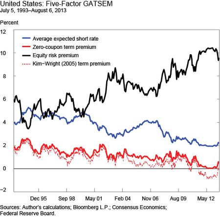
As a caution, the sweeping scope of these models comes at the cost of estimation challenges, and a fair question is whether they produce intuitive results. Fortunately, the initial answer seems to be yes. Focusing solely on a single point along the equity risk premium term structure for now, the chart below shows the ten-year average expected short rate path, the ten-year zero-coupon term premium, and the ten-year equity risk premium for the United States, derived from my model that estimates these quantities simultaneously for the full term structure of bonds and equities. Consistent with several term structure models, term premiums—the solid red line—steadily decline through the sample, and the equity risk premium—the solid black line—at this horizon ranges from less than 4 percent to around 10 percent. The estimate was low in the mid-1990s amid the Internet stock bubble, edged higher around the fall of 1998, increased as share prices fell when the “tech bubble” burst and through the aftermath of September 11, 2001, nudged lower during the “considerable period” and “measured pace” phase of Federal Reserve policy during the mid-2000s, and increased to sample highs through the global financial crisis.
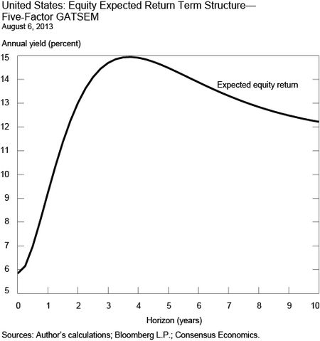
These results are consistent with standard estimates and, at first blush, also produce elevated equity risk premiums, again at least for the ten-year horizon, amid low nominal Treasury yields coincident with unconventional Federal Reserve policy. However, consider the full schedule of recent equity premiums as of August 6, 2013, in the next chart. The term structure from overnight through ten years, expressed not as a premium but in required equity returns (to transcend the observation that the equity premium is high, simply because Treasury yields are so low), is neither flat nor linear. The nearest-horizon estimate is about 6 percent, well within historical averages and therefore perhaps contrary to the perception that “the” equity risk premium is elevated, and it increases to a peak of about 15 percent around the four-year horizon before reaching an asymptote a couple of percentage points lower.
Why might the curve take this shape? Any answer has to reflect investors’ varying perceptions of risk over the horizon, and one story relates to unconventional monetary policy. Equity investors might have expected the Fed’s large-scale asset purchases and other policies to support risky asset prices in the very near term, presumably before required risk compensation increased amid the anticipated unwinding of such measures. So, even though long-run equity premiums remain elevated, shorter-run measures are notably lower, which perhaps isn’t wholly inconsistent with some portfolio rebalancing in response to the large-scale asset purchases. Nonetheless, today’s hump shape conveys persistent headwinds for policy, given heightened aversion to equity risk in the medium run, perhaps around investors’ presumed exit timing.
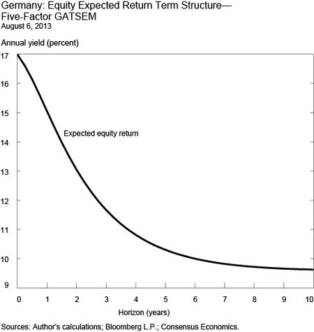
Comparisons across major equity markets may be noteworthy on this score. As the next chart indicates, long-run required equity returns for Germany are similarly elevated, but the shape of the term structure is very different indeed. What explains the inversion, which we don’t see for the United States? Besides possible speculation about the relative transmission mechanisms of contemporary Federal Reserve and European Central Bank policies, this shape perhaps reflects particularly acute near-term risks stemming from concerns regarding EMU. Consistent with that story, the shape of the term structure for France (not shown) is quite similar.
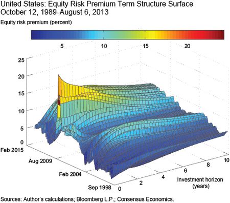
To consider more than a single day of trading and make broader inferences, the exhibit below shows the complete surface in three dimensions—the time series of the cross-section shown in the second chart—for the last fifteen years or so in the United States. Note that the term structure is sharply downward-sloping around the height of the global financial crisis, consistent with the previous stylized illustration around September 29, 2008. What does this have to do with subsequent Federal Reserve policy? The surface thereafter sharply rotates from steep inversion to a positive slope, a development not inconsistent with a notable ease in the nearer-term quantity or price of equity risk.
Conclusion
None of these inferences should be oversold, again because calibrating equity and term premiums simultaneously is very challenging. However, the term structure of equity risk should be taken seriously, particularly given the limits of fixed-horizon dividend discount models or popular valuation rules-of-thumb that by construction are silent on the full trajectory of investors’ required returns, even including the useful Shiller P/E. Indeed, these results suggest a more nuanced story about premiums germane to market participants, who want to know when they’re paid the most to take risk, and to central bankers, who routinely tease investors’ expectations from asset prices.
Disclaimer
The views expressed in this post are those of the author and do not necessarily reflect the position of the Federal Reserve Bank of New York or the Federal Reserve System. Any errors or omissions are the responsibility of the author.

J. Benson Durham is an assistant vice president in the Federal Reserve Bank of New York’s Markets Group.


 RSS Feed
 Follow Liberty Street Economics
The numbers for the US (I can’t see the other graphs) seem extraordinarily high, and so far above GDP growth that there is no way in which dividends can make up the gap. There’s something clearly amiss with the estimator. While it makes perfect sense to think about a term structure of equity returns, the fact that most of the inputs to an estimator of equity returns are not directly observable makes this a tricky problem. It doesn’t help that most analysts estimates of earnings are biased upward. Think about this in a different way: in effect, it is being argued that the cost of equity capital is about 15% higher than than of riskless debt over the next 3 years and about 12% higher over the next decade (let’s say 13% and 10% over the cost of corporate debt). If this were true, equity issuance would be close to 0, and every corporation would be issuing debt to buy back shares. But that isn’t happening, which suggests that the model has a flaw that needs fixing.
An interesting post. I wonder if you have any comments about those we view the current equity risk premium as negative (e.g., see many commentaries by John Hussman or a few by GMO). The basic argument from the bears is that prices are very high compared to long term average earnings (e.g., as measured by the Shiller P/E) and margins are also high. As both of these come down, equity prices will fall. I’m guessing you are using trailing P/E in your model which looks less overpriced. Any thoughts on the wide divergence in equity premium from these different methods? Thanks, Enonymous
Can you perhaps provide more detailed explanations of how an equity term structure is calculated? With no specific maturities, I’m in the dark as to how you would estimate it.