This morning, the Federal Reserve Bank of New York released a set of interactive visuals that present school spending and its various components—such as instructional spending, instructional support, leadership support, and building services spending—across all thirty-two Community School Districts (CSD) in New York City and map their progression over time. The interactive features allow the user to easily view the data and observe spending trends. Our purpose is to make data on education finance more accessible to a broader audience.
We built the dataset using data obtained from the New York City Department of Education. These numbers reflect current spending, and thus exclude capital spending (which accounts for approximately 8 percent of total spending). All spending figures are expressed in real 2012 dollars. We refer to school years by the year corresponding to the spring semester. Below, we offer a few quick insights that are revealed in the interactive graphics.
1. New York City school spending steadily increased through 2010, and then declined modestly in 2011 and 2012.
Spending per student (in real terms) rose 23 percent from 2004 to 2012. While spending increased steadily between 2004 and 2010, climbing 28 percent, it was adversely affected in the aftermath of the Great Recession. The influx of federal stimulus funds under the American Recovery and Reinvestment Act (ARRA) immediately following the recession abated a decline in spending in the initial post-recession years, but the ARRA funds dried up after 2010 and state aid also declined markedly during this period. State aid fell from $8.7 billion in 2009 to 8 billion in 2012, a fall of $700 million in three years. Federal aid fell from $3 billion in 2010 to $1.9 billion in 2012, a fall of more than $1 billion in two years. In response, New York City increased its education contribution between 2010 and 2012. Still, school spending saw a decline during this period, falling nearly 4 percent between 2010 and 2012.
For the full 2004-2012 period, while total spending rose 23 percent, instructional spending per student, the category most closely associated with student learning outcomes, increased 13 percent, which is the lowest growth rate across all spending categories. In contrast, instructional support services (counseling staff, physical, occupational and speech therapy services, paraprofessional support for special needs students, and after-school activities) increased 63 percent, the highest growth rate across all categories. This was mostly driven by a large increase in special needs services, including a recent marked increase in occupational therapy services in New York City schools. Non-instructional categories (principals, custodial services, transportation, and safety) also increased, at rates around 20 to 30 percent. Overall enrollment fell 4 percent between 2000 and 2012.
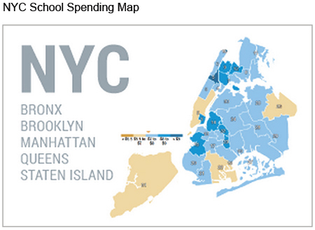
Click on the image below to view the interactive map that shows the progression of total spending (and its components) through time.
2. There are differences in school spending across boroughs.
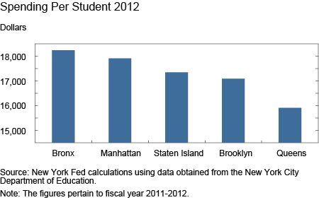
As the interactive visuals show, in the 2011-2012 school year, the Bronx had the highest spending per student at $18,239, while Queens had the lowest at $15,909, or almost 13 percent less. This pattern is not unique to 2012. In fact, across our entire panel, the Bronx always had the highest spending per student and Queens always had the lowest. The chart below shows total spending per student for the five boroughs in 2012.
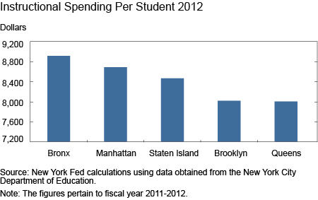
A similar pattern is seen for instructional spending per student. Across the entire panel, the Bronx had the highest instructional spending per student. From 2004 to 2008, Staten Island had the lowest spending in this category, and from 2009 to 2012, Queens occupied this spot. The chart below shows instructional spending per student for the five boroughs in 2012. These spending differences reflect many factors, so conclusions should not be drawn from the raw data. In particular, demographic and socio-economic differences impact the spending across boroughs and among the various spending categories. For example, the Bronx has the highest proportion of students in poverty and the highest proportion of students who are English Language Learners, and many funding sources reflected in our spending data are directed specifically to these student populations.
3. There are differences among CSDs, even within the same borough.
CSD 26 (in Queens) had the lowest spending per student in New York City for the entirety of our panel, while various CSDs held the top spot across time. In 2004 and from 2006 to 2008, CSD 5 (in Manhattan) had the highest spending per student in all of New York City; in 2005, it was CSD 1 (in Manhattan); from 2009 to 2010, it was CSD 7 (in the Bronx); from 2011 to 2012, it was CSD 16 (in Brooklyn). In 2012, the difference between the highest and lowest CSDs in New York City was 24 percent, a substantive difference. As before, note that demographics are an important factor in explaining variation between CSDs.
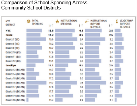
Click on the image below to view interactive charts that compare school spending (and its components) across New York City CSDs and boroughs.
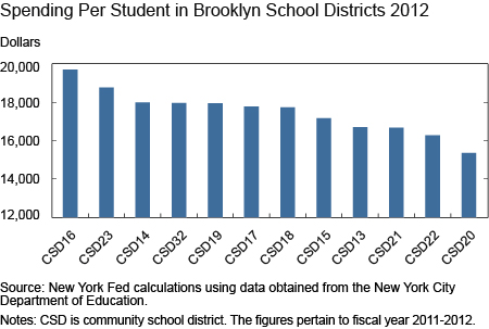
Within-borough differences tend to be highest in Brooklyn and Manhattan and lowest in the Bronx and Queens. Differences (calculated as the spread between the CSD with the highest spending per student and the CSD with the lowest spending per student) were lowest in the Bronx in 2008 and lowest in Queens for all other years. This spread was highest in Manhattan from 2007 to 2008 and in Brooklyn for all other years. The following chart shows total spending per student for all Brooklyn CSDs in 2012. The difference between the highest and lowest CSDs in Brooklyn was 22 percent.
We at the New York Fed are interested in understanding these spending differences more fully, so stay tuned for future posts exploring the importance of demographic variations in explaining these differences.
Disclaimer
The views expressed in this post are those of the authors and do not necessarily reflect the position of the Federal Reserve Bank of New York or the Federal Reserve System. Any errors or omissions are the responsibility of the authors.

Ravi Bhalla is a senior research analyst in the Federal Reserve Bank of New York’s Research and Statistics Group.

Rajashri Chakrabarti is a senior economist in the Bank’s Research and Statistics Group.


 RSS Feed
 Follow Liberty Street Economics