Household debt in the United States expanded before the Great Recession, contracted afterward, and has been recovering since 2013. But how has the distribution of debt across different income groups evolved over time? Who has been driving the recovery of household debt over the past two years? To date, there has been little work on how borrowing patterns for high- and low-income individuals have changed over time, although one notable exception is Amromin and McGranahan. Here, using the New York Fed Consumer Credit Panel (CCP), a quarterly panel data set based on Equifax credit reports, we shed further light on these questions.
Measuring Debt and Income
We use zip code-level income data from the 2012 Internal Revenue Service Statistics of Income and population information from the 2010 Census to obtain an estimate of income per adult (defined as the Census population aged eighteen and older) for each zip code. We sort zip codes by their income per adult in 2012, and then divide them into five groups (quintiles) such that each contains a roughly equal population of individuals aged eighteen and over. The lowest quintile consists of zip codes with average income per adult less than or equal to $22,000, while the highest quintile captures those with an income per adult greater than $48,000. (Our use of a single year’s income doesn’t matter much, since the ranking of zip codes tends to stay stable over time. For example, of the zip codes that were in the top income quintile in 2004, 82 percent were in the top quintile in 2012 also.)
Debt Concentration by Income
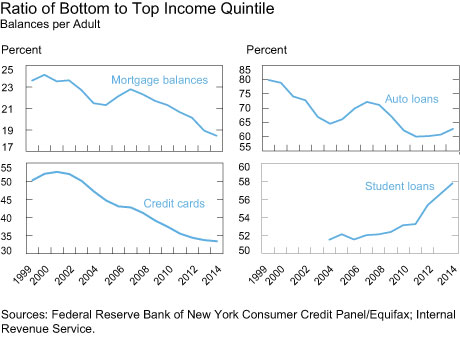
To investigate whether debt has become more or less concentrated over time in high-income areas, we first calculate balances per adult at the zip code level. We plot the ratio of balances for the lowest quintile to highest quintile for each of the household debt types, shown in the chart below. First, we see that mortgage debt and credit card debt balances are larger among the higher-income group (that is, the ratios are considerably below one). This is not surprising since home prices are generally higher in high-income areas and higher-income groups tend to spend more than the lower-income groups. Interestingly, we see modest evidence of the housing boom and subsequent bust: in 2004, mortgage balances per adult among the lowest-income group were 22 percent the size of mortgages in the highest-income group; by 2007, as mortgages were easier to obtain (as the subprime lending market peaked), we see the ratio increased to 23 percent. However, since the boom, the number has decreased steadily: now, mortgages in the lowest-income area are only 18 percent the size of those in the highest.
Credit card debt is relatively more evenly spread over these income groups. Credit card balances per adult in the lowest quintile were about 48 percent as large as those in the highest quintile in 2004, but have steadily declined since then to about 34 percent in 2014. These patterns indicate that mortgage and credit card balances per adult are not only higher in high-income areas relative to lower-income areas, but the gap has been increasing in the last ten years.
Auto loans, shown in the upper right panel of the chart below, increased in the low-income zip codes until 2008, followed by a reversal thereafter. However, the chart also reflects relative increases in auto loan balances in the lower-income groups over the last two years, arguably due to an expansion of subprime auto lending. Still, relative auto loan balances have not reattained their level of a decade ago.
This trend toward increased concentration of debt in relatively high-income localities has not applied to student loans. (Note that we report student loans starting in 2004 because of data reliability issues for prior years.) The lower right panel of the chart shows that the relative ratio of per adult student loan balances has steadily increased over the last ten years, with no interruption even during the Great Recession. Average student loan balances in the lowest quintile were 52 percent of those in the highest quintile in 2004, but rose to 59 percent in 2014.

Visualizing Credit Flows over the Income Distribution
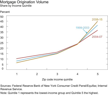
In the previous charts, we show only the relationship between the top and bottom quintiles. However, it’s important to note that the relationship is consistent among the middle quintiles as well, and to consider flows, rather than stocks, of new credit. This can be seen in the next chart, which shows the mortgage origination volume for the five quintiles, for three distinct sample periods, 1999-2003 (pre-boom), 2004-07 (boom), and 2008-15 (post-boom). The steepness of the curve indicates the extent of debt concentration in the top quintiles, with a flatter curve indicative of a relatively more equal concentration of debt. The least unequal period in terms of mortgage originations was the boom era, with the post-boom era being the most unequal. For example, the share of mortgage originations for the lowest quintile dropped from 10 percent in the boom to 6 percent in the post-boom period (and from 13 percent to 11 percent for the second lowest quintile), while that of the top quintile rose from 36 percent to 45 percent.

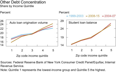
A similar picture emerges for auto loans, which have become slightly more concentrated in the higher quintiles since 1999, with a small decline in the share of the bottom quintile, from 17.5 percent in the pre-boom period to 15.7 percent in the post-boom period. Note, however, that even in the most unequal period, the share of the top quintile never rose above 25 percent. Turning to student loans, the patterns are the opposite: student loans have become relatively more equally distributed.

Discussion
Have these patterns been driven by changing relative income or demand for credit across groups, or by changes in lending standards? (In analysis not presented here, we found the changes in age composition across these income groups to be relatively stable and, thus, not a driver of these patterns.)
The income gap overall has been widening during this period, and mortgage and credit card balances tend to be positively correlated with income. Thus, we would expect mortgage and credit card debt to have become more concentrated in higher-income zip codes. So, the declining share of mortgage debt and credit card debt in the lower-income zip codes over the last decade is broadly consistent with the widening income gap over the same period.
Considering the role of lender-side factors, we first note that credit scores are positively correlated with income at the zip code level. There is a constant gap of nearly 65 points in average Equifax credit scores between the highest-income group and the lowest over this period. Loosening credit standards before the Great Recession and the subsequent tightening since then are consistent with the inverse-U shapes of low income debt shares of mortgages and auto loans. Student loans are an exception to this pattern since the vast majority of student loans are not underwritten.
To further explore the cause behind these patterns, we examine credit demand from the SCE Credit Access Survey from June 2015 which has questions on past credit experiences and can be sorted by household income (below $40,000 for the lowest-income group and above $100,000 for the highest). The lower-income borrowers are less likely to apply for credit and more likely to be rejected than higher-income applicants. Importantly, this gap in application rates is nearly bridged when we consider “discouraged” borrowers, who did not apply because they believed they wouldn’t be approved. While the survey does not go sufficiently far back for us to understand how lender-side factors have changed over time, the evidence does suggest that the relative decrease in debt balances that we observe for lower-income areas are not entirely a result of lower demand in these areas, but are due at least in part to higher (actual and expected) rejection rates. Thus, lender-side factors may have some role in the patterns that we observe.
Conclusion
We have shown increased concentration of mortgage and credit card debt in the highest-income quintiles over the last decade, and an overall similar pattern for auto debt. However, student debt seems to have become relatively less concentrated in the highest-income groups. Since incomes are generally correlated with credit scores at the zip code level, these findings parallel those presented in the blog post early last year, which showed that much of the recent growth in mortgage and credit card debt was driven by prime borrowers, while the opposite was true of student loans.
Thus, the tighter credit standards that we’ve seen post-recession, coupled with the stagnant performance of income in the lower-income areas, seems to have led to higher flows of credit, except for student loan debt, into higher-income areas.
Disclaimer
The views expressed in this post are those of the authors and do not necessarily reflect the position of the Federal Reserve Bank of New York or the Federal Reserve System. Any errors or omissions are the responsibility of the authors.

Donghoon Lee is a research officer in the Federal Reserve Bank of New York’s Research and Statistics Group.
Matthew Mazewski is a former senior research analyst in the Bank’s Research and Statistics Group.

Joelle Scally is the administrator of the Center for Microeconomic Data in the Bank’s Research and Statistics Group.

Basit Zafar is a research officer in the Bank’s Research and Statistics Group.


 RSS Feed
 Follow Liberty Street Economics
The concentration of mortgage and credit card debt in the highest-income quintiles has increased over the last decade. However, the concentration of income and wealth in these quintiles probably also increased. A useful complement to this study would be to compute the evolution of the households’ leverage by quintile (e.g. by using a crude measure like the debt-to-income ratio). A chart reporting the ratio of bottom to top income leverage would give a helpful picture of the evolution of the relative debt sustainability for these groups.