Our most recent Quarterly Report on Household Debt and Credit showed that although total household debt has increased somewhat since 2012, that growth has been driven almost entirely by nonhousing debt—credit cards, auto loans and student loans. The largest category of household debt—mortgages—has been essentially flat since 2012, in spite of a substantial rise in housing prices over that period. In this post, we explore the sources of the sluggish growth in mortgage debt using our New York Fed Consumer Credit Panel, which is based on Equifax credit data.
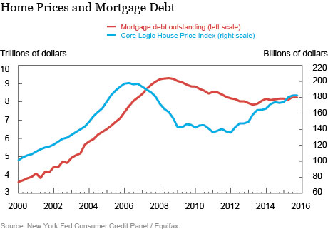
The chart below illustrates the puzzle. Between 2000 and 2006, home prices (in blue) roughly doubled and so did mortgage debt (in red). Prices then began to fall and, after about two years, so did mortgage debt. Persistent recovery in home prices began in early 2012, and as of last fall prices had risen by more than a third. Yet mortgage debt hasn’t really grown at all and ended 2015 just 1 percent above where it stood in the first quarter of 2012. What has caused the relationship between mortgage debt and home prices to change so completely?

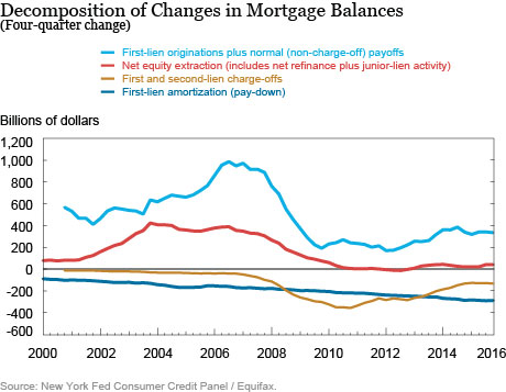
The next chart shows our decomposition of mortgage balance changes, with each line reflecting that category’s contribution to mortgage balance changes over the last year. The figures are thus interpretable as annual changes.
Fact 1: It isn’t foreclosures.
Our first suspect for possibly holding mortgage balances down is foreclosures. After all, there was a very large increase in the foreclosure rate during the housing bust, and it takes time for a foreclosure to get to the point when the loan disappears from the borrower’s credit report. That’s all true, but as the gold line shows, the contribution of foreclosures to reducing mortgage balances peaked in 2010, and has been declining since then. By now, about $130 billion is being charged off due to foreclosures at an annual rate—well below the $350 billion level we saw in 2010 and the $275 billion we saw as recently as 2012. So while charge-offs related to foreclosures are still holding balances down, their influence is fading.
Fact 2: Purchases Aren’t Adding as Much to Balances as They Used to.
A second contributor to the total balance is home purchases, which are often associated with a borrower originating a new mortgage that adds to the total debt outstanding. Of course, sellers often have mortgages, too, and those will be paid off when the transaction takes place. In a typical situation the buyer’s newly originated loan will have a higher balance than the one the seller is paying off. That’s because the seller has usually been paying the loan down, and the house may have appreciated in value since the last time it sold. Thus, as long as prices aren’t falling for a prolonged period, transactions will lead to increased mortgage balances. We see this in the light-blue line, which is the contribution to mortgage balances coming from housing transactions. This is always positive, but has fallen from nearly $1 trillion in 2006 and 2007 (at an annual rate) to about $350 billion now. So transactions are pushing up balances, but not to nearly the extent that they were during the boom.
Fact 3: Equity Withdrawal Is Very Low.
The third major factor to consider is equity withdrawal, shown in red. There are two ways that households can convert their housing equity into cash (short of selling the house): through cash out refinances and use of junior liens, such as second mortgages and home equity lines of credit (HELOCs). Combined, these two forms of withdrawal were a very important source of cash for households during the housing boom, increasing debt balances by more than $300 billion annually for the five year period 2003-07. After 2007, though, equity extraction began to decline and is now a far less important source of debt growth, contributing only about $30 billion in 2015. In fact, you can’t see it in the chart but the small amount of cash-out refi going on is almost completely offset by people repaying second mortgages and HELOCs.
Fact 4: First-Lien Principal Pay-Down has Grown a Lot.
The final piece to consider is the reduction in mortgage balances that comes from the everyday hum-drum making of scheduled payments, in dark blue. What’s surprising is how much this has grown in spite of the fact that mortgage balances are still well below their level of seven years ago. One way of seeing this is to note that the year-end level of mortgage debt in 2015 was $8.25 trillion. Given the up, down and (slightly) up again pattern in outstanding mortgage debt, we’ve seen this level twice before: in the fourth quarters of 2006 and 2011. In 2006, $8.25 trillion in outstanding mortgage debt produced $170 billion in annual pay-down, which is 2.1 percent of the balance. In 2011, the same amount of debt produced $234 billion in pay-down. Last year, the pay-down increased to $288 billion or 3.5 percent of the balance.

Why Has Pay-Down Increased So Much?
The rate at which a mortgage is paid back is governed by the interest rate on the loan, and how many months are left before the loan is scheduled to be paid off. These factors have been pushing up the percentage of each mortgage payment that reduces the outstanding balance for some time, with the result that mortgage pay-down has now become a major drag on the growth of household debt.
The most obvious factor is interest rates, which have come down very substantially since 2000. In June of 2000, both 30- and 15-year mortgages were offered at rates around 8.4 percent. By late 2012, the 30-year rate was below 3.5 percent, and the 15-year had fallen even further, to 2.7 percent. Also, the tight lending standards that we’ve noted before mean that people who do get loans have high credit scores, qualifying them for lower interest rates. These factors reduce the weighted average rate of interest on the outstanding debt balance, which fell almost 50 percent, from 7.65 percent in 2000 to 3.85 percent in 2015.
In addition, the rising differential between 30- and 15-year mortgage rates, along with the structure of fees in the Home Affordable Refinance Program, has given individuals who want to refinance strong incentives to shorten the term of their loans. Taking this step produces a higher principal pay-down for each dollar of their monthly payment. Finally, the existing inventory of loans has aged significantly since 2003, meaning that the payments due are becoming more and more “principal heavy”.
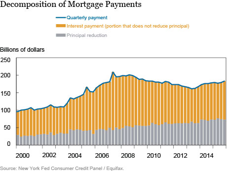
These factors—loans at lower interest rates with shorter remaining terms—have substantially increased the amount of principal pay-down even while payments in aggregate have gotten smaller. In the chart below, the gray bars show the amount of principal pay-down each quarter (this is the absolute value of the dark-blue line from the above chart) while the gold bar is the balance of the payments (interest, insurance, taxes, etc.). Since 2008, aggregate mortgage payments have fallen by 8 percent but principal payments have risen 41 percent!

What’s next?
Principal pay-down is a form of saving for borrowers, so in the face of rising home prices this means strengthening balance sheets for mortgagors. This is important, of course, as we learned in 2008 just how crucial household debts can be. And given that many borrowers locked in mortgages at historically low interest rates during the mini refinance boom of 2012 and 2013, they are unlikely to want to refinance again, meaning that from here we can expect further increases in the age of outstanding loans. Ultimately this will mean continued pay-down, and growing home equity for these borrowers. It also means that, barring big increases in equity withdrawal or purchase mortgages, we are unlikely to see rapid mortgage growth for the foreseeable future.
Disclaimer
The views expressed in this post are those of the authors and do not necessarily reflect the position of the Federal Reserve Bank of New York or the Federal Reserve System. Any errors or omissions are the responsibility of the authors.
 Andrew F. Haughwout is a senior vice president in the Federal Reserve Bank of New York’s Research and Statistics Group.
 Donghoon Lee is a research officer in the Bank’s Research and Statistics Group.

Joelle Scally is the administrator of the Center for Microeconomic Data in the Bank’s Research and Statistics Group.

Wilbert van der Klaauw is a senior vice president in the Bank’s Research and Statistics Group.


 RSS Feed
 Follow Liberty Street Economics
Thanks for the excellent question. You characterize the data correctly, and we agree that the answer has to do with the dynamics of prices and quantities. In 2006, prices had just peaked and so the typical sale – and there were over a million single family homes sold in 2006 – still involved a larger mortgage being opened (by the buyer) than was being prepaid (by the seller). This led to substantial increases in mortgage debt. By 2008, both prices and the number of units sold (less than half a million houses sold in 2008) had fallen sharply, greatly reducing this effect on outstanding debt.
I’m curious: house prices started falling in mid-2006 or early-2007 depending on the measure, but first-lien originations plus payoffs jumps in 2006 and only starts falling sharply in 2008. Does this just reflect the lagged impact of previous house price dynamics, perhaps distressed selling of underwater homes, or a jump up in adjustable rate mortgages?