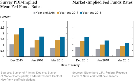
Over the past year, market pricing on interest rate derivatives linked to the federal funds rate has suggested a significantly lower expected path of the policy rate than responses to the New York Fed’s Survey of Primary Dealers (SPD) and Survey of Market Participants (SMP). However, this gap narrowed considerably from December 2015 to January 2016, before widening slightly at longer horizons in March. This post argues that the narrowing between December and January was mostly the result of survey respondents placing greater weight on lower rate outcomes, while the subsequent widening between January and March likely reflects an increased demand for insurance against states of the world where the policy rate remains at very low levels.
Before each meeting of the Federal Open Market Committee (FOMC), the Trading Desk of the Federal Reserve Bank of New York (the Desk) surveys financial market participants—including both primary dealers and buy-side investors—on a variety of topics related to the economy, monetary policy, and financial markets. The Desk has been surveying primary dealers for more than a decade, and since 2011 it has made the results of the SPD publicly available (“Understanding the New York Fed’s Survey of Primary Dealers” offers some background.) In 2014, the Desk launched the SMP, which solicits views on these topics from other market participants, such as mutual, pension, and hedge fund managers as well as nonfinancial corporations.
Both the SPD and SMP ask survey respondents to indicate their expectations for the most likely (in other words, modal) levels of the target fed funds rate at various points in time, and to provide probability distributions (PDFs) for the target fed funds rate at year-end dates. Specifically, recent surveys have asked respondents to indicate the “percent chance” that they attach to the target fed funds rate falling into various bins, for example between 1.51 percent and 2.0 percent, at the end of 2016, 2017, and 2018.
It is possible, given some assumptions, to estimate PDF-implied mean rate expectations from these probability distributions. PDF-implied mean rates, as opposed to the modal rates, are more directly comparable to market-implied policy expectations, which reflect investors’ probability-weighted averages over different possible rate paths. Indeed, if the marginal investor in futures markets was risk-neutral, and her probability distribution coincided with the average probability distribution of the survey respondents, then the market-implied rate and the survey respondents’ PDF-implied mean rate should be the same. Of course, the marginal investor is unlikely to be risk-neutral, so a gap between these means could arise from risk preferences. (Risk-based explanations are discussed in more detail in our next blog post, “Reconciling Survey- and Market-Based Expectations for the Policy Rate.”)
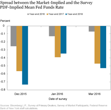
The chart above compares the gap between the market-implied path of the policy rate and the survey PDF-implied mean rates for year-end 2016, 2017, and 2018 found in the December, January, and March surveys. The gap narrowed considerably from December to January and then widened slightly in March for year-end 2017 and 2018. (Note that respondents were re-surveyed after both the December and March FOMC meetings. Their responses were very similar to those in their respective pre-FOMC surveys and so we do not report them.)
The panels in the chart below show that survey PDF-implied mean rates declined notably from December to January and were virtually unchanged from the January to March surveys. Conversely, market-implied rates declined for year-end 2017 and 2018 as of each of the three surveys. These panels highlight that the narrowing gap from December to January was largely driven by declines in survey-implied rates, while the slight widening from January to March was the result of additional declines in market-implied rates.
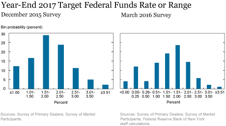
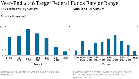
The four panels in the chart below show how the average probability distributions for the target fed funds rate at year-end 2017 and year-end 2018 changed from the December 2015 to the March 2016 survey (given the similarity between the January and March results, we do not show the January distributions). The bin with the most probability mass in each of the distributions did not change between December and March—remaining between 1.5 percent and 2.0 percent for year-end 2017 and between 2.0 percent and 2.5 percent for year-end 2018. However, the probabilities associated with lower rate outcomes increased. For example, the probability of year-end 2017 rate outcomes less than 1.0 percent more than doubled from 12 percent in December to 33 percent in March. The year-end 2018 PDF saw an even more pronounced increase in the probability of rates less than or equal to 1.5 percent.
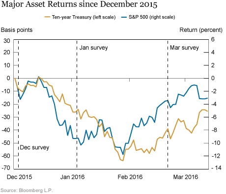
Why did survey respondents increase the probabilities they assigned to lower rate outcomes after the December survey? One explanation is that respondents became relatively more pessimistic about the outlook for U.S. growth and inflation following the financial market turbulence at the start of the year. As shown in the chart below, U.S. interest rates and equities declined between the December and January surveys. They both continued declining after the January survey, before retracing somewhat in the three weeks prior to the March survey.
Another explanation is that a change in the survey design between the December and January surveys affected the PDF-implied mean rate expectations. In particular, the number of buckets associated with lower rate outcomes increased in the January survey, which may have led some respondents to assign greater weight to these outcomes in their responses. Additionally, changes in how the survey elicited these distributions may have affected survey responses. In December, the survey asked directly for the unconditional probability that respondents associated with the various bins. Beginning in January, the question was framed in two parts. First, it asked for a probability distribution “conditional on not returning to the zero lower bound (ZLB) at any point during 2016-2018.” Second, it asked for another probability distribution “conditional on returning to the ZLB at some point in 2016-2018.” It is possible that asking respondents explicitly to consider states of the world in which the FOMC returns to the ZLB in the next three years may have prompted respondents to generally place greater weight on lower rate policy outcomes.
The driving factor for the increase in the gap from January to March was the decline in market-implied rates, as noted above. One potential reason for this decline is that investors became more pessimistic about the U.S. or global economic outlook. The survey results should also have changed in that case, but might not have if the survey respondents are not representative of investors in the futures market. In our next post, we will show that there is substantial heterogeneity in the outlook among survey respondents and that this heterogeneity varies over time. Hence, the average survey respondent and the marginal investor in futures markets may have different views about the economy, and the gap between mean survey forecasts and market-implied rates could in principle reflect these differences.
Another explanation is that investors demanded greater insurance against lower rate outcomes. Model-based measures of risk premia are consistent with this explanation from January to March. Our next post will discuss risk premia in futures markets and provide evidence on changes in these premia between December and March.
In conclusion, the narrowing gap between market-implied rates and survey expectations from December to January was largely the result of respondents placing greater weight on lower rate outcomes, with some of this potentially the result of changes to the survey questions. The subsequent widening of the gap between January and March likely reflects a decrease in risk premia. Our next blog post discusses a novel approach to analyzing the differences between survey expectations and market-implied rates.
Disclaimer
The views expressed in this post are those of the authors and do not necessarily reflect the position of the Federal Reserve Bank of New York or the Federal Reserve System. Any errors or omissions are the responsibility of the authors.

Bonni Brodsky is a policy and market analysis associate in the Federal Reserve Bank of New York’s Markets Group.
 Marco Del Negro is an assistant vice president in the Bank’s Research and Statistics Group.
 Joseph Fiorica is a senior analyst in the Bank’s Markets Group.
 Eric LeSueur is a manager in the Bank’s Markets Group.
 Ari Morse is a quantitative policy and market analysis associate in the Bank’s Markets Group.
 Anthony P. Rodrigues is a quantitative policy and market analysis senior associate in the Bank’s Markets Group.


 RSS Feed
 Follow Liberty Street Economics