As stock market volatility hovers near all-time lows, some analysts are questioning whether investors are complacent, drawing an analogy to the lead-up to the financial crisis. But, is this time different? We follow up on our previous post by investigating the persistence of low volatility periods. Historically, realized stock market volatility is persistent and mean-reverting: low volatility today predicts slightly higher, but still low, volatility one month and one year from now. Moreover, as of mid-September, the market is pricing implied volatility of 19 percent in one to two years’ time. This level contrasts with the pre-crisis period when the term structure of implied volatility was relatively flat, which suggests this time may indeed be different, at least as measured by market participants’ pricing of risk.
Realized Volatility Forecasts When Volatility Is Low
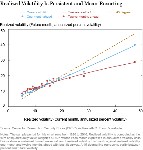
When realized volatility is low, does it tend to stay low the next month? What about twelve-months ahead? The chart below answers this question by plotting current realized volatility on the horizontal axis against realized volatility one-month and twelve-months ahead on the vertical axis. Realized volatility is computed as the sum of squared daily Center for Research in Security Prices (CRSP) value-weighted returns obtained from Kenneth R. French’s website, reported in annualized volatility units.
The chart shows that realized volatility is persistent and mean-reverting. To see this, note how low volatility today forecasts low volatility one-month and twelve-months ahead. The volatility forecasts are above the 45 degree line when volatility is low but below the 45 degree line when volatility is high. Moreover, there is no evidence of a nonlinearity when volatility is at the lower end of its historical distribution. On average, extremely low volatility today predicts low volatility in the future, not higher. This evidence weighs against the narrative discussed in the previous post that low volatility, in and of itself, may be a concern.
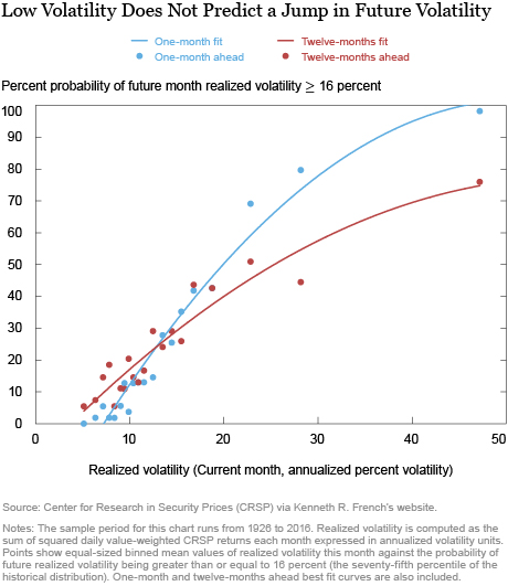
Nonetheless, it may be that this analysis masks an increased probability of a jump in volatility when volatility is extremely low. To consider that possibility, the next chart shows the probability of moving into a high volatility state, defined as realized volatility above 16 percent (the seventy-fifth percentile of the historical distribution), based on the current level of realized volatility. Similar to the volatility forecasts, we find no evidence that being in a low volatility environment raises the probability of jumping to a high volatility state, as compared to a “normal” volatility environment of, say, 15 percent.
The Term Structure of Implied Volatility
As an alternative to the historical analysis, we can look at the term structure of market-implied volatility over different horizons. This measure is analogous to the VIX, but uses longer-dated options to provide information on the level of implied volatility beyond a one-month horizon (see Carr and Wu [2009] for details on methodologies).
The chart below illustrates a recent snapshot of the implied volatility term structure using these VIX-type indexes, also known as synthetic variance swap rates, for longer maturities. As shown by the blue line, the implied volatility term structure is upward sloping. The front end of the curve is low and matches the current level of the VIX which is around 10 percent. The longer-dated VIX-type indexes increase to between 16 percent and 17 percent, representing the average implied volatility over the corresponding maturity.
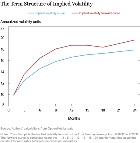
In particular, if one-month implied volatility is 10 percent and one-year implied volatility is 17 percent, it follows that implied volatility is priced to rise rapidly from 10 percent in order to average 17 percent over the next year. The implied volatility forward curve shown as the red line above reflects this observation. The forward curve represents the implied volatility over a one-month period at various points in the future, similar to the forward curve for interest rates. Since the implied volatility term structure is upward sloping, the forward curve sits above the implied volatility curve. The forward curve indicates that the market is pricing implied volatility of around 19 percent in one to two years’ time.
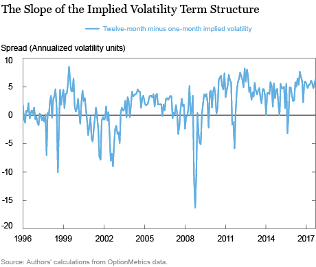
Going beyond this snapshot on a given day, it is useful to summarize the shape of the term structure over time by tracking its slope (twelve-month minus one-month implied volatility). As shown in the chart below, the slope is positive on average with a historical mean of about 1.8 percent. During periods of financial stress, the slope tends to invert and go negative. Currently, the slope is over 6 percent. This is steep both in absolute terms and in comparison with the historical average of 1.8 percent and the pre-crisis average of 1.4 percent from 2006 to 2007, which reflects how investors are pricing higher volatility in the future. Based on this evidence, it seems that, despite the low level of the VIX, investors may not be so complacent after all.
The Volatility Risk Premium at One-Month versus Twelve-Month Horizons
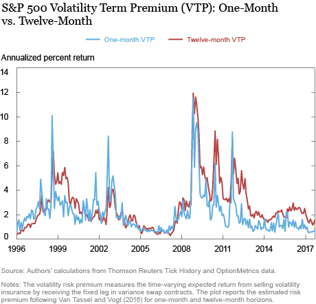
Notwithstanding our findings so far, a key caveat with implied volatility is that it’s a “market price.” This means that implied volatility is not a volatility forecast per se, but rather the sum of a volatility forecast and a risk premium. We disentangle these components below using an updated version of the model in Van Tassel and Vogt (2016) and plot the one-month and twelve-month volatility risk premium below (strictly speaking, the variance risk premium).
The volatility risk premium can be interpreted as the time-varying expected return from selling volatility insurance by receiving the fixed leg in variance swaps over different horizons. Our previous post noted that the one-month volatility risk premium has compressed in recent months, which might be interpreted as a sign of investor complacency. In particular, the low level of volatility may be encouraging investors to increase leverage, which can push asset prices up and risk premia down, thereby increasing systemic risk (for example, see Brunnermeier and Sannikov [2014] and Adrian and Shin [2013]).
The term structure of risk premia, however, appears to provide evidence against the complacency story, consistent with results from the term structure of implied volatility. The chart below reports the one-month and twelve-month volatility risk premiums in the estimated model. The twelve-month risk premium has averaged 1.5 percent in 2017, which is the twenty-sixth percentile of its historical distribution. In contrast, the one-month risk premium has averaged 0.67 percent in 2017, or the eighth percentile of its historical distribution. The higher risk premium at the long- versus short-end of the term structure provides further evidence that investors are demanding compensation for bearing long-dated volatility risk.
Is This Time Different?
What’s perhaps most striking about the preceding chart is the different behavior of long-dated risk premia in recent years versus the pre-crisis period in the mid-2000s. As the plot indicates, volatility risk premia were compressed across the curve in the period leading up to the financial crisis, consistent with the complacency story. In contrast, there is currently a larger wedge between short-dated and long-dated risk premia, suggesting that investors may understand that volatility may increase again in the future.
Of course, this is not to say that there are no risks or reasons for concern in the current environment. One could argue that a twelve-month term premium at 1.50 percent is still low in absolute terms. Moreover, the impression that volatility is low relative to a large number of risks was the starting point for our companion post. If these risks materialize, volatility may well jump and the market could see a correction. That said, our analysis highlights how the slope of the implied volatility term structure is steep today and how the twelve-month risk premium is large relative to the pre-crisis period of the mid-2000s, suggesting there are differences in how market participants are pricing risk.
Disclaimer
The views expressed in this post are those of the authors and do not necessarily reflect the position of the Federal Reserve Bank of New York or the Federal Reserve System. Any errors or omissions are the responsibility of the authors.

David O. Lucca is a research officer in the Federal Reserve Bank of New York’s Research and Statistics Group.

Daniel Roberts is a senior research analyst in the Bank’s Research and Statistics Group.

Peter Van Tassel is an economist in the Bank’s Research and Statistics Group.
How to cite this blog post:
David O. Lucca, Daniel Roberts, and Peter Van Tassel, “The Low Volatility Puzzle: Is This Time Different?,” Federal Reserve Bank of New York Liberty Street Economics (blog), November 15, 2017, http://libertystreeteconomics.newyorkfed.org/2017/11/the-low-volatility-puzzle-is-this-time-different.html.


 RSS Feed
 Follow Liberty Street Economics