The Paycheck Protection Program (PPP) is a central piece of the CARES Act. In the program’s first round, $349 billion in forgivable government-guaranteed loans were extended to small businesses to cover costs related to payroll and utilities, as well as mortgage and rent payments. The program opened for applications on April 3 and was oversubscribed by April 16. Because of its popularity, lawmakers passed a new bill replenishing the fund with another $310 billion and the Small Business Administration (SBA) started approving loans again on April 27. With a new round of PPP lending underway, it is natural to examine the allocation of credit in the first round and ask: Have PPP loans gone to the areas of the country and sectors of the economy hardest hit by COVID-19?
Have PPP Loans Gone to the Hardest Hit Areas?
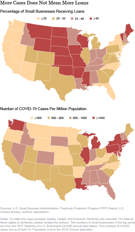
Using the number of coronavirus cases as a proxy for the economic impact of COVID-19 in a specific state, we can look at whether the geographical distribution of PPP loans approved per number of small businesses matches that of COVID-19 cases. The number of PPP loans per state translates one-to-one to the number of small businesses receiving loans, since PPP loans are capped at one per business.
The figure below suggests that some of the hardest hit areas—such as New York, New Jersey, Michigan, and Pennsylvania—are getting fewer loans than some Mountain and Midwest states on a per-small-business basis. In New York, the epicenter of the coronavirus in the United States, less than 20 percent of small businesses have been approved to receive PPP loans. In contrast, more than 55 percent of small businesses in Nebraska are expecting PPP funding. The between-state variation of loans has generated heated political discussions.
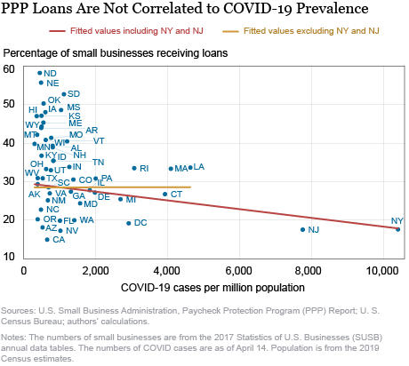
Building on this initial evidence, we further show that there is no statistically significant relationship between the severity of the economic impact of COVID-19—measured both in terms of cases and unemployment claims—and the share of small businesses getting PPP loans, after excluding New York and New Jersey. First, the chart below shows that there is actually a negative relationship between COVID-19 cases per capita and the share of small firms getting PPP funding, suggesting that credit is misallocated; however, this state-level relationship is not statistically significant after excluding New York and New Jersey. Results are unchanged if COVID-19 deaths per capita are used instead of the number of cases.
Then, in the next chart, we use unemployment claims per capita in the four weeks starting March 15 as the measure and find no statistically significant relationship between economic hardship due to COVID-19 and the chance of getting a PPP loan.
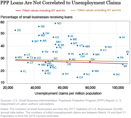
In unreported regressions and charts, we show that these results are robust to adjusting for the share of employment by small businesses in a state, as well as to various other factors. But we also acknowledge that our analysis is preliminary and subject to caveats. For example, PPP loans could be viewed as a substitute for unemployment claims, since firms applying for PPP loans, and expecting relief, may refrain from reducing payroll or at least delay it. This would dampen the relationship between PPP loans and initial unemployment claims. Another caveat is that the number of COVID-19 cases per capita is an imperfect measure for the severity of the economic impact, since other variables could affect outcomes differently across states. For example, among states with few COVID-19 cases per capita, California could have suffered from strict social distancing rules and North Dakota could have benefited from low population density even with laxer restrictions in place.
What Are the Other Drivers of Geographical Variation in PPP Loans?
Next, we explore other potential drivers for state-level variation in PPP loans. One commonly proposed theory is that the hardest hit states also have the strictest social distancing rules, which make it challenging for small business owners to visit local bank branches to apply for PPP loans. However, most lenders have set up online application systems and accept e-signatures and e-consents, so this is unlikely to be the full explanation.
The lending criteria for PPP loans establish an extended base of eligible borrowers, and the forgiveness feature of PPP provides a great incentive for qualifying businesses to apply. This incentive holds for firms in areas of the country not much affected by COVID-19, and for firms that might be able to continue operating without a loan. The eligibility requirements in the CARES Act only demand a good faith certification by the borrower that “the uncertainty of current economic conditions makes necessary the loan request to support ongoing operations.”
Furthermore, the limited size of the PPP fund means that borrowers whose applications are processed and approved earlier get funding while late-comers are left out. The SBA approves PPP loans on a first-come, first-served basis, based on the date it receives applications from banks. However, the order in which banks submit applications to the SBA may not coincide with the order in which they were received from borrowers, due to differences in banks’ acceptance, processing, and approval times. As an example, banks are quicker to accept loan applications from existing customers, since they already have much of the relevant information and screening is faster. More generally, it has been widely documented that banks prioritize businesses with existing lending relationships for cost savings reasons and to avoid fraudulent applications. Arguably, lenders’ preference for their own depository base could be an important factor in explaining the observed PPP loan approval data.
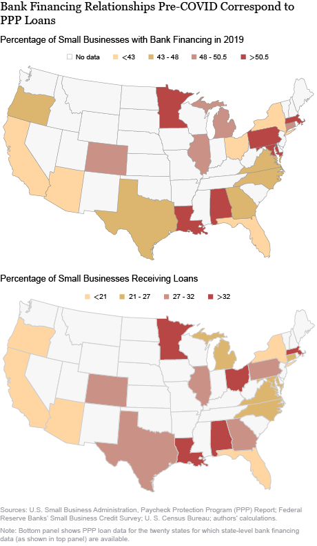
For this reason, we turn to testing the hypothesis that variation in the share of small businesses with existing bank financing explains the variation of PPP loans approved across states. The top panel of the figure below shows the share of small businesses with bank financing in 2019, while the bottom panel shows the share of firms receiving PPP loans. (The bank financing data are from the Federal Reserve Banks’ Small Business Credit Survey; we restrict our sample to the twenty states for which state-level data are available). We can see that there is strong similarity in shading between the top and bottom panels, consistent with the lenders’ preference explanation. This relationship is further confirmed in unreported regressions. Our interpretation is that banks’ preference for their own customers causes the PPP to favor firms with existing lending relationships. An alternative interpretation, albeit one we think less plausible, is that a prior relationship is a proxy for credit demand, so that credit is going to the firms that need it most. We leave the task of causally identifying relationship banking in the PPP to ongoing work.
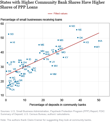
We conjecture a second hypothesis, that the market share of community banks is a good predictor of PPP loans approved across states. Community banks have been reported to view PPP as a chance to expand their customer base. The four largest banks in the United States represent a significant share of the depository base but have (at most) a combined 12 percent share of the total amount lent through the PPP. Moreover, the fifteen largest banks originating PPP loans have just a combined 26 percent market share of the total dollar amount lent. It seems therefore that medium-sized and small banks, including community banks, are important in channeling PPP funding.
We test this hypothesis and find a strong relationship between community banks’ market shares and the share of small businesses with PPP loans, consistent with this theory. Results are shown in the chart below. We acknowledge that the evidence presented here is preliminary and that there are many differences between states besides the variables we control for.
Finally, we shift our focus to the industry composition of PPP loans. The next chart shows that more affected industries, such as Retail Trade and Accommodation and Food Services, are receiving more PPP funding than industries that likely lost less revenues, such as Information, Finance and Insurance, and Educational Services. There are, however, notable exceptions in the pattern. One sector that has received disproportionately more PPP funding is Construction, even though it has been classified as “essential business” in many states, making it conceivably more immune to the social distancing measures enacted to contain COVID-19. Another sector that has possibly been less affected but has received a relatively large share of PPP loans is Professional, Scientific, and Technical Services. Small businesses in this sector are more likely to be able to continue operating online.
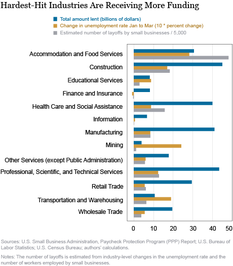
Accommodation and Food Services is one of the hardest hit sectors but is receiving less funding than four other industries. This is even more notable if we consider the estimated number of layoffs by small businesses in this sector. One potential explanation for the disparity is that small businesses in this sector may have applied for other loans, including the SBA’s Disaster Assistance Loans (in the areas declared disaster zones, such as New York State). A further explanation could be that the impact of COVID-19 on hotels and restaurants is larger than the eight-week payroll covered by the PPP; thus, owners of small businesses in this sector could lay off some of their employees despite potential funding through the PPP. A third explanation is that the average wage in this sector is lower than that of other sectors. Therefore, a similar-sized loan can cover more employees in this sector than, for example, in Professional, Scientific, and Technical Services.
Credit Misallocation?
The economic impact of COVID-19, both measured by the number of COVID-19 cases per capita and by the number of initial unemployment claims per capita, does not explain the geographical distribution of PPP loans. In contrast, we find that lenders’ preference for borrowers with an existing relationship and the market share of community banks are the main factors explaining the geographical variation in PPP funding. These results are preliminary and subject to caveats. We leave a causal analysis to ongoing and future work.
Related Reading:
U.S. Small Business Administration, Paycheck Protection Program (PPP) Report
FDIC Summary of Deposits search tool
 Haoyang Liu is an economist in the Federal Reserve Bank of New York’s Research and Statistics Group.
 Desi Volker is an economist in the Bank’s Research and Statistics Group.
How to cite this post:
Haoyang Liu and Desi Volker, “Where Have the Paycheck Protection Loans Gone So Far?,” Federal Reserve Bank of New York Liberty Street Economics, May 6, 2020, https://libertystreeteconomics.newyorkfed.org/2020/05/where-have-the-paycheck-protection-loans-gone-so-far.html.
Disclaimer
The views expressed in this post are those of the authors and do not necessarily reflect the position of the Federal Reserve Bank of New York or the Federal Reserve System. Any errors or omissions are the responsibility of the authors.




 RSS Feed
 Follow Liberty Street Economics
Thank you. Your study gave me the statistical support for what I saw from looking at a map for about 5 seconds. States dominated by large banks did less well. They relied on online applications that had to be tweaked as the rules kept changing. They were slow to allow applications and to make decisions. In the meantime more nimble community banks killed the large banks. This was not a needs based program, so any attempt to judge if credit was misallocated is wrongheaded. This was, at least as advertised and designed, a helicopter drop of money on SBA defined small businesses. I believe the large states still got the most dollars didn’t they?
Fascinating! I’d be interested to see which banks provided the most loans by number. I applied through 4 different banks. Two have hounded me for forms that aren’t supposed to be necessary for receiving this loan. The smaller banks have not. I have relationships with all.
Thanks for the interesting analysis. Curious to know what other theories you might have considered but ultimately discarded since the data didn’t prove them out?