In this post, we study whether (and how) the spread of COVID-19 across the United States has varied by geography, race, income, and population density. Have urban areas been more affected by COVID-19 than rural areas? Has population density mattered in the spread? Has the coronavirus’s impact varied by race and income? Our analysis uncovers stark demographic and geographic differences in the effects of the pandemic thus far.
We use county-level data as of June 11, compiled by the New York Times and the New York City Department of Health (NYC Health) on numbers of cases and deaths for our analysis. The New York Times compiles a daily series of confirmed cases and deaths by county for almost every county in the United States. Its data set aggregates New York City, which consists of five counties, into a single entity. To get a breakdown of deaths and cases by New York City’s boroughs, we use data from NYC Health. Since race and income data for affected individuals are not available in all states, we match our county-level COVID-19 data with county-level data on race, income, urban status, and population density from the 2014-18 five-year American Community Survey to understand the dispersion of COVID-19 by these factors.
To understand the spread of COVID-19 by race, we investigate whether majority-minority (MM) counties were affected differently than other counties. For our analysis, we define majority-minority counties as those in which at least half the population is Hispanic and/or non-Hispanic black. As of June 11th, MM counties had COVID-19 cases at a rate of 7.2/1,000 people, while individuals in other counties contracted it at a rate of 5.9/1,000 people. We find that MM counties had a death rate of 35/100,000 people while other counties had a death rate of 33/100,000 people.
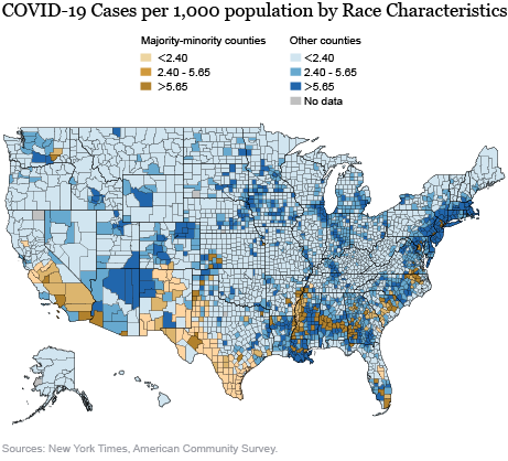
The map below shows the geographic distribution (in population-weighted terciles) of cases per thousand, differentiating between the spread in MM counties and other counties. The visibly higher rate in MM counties is driven mostly by the Bronx, Brooklyn, and several counties in Northern New Jersey (although these areas are too small to discern in the map), but some cities, such as New Orleans and Philadelphia, and less urban places, such as Southwestern Georgia and the Mississippi Delta, have very high rates of infection. In analysis not reported here, we find that the geographic distribution of deaths across counties is qualitatively similar to the geographic distributions of cases.

However, such simple univariate descriptive analysis leaves open the question of whether the higher incidence of the virus in MM areas is best explained by their racial distribution or by other factors such as income, population density, and urban status. We define urban counties as counties that lie within metropolitan statistical areas. To parse out these effects, we next present results from some multivariate regressions. All regressions below control for time-invariant characteristics of the states and exploit within-state variation to understand patterns. We define low-income counties as those that fall in the bottom quartile of the population weighted distribution of median household income.
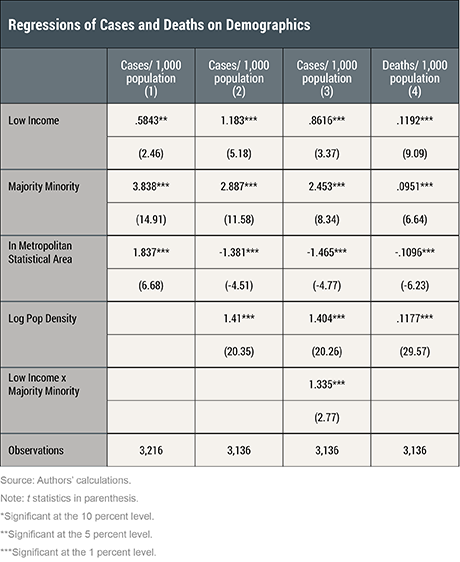
As seen in the first column of the table below, MM counties have 3.8 more cases per 1,000 than other counties after controlling for low-income and urban status, see the first column of the table below. Similarly after controlling for the other statuses, urban counties have 1.8 more cases per 1,000 than rural counties and low-income counties have 0.6 more cases per 1,000 than counties that are not low income. Thus, each of the MM, urban, and low-income counties has a significantly higher rate of cases than their corresponding counterparts. Notably, this effect is the strongest in MM counties. We find the patterns are similar for death rates.
We extend the model by including county population density as an additional covariate in columns 2 and 4. Counties in urban areas tend to have higher population density (the correlation coefficient is 0.59), so a relevant question is whether the higher incidence of COVID-19 in urban areas is attributable to their urban status or to their higher population density. Specifically, including population density in the model enables us to investigate whether it drives the more extensive spread in MM, urban, and low-income areas.
Controlling for population density yields a very different picture for urban versus rural areas—we find that urban areas have lower case rates (column 2) and lower death rates (column 4) than rural counties. This implies that the higher incidence in case and death rates in urban areas above was driven by higher population density in these areas. The lower susceptibility of urban areas may be because of better medical facilities and easier access to essential goods and services in these areas relative to rural areas. On the other hand, even after controlling for population density, we continue to find markedly larger incidence of COVID-19 in both low-income and MM communities, as captured by case rates (column 2) and death rates (column 4).
In column 3, we build on the model in column 2 and add an interaction term between low-income and MM dummies. The purpose is to investigate whether counties that are both low income and majority-minority have different patterns. We find that low-income counties that are also MM have a markedly larger number of cases than low-income counties that are not MM. Specifically, low-income MM counties have 3.79 more cases per 1,000 people than low-income counties that are not MM. Low-income MM counties have 4.7 more cases per 1,000 people than non-low income counties that are not MM. Similarly, MM counties that are low income have a higher rate of cases than MM counties that are not low-income.

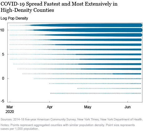
Finally, the chart below reveals the role of population density in the timing and severity of local outbreaks. We group all counties with similar population density and plot the per-capita case spread by population density (vertical axis) and time (horizontal axis). The size of the bubbles represents the severity of the outbreak as captured by number of cases per capita.
We find that population density played a major role in the spread of the virus. The scatter reveals that denser counties were the first to see cases and the rate of cases has been markedly larger in denser counties. The bubbles in the upper rows start growing well before the bubbles in lower rows do and they are markedly larger in size than the bubbles in the lower rows. In a chart, not included here, we find that the picture looks qualitatively very similar if we replace cases by deaths in the scatter chart below. The higher susceptibility of dense areas is because it is relatively difficult to socially distance in places with higher population density, which increases the risk of COVID-19 infection.

In this post, we have studied heterogeneity in incidence of COVID-19 (cases and death rates) by urban, minority, and low-income status. We find that urban areas, majority-minority communities, and low-income communities have been impacted markedly more than other communities. Delving deeper, we find that the higher incidence of COVID-19 cases and deaths in urban areas is due to their higher population density. Controlling for population density, we find that urban areas are likely to have lower case and death rates. This may be due to better medical care facilities (hospitals, doctors, medical equipment) and better/easier availability of essential commodities and services. The larger vulnerabilities in low-income and majority minority communities continue to remain prominent even after controlling for the effect of population density. In ongoing work, we are studying the underlying reasons behind the differences in vulnerabilities in majority minority and low-income areas. Is this due to differences in pre-existing comorbidities? Is it because of differences in access to the health care system? Is it because of higher exposure in certain jobs (for example, essential versus non-essential) for which social distancing is more difficult? These are questions we are continuing to study; stay tuned for forthcoming postings in this area.

Rajashri Chakrabarti is a senior economist in the Federal Reserve Bank of New York’s Research and Statistics Group.

William Nober is a senior research analyst in the Bank’s Research and Statistics Group.
How to cite this post:
Rajashri Chakrabarti and William Nober, “Distribution of COVID-19 Incidence by Geography, Race, and Income,” Federal Reserve Bank of New York Liberty Street Economics, June 15, 2020, https://libertystreeteconomics.newyorkfed.org/2020/06/distribution-of-covid-19-incidence-by-geography-race-and-income.html.
Disclaimer
The views expressed in this post are those of the authors and do not necessarily reflect the position of the Federal Reserve Bank of New York or the Federal Reserve System. Any errors or omissions are the responsibility of the authors.


 RSS Feed
 Follow Liberty Street Economics