The New York Fed today unveiled a set of charts that track COVID-19 cases in the Federal Reserve’s Second District, which includes New York, Northern New Jersey, Fairfield County Connecticut, Puerto Rico, and the U.S. Virgin Islands. These charts, available in the Indicators section of our Regional Economy webpage, are updated daily with the latest data on confirmed COVID-19 cases from The New York Times, which compiles information from state and local health agencies. Case counts are measured as the seven-day average of new reported daily cases and are presented on a per capita basis to allow comparisons to the nation and between communities in the region. Recent data indicate that after spiking to extraordinary levels in April, new cases have remained relatively low and stable in and around New York City. Cases didn’t reach nearly as high in upstate New York, and have held fairly low in recent weeks. By contrast, cases have been trending higher in Puerto Rico and the U.S. Virgin Islands since mid-July.
New York City Area
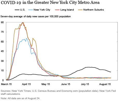
The New York City metro area emerged as the epicenter of the pandemic a few months ago. As the chart below shows, the seven-day average of daily new cases reached a level of about 65 per 100,000 population in New York City in mid-April. For comparison, the same measure for the United States overall has not exceeded much more than 20, even during its recent peak in mid-July. In terms of the spread of the disease, some of the counties surrounding New York City may have fared even worse than the City itself: Long Island and the northern suburbs (Orange, Rockland, and Westchester counties) peaked at around 90 new cases per 100,000 in mid-April, while Northern New Jersey peaked in the upper 50s around the same time. All of these peaks were likely understated, to varying degrees, given that they occurred in the early spring, when testing was more hampered by lack of availability. As of mid-August, all areas within the New York City Metro Area have been doing much better, with rates steadily below 5 daily new cases per 100,000, well below the U.S. average of around 15.

Upstate New York, Puerto Rico, and the U.S. Virgin Islands
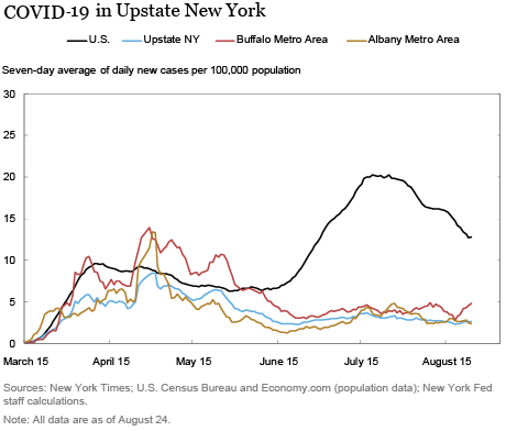
New cases never reached such highs in upstate New York as they did in the New York City metro area, nor did they in Puerto Rico or the U.S. Virgin Islands (so much so that we use different scales on these charts than those used for the New York City area). As the chart below shows, the Buffalo metro area and the Albany metro area both neared 15 daily new cases per 100,000 in late April, but most of upstate New York has stayed under 10. New case counts were particularly low and relatively stable in Ithaca and Watertown. New daily cases are now under 5 per 100,000 in all upstate metro areas.

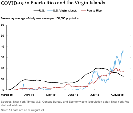
As shown below, case counts were quite low in Puerto Rico and the U.S. Virgin Islands until mid-July, but rates have recently trended upward, particularly in the U.S. Virgin Islands. The recent flare-up is most pronounced in the tourist areas of St. Thomas and San Juan, where new cases have recently reached over 50 and 25, respectively.

It should be noted that there are some shortcomings to this measure of the incidence of COVID-19. The number of new infections is likely understated, since cases are counted only if people get a test. Further, testing may lag relative to when the infection occurred, depending on when the test is taken and how long it takes to get the results. And the availability and accuracy of tests may vary across states and localities. Despite these shortcomings, daily new case counts expressed on a per capita basis is an effective metric for tracking the spread of COVID-19 in the region.
As the coronavirus pandemic unfolds, we will continue to monitor economic conditions in the region and provide timely updates as additional data and information become available. You can visit our Regional Economy website for more information useful in tracking economic conditions in the region.
Note: The New York Times raw data for COVID-19 cases are available on Github.

Jaison R. Abel is an assistant vice president in the Federal Reserve Bank of New York’s Research and Statistics Group.

Jason Bram is a research officer in the Bank’s Research and Statistics Group.

Richard Deitz is an assistant vice president in the Bank’s Research and Statistics Group.

Jonathan Hastings is a research associate in the Bank’s Research and Statistics Group.
How to cite this post:
Jaison R. Abel, Jason Bram, Richard Deitz, and Jonathan Hastings, “Tracking the Spread of COVID-19 in the Region,” Federal Reserve Bank of New York Liberty Street Economics, August 27, 2020, https://libertystreeteconomics.newyorkfed.org/2020/08/tracking-the-spread-of-covid-19-in-the-region.html.
Disclaimer
The views expressed in this post are those of the author and do not necessarily reflect the position of the Federal Reserve Bank of New York or the Federal Reserve System. Any errors or omissions are the responsibility of the author.


 RSS Feed
 Follow Liberty Street Economics