U.S. inflation used to rise during economic booms, as businesses charged higher prices to cope with increases in wages and other costs. When the economy cooled and joblessness rose, inflation declined. This pattern changed around 1990. Since then, U.S. inflation has been remarkably stable, even though economic activity and unemployment have continued to fluctuate. For example, during the Great Recession unemployment reached 10 percent, but inflation barely dipped below 1 percent. More recently, even with unemployment as low as 3.5 percent, inflation remained stuck under 2 percent. What explains the emergence of this disconnect between inflation and unemployment? This is the question we address in “What’s Up with the Phillips Curve?,” published recently in Brookings Papers on Economic Activity.
Inflation Has Been Less Responsive to Unemployment since 1990
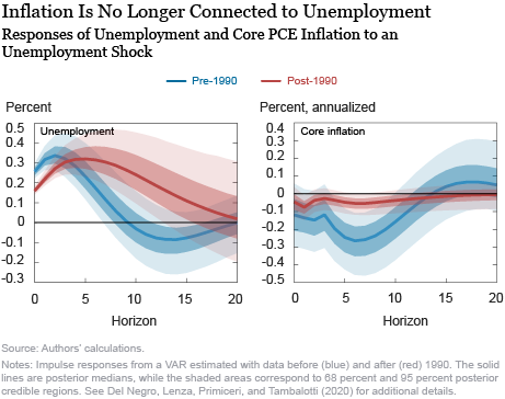
To illustrate this phenomenon, the chart below shows the dynamic responses of core PCE inflation and the unemployment rate to a surprise increase in the latter, based on a vector autoregressive (VAR) model. When these responses are computed using data before 1990 (in blue), core inflation drops significantly. When they are computed using data after 1990 (in red), core inflation barely moves. The behavior of unemployment, in contrast, is pretty similar across the two samples.
What Explains the Inflation–Unemployment Disconnect?
Economists have explored three main possible explanations for the emergence of this disconnect between inflation and unemployment: (1) Labor markets have changed in the past three decades, making unemployment a poorer indicator of both resource utilization in the economy (“slack”) and the cost pressures faced by firms. (2) Firms’ pricing decisions have become less sensitive to these cost pressures, leading to a flattening of the so-called Phillips curve. (3) Policy has become more successful in stabilizing inflation, as argued most recently by McLeay and Tenreyro (2019).
It Is Not the Labor Market
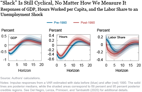
The chart below suggests that the first hypothesis is unlikely to be the main story. It shows the response of various measures of economic slack and cost pressures—such as GDP, the unemployment rate, hours worked, and unit labor costs—to the unemployment shock mentioned above. The responses of all these variables are very similar before and after 1990. This suggests that the stability of inflation over the past thirty years is not due to a break in the cyclical behavior of any specific measure of slack or cost pressures, which arguably rules out changes in the functioning of labor markets as a leading explanation for the inflation–business cycle disconnect.

Distinguishing Demand and Supply
This leaves us with two possible explanations: a flatter Phillips curve or improved monetary policy. We distinguish the two by studying the dynamic effects of aggregate demand shocks. Monetary policy can limit their impact on inflation by “leaning against the wind” to counteract their effects on economic activity, as well as on inflation. Therefore, if improved monetary policy is behind inflation stability, these demand shocks should have minor effects on both inflation and unemployment after 1990. But if inflation stability is due to limited sensitivity of prices to cost pressures and a flatter Phillips curve, demand shocks should continue to have a large impact on unemployment, although not on inflation.
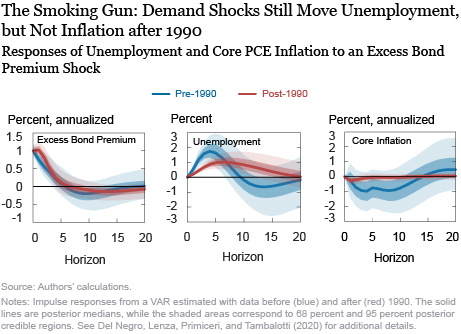
In the paper, we associate demand shocks to financial disturbances. More specifically, we follow Gilchrist and Zakrajšek (2012) and identify the latter with shocks to the so-called excess bond premium, which measures changes in credit spreads driven by credit market sentiment, as opposed to default risk. As vividly illustrated by the macroeconomic disruptions brought about by the financial crisis of the last decade, financial shocks hit both firms and households, leading them to reduce their demand for investment and consumption. The left panel in the chart below shows the response of the excess bond premium to its own shock, which is basically identical across samples. The middle panel shows the response of unemployment. In the post-1990 sample, this response is attenuated in the first few quarters, but it is also more persistent than in the pre-1990 sample, leading to a larger cumulative effect. On balance, unemployment reacts strongly to demand shocks both before and after 1990, indicating that monetary policy is not entirely successful in leaning against the wind. In contrast, the response of core inflation is muted since 1990, consistent with a flatter Phillips curve.

These empirical results are consistent with the common narrative behind the Great Recession, which most observers would associate with a collapse in demand: economic activity fell precipitously, but inflation barely budged, suggesting that the Phillips curve is flat. This flattening of the Phillips curve is also what we find by estimating the New York Fed DSGE model before and after 1990.
What Does a Flat Phillips Curve Imply for Monetary Policy?
Does monetary policy lose its traction on inflation when the Phillips curve is as flat as we find it to be after 1990? Our DSGE model suggests that this is not necessarily the case. The reason is that the other side of the “flat Phillips curve” coin is that the economy is more “Keynesian,” meaning that economic activity reacts more persistently to changes in monetary policy, as discussed in this 2014 Liberty Street Economics post. Therefore, even if the reaction of inflation to changes in economic activity is smaller, monetary policy has more traction on the latter, evening things out. To illustrate this principle, we show that policies that react forcefully to deviations of inflation from the central bank’s target, such as flexible average inflation targeting, can deliver stable inflation even with a flat Phillips curve. In fact, the flatness of the Phillips curve was one of the main motivations for the new monetary policy strategy recently unveiled by the Federal Reserve, as discussed by Chair Powell in his Jackson Hole speech as well as in this recent interview with NPR.

William Chen is a senior research analyst in the Federal Reserve Bank of New York’s Research and Statistics Group.

Marco Del Negro is a vice president in the Bank’s Research and Statistics Group.
Michele Lenza is an economist at the European Central Bank.
Giorgio Primiceri is a professor at Northwestern University.

Andrea Tambalotti is a vice president in the Bank’s Research and Statistics Group.
How to cite this post:
William Chen, Marco Del Negro, Michele Lenza, Giorgio Primiceri, and Andrea Tambalotti, “What’s Up with the Phillips Curve?,” Federal Reserve Bank of New York Liberty Street Economics, September 18, 2020, https://libertystreeteconomics.newyorkfed.org/2020/09/whats-up-with-the-phillips-curve.html.
Disclaimer
The views expressed in this post are those of the authors and do not necessarily reflect the position of the Federal Reserve Bank of New York or the Federal Reserve System. Any errors or omissions are the responsibility of the authors.


 RSS Feed
 Follow Liberty Street Economics
Gary: Thank you for your comment. You are correct that there is a wage Phillips curve, mapping slack in economic activity (or more narrowly, unemployment) into nominal wage growth. This is indeed the relationship originally uncovered by A.W. Phillips. Economists also talk about a price Phillips curve, which maps slack—or more narrowly, in the New Keynesian tradition, measures of marginal costs—into price inflation. As we discuss in more detail in the paper, the wage Phillips curve seems to be alive and well, as you have also found. It is the price Phillips curve that we find has become flatter after 1990. To put it differently, in the transmission from labor market slack to wage and price inflation, the first link remains solid, but the second one has become much weaker.
It is the relation between wage inflation and general inflation that has changed. (e.g. see the 2000 article by Hess and Schweitzer, FRB Cleveland.) The relationship developed by AW Phillips (wage inflation and unemployment) continues to be statistically significant. For a section of a stat course, I used the Phillips curve to illustrate how a nonlinear model could be estimated by converting it to a linear alternative. The model regressed the annual rate of change in wages (AHETPI- Average Hourly Earnings of Production and Nonsupervisory Employees: Total Private) against the reciprocal on the unemployment rate (LNS14000024 – unemployment rate 20 years and over) for the period 1984 through 2017. Adjusted R-sq of around 50%; slight improvement if wage inflation is regressed on the reciprocal of the prior year’s unemployment rate. Data visualization using scatter plots of both the linear and nonlinear alternatives were effective in illustrating the statistical lesson.
Isn’t it imprecise and inaccurate to refer to the relationship between unemployment and broad inflation as “The Phillips Curve”? My understanding is that the Phillips Curve specifically relates unemployment to wage rates rather than broad inflation.