Changes in the distribution of banks’ reserve balances are important since they may impact conditions in the federal funds market and alter trading dynamics in money markets more generally. In this post, we propose using the Lorenz curve and Gini coefficient as a new approach to measuring reserve concentration. Since 2013, concentration, as captured by the Lorenz curve and the Gini coefficient, has co-moved with aggregate reserves, decreasing as aggregate reserves declined (such as in 2015-18) and increasing as aggregate reserves increased (such as at the onset of the COVID-19 pandemic).
How Do We Traditionally Measure Reserve Concentration?
A widely used measure of reserve concentration is the share of reserves held by the largest reserve holders. This share is close to zero if reserves are evenly distributed among the several thousand institutions holding reserves (that is, when concentration is low) and close to 100 percent if the largest holders hold almost all reserves (that is, when concentration is high). The selection of the number of institutions to include among the largest reserve holders is arbitrary; often, the share of the top five or top twenty reserve holders is used as the concentration measure. Indeed, that is what we used in a recently published post.
Of course, when concentration is measured as the share of reserves of a few top holders, its evolution over time depends on the number of institutions selected for its computation: for example, the share of reserves of the top five holders increased between 2015 and 2018, whereas that of the top twenty holders remained flat. Moreover, when measuring concentration as the share of reserves held by the largest holders, one fails to capture changes in the distribution of reserves both within the subset of the smaller institutions and within that of the larger ones.
A Novel Way of Measuring Reserve Concentration: The Lorenz Curve
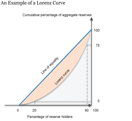
The Lorenz curve is a graphical representation of a variable’s distribution widely used in the analysis of income inequality. The Lorenz curve provides a simple way to characterize the distribution of reserves across all reserve holders, without focusing on a specific set of institutions. It plots the cumulative percentage of aggregate reserves against the cumulative percentage of reserve holders, ranked by increasing share. For instance, in the chart below, the point on the Lorenz curve corresponding to x=20 percent reports the cumulative share of reserves held by those institutions in the bottom 20 percent of the reserve distribution (5 percent of reserves in the example below).
The 45-degree line is the Lorenz curve for a hypothetical economy in which reserves are distributed evenly across reserve-holding institutions (the line of equality): in such an economy the bottom 20 percent of reserve holders holds exactly 20 percent of reserves. In contrast, if all reserves are held by one institution, the curve is flat for all percentiles except for the last percentile, which contains the institution holding all the reserves.
The Evolution of the Distribution of Reserves
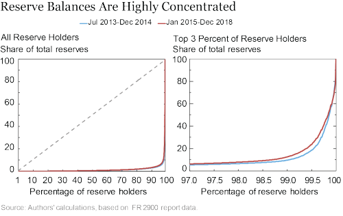
The chart below presents the Lorenz curves of reserves for two periods: July 2013-December 2014 (blue) and January 2015-December 2018 (red), corresponding to expansion and decline of reserves. As the left-hand panel shows, in both periods, reserves are very concentrated: the curve is practically flat until, at the least, the 99th percentile and becomes very steep afterwards.

The right-hand panel zooms into the right portion of the curve, focusing on the top 3 percent of reserve holders. Overall, reserves were less concentrated in January 2015-December 2018 than in July 2013-December 2014, as indicated by the upward shift of the Lorenz curve (from blue to red). Note that this upward shift of the Lorenz curve during the 2015-18 period contrasts with the fact that the share of reserves held by the top five institutions actually increased during that period. This highlights the differences between using a measure of concentration that focuses on the share of a specific set of institutions and a measure that summarizes the entire distribution.
Higher Reserves, Higher Concentration?
Since the Federal Reserve primarily interacts with large market participants when conducting open market operations, one could imagine that, as a result, increases in the level of reserves are accompanied by increases in the concentration of reserves, whereas decreases in the level of reserves are accompanied by a reduction in the concentration.
A common way to summarize the degree of concentration of a Lorenz curve is through the Gini coefficient, which is the ratio of the area between the line of equality and the Lorenz curve to the area below the line of equality. This can be seen in the first chart above, where the Gini coefficient is the ratio between the orange-shaded area and the sum of the orange-shaded and the grey-shaded areas. The Gini coefficient takes a value between zero (full-equality) and 100 percent (one institution holds all reserves).
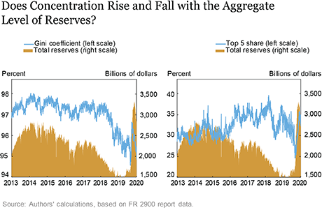
As the left-hand panel of the chart below shows, the Gini coefficient has been highly correlated with the level of aggregate reserve balances since late 2013: for instance, it fell sharply in 2018 and 2019 as reserves declined due to the Federal Reserve’s balance-sheet normalization and spiked up in early 2020 (although not to the same levels observed over 2014-17) as reserves increased during the early stages of the COVID-19 pandemic. Indeed, the daily correlation between reserves and the Gini coefficient during 2014-19 is 0.81.

By contrast, as the right-hand panel shows, there is no clear relationship between aggregate reserves and the share held by the top five institutions: indeed, as reserves were declining between 2014 and 2019, the share held by the top five institutions actually increased.
Conclusions
The Lorenz curve and the Gini coefficient are useful tools for characterizing reserve concentration based on the entire distribution of reserves and not just on the share of reserves held by the largest institutions. Since 2013, the Gini coefficient of the reserve distribution has broadly moved in tandem with aggregate reserves: reserves became less concentrated as the Federal Reserve normalized its balance sheet, and they became more concentrated as reserve balances increased during the early stages of the COVID-19 pandemic.

Gara Afonso is an assistant vice president in the Federal Reserve Bank of New York’s Research and Statistics Group.

Marco Cipriani is an assistant vice president in the Bank’s Research and Statistics Group.

Steph Clampitt is a senior research assistant in the Bank’s Research and Statistics Group.

Haitham Jendoubi is a senior associate in the Bank’s Markets Group.

Gabriele La Spada is a senior economist in the Bank’s Research and Statistics Group.

Will Riordan is an assistant vice president in the Bank’s Markets Group.
How to cite this post:
Gara Afonso, Marco Cipriani, Steph Clampitt, Haitham Jendoubi, Gabriele La Spada, and Will Riordan, “How Bank Reserves Are Distributed Matters. How You Measure Their Distribution Matters Too.,” Federal Reserve Bank of New York Liberty Street Economics, November 24, 2020, https://libertystreeteconomics.newyorkfed.org/2020/11/how-bank-reserves-are-distributed-matters-how-you-measure-distribution-matters-too.html .
Disclaimer
The views expressed in this post are those of the authors and do not necessarily reflect the position of the Federal Reserve Bank of New York or the Federal Reserve System. Any errors or omissions are the responsibility of the authors.


 RSS Feed
 Follow Liberty Street Economics