


House prices have risen rapidly during the pandemic, increasing even faster than the pace set before the 2007 financial crisis and subsequent recession. Is there a risk that another dangerous housing bubble is developing? This is a complicated question, and the answer has many components. This post, the first of two, provides a more detailed look at the recent rise in home prices by breaking it down geographically, with a comparison to the pre-2007 bubble. The second post looks at the potential risks to financial stability by comparing the currently outstanding stock of mortgage debt to the period before the financial crisis and projecting defaults should prices decline.
The Sharp Rise in Housing Prices during the Pandemic
The U.S. economy shut down in March 2020 due to the pandemic. Yet, by the summer housing prices started to rise sharply despite high unemployment. How similar is this to the early 2000s? We would be worried if the housing market were playing out exactly as it did in the prior boom. In the time series, we aren’t there yet: so far, we’ve had about one year of double-digit price growth, compared to the national average compound annual growth rate of more than 14 percent between 2003 and 2005.
Home Prices Are Rising Faster Now than during the Bubble
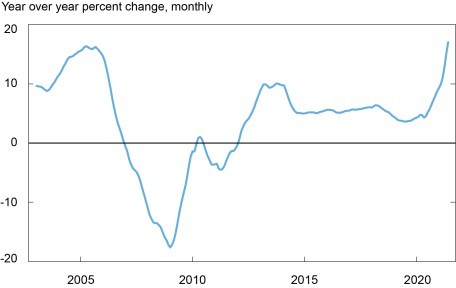
Source: CoreLogic Home Price Index, January 2003-June 2021.
Spatial Patterns of Home Price Growth
What about trends at the regional level? It turns out that the boom is taking place in different places within and across metro areas this time around. For most places, recent home price growth has been even stronger than during the previous boom: 79 percent of metropolitan areas in our data saw higher growth rates during the pandemic than during the peak years 2003-05. Of the thirty metropolitan areas containing the most populated cities in the country, 63 percent saw higher growth during the pandemic compared to 2003-05. In the chart below, we plot a 45-degree line, colored in gray, to differentiate which of the metropolitan areas with the largest population saw their fastest growth during either the pandemic or the housing bubble. Austin, Charlotte, Seattle, and Atlanta are a few metropolitan areas above the 45-degree line, meaning they have had higher growth rates during the pandemic. On the other hand, Las Vegas, Los Angeles, Miami, and New York had higher growth rates during 2003-05 and are below the 45-degree line. Some areas, however, saw similar paces of growth: Sacramento had minimal variation between its pandemic and housing bubble growth rates, putting the city close to the 45-degree line.
At the regional level, the northeast and south have positive trends in the graph, meaning that price increases are positively correlated in the two boom periods, whereas the midwest and west have slightly negative trends. The midwest points are clustered between growth rates of 10-20 percent for the pandemic and between 0-10 percent for 2003-05, whereas the other regions are more spread out. The west has the majority of its points above the trendline, while the south has most of its points near or below the trendline. The northeast points have the strongest positive relationship when compared to the other regions.
The blue regression line shows there is a positive relationship in the whole data set between house price growth during the housing bubble and the pandemic, meaning metropolitan areas that had high annual growth between 2003-05 saw higher growth rates during the pandemic, and vice versa. But note how flat the regression line is and how far away most of the dots are from the line, suggesting the relationship is weak. Many metropolitan areas that experienced fast-growing housing prices in 2003-05 have had slower growth rates during the pandemic and vice versa.
Most Metro Home Prices Have Grown Faster during the Pandemic than during 2003-05
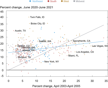
Source: CoreLogic Home Price Index.
Note: Each city represents the home price index of its respective metropolitan statistical area.
House Prices in Urban Areas Have Been Growing More Slowly than in Suburban and Rural Areas
The data above cover metropolitan areas and include both urban and suburban housing. A breakdown along these lines shows that house prices in urban areas have grown at a slower rate than those in suburban areas during the pandemic. To arrive at our urban classification, we first define the zip code that has the highest employment density, which we call the employment hub. We categorize zip codes as “urban” if they are within five miles of the employment hub, belong to a metropolitan statistical area, and have a population density greater than the 95th percentile. For suburban areas, we categorize zip codes as “suburban within 5/10/15/15+ miles” if they are within 5, 10, 15, or 15+ miles of the employment hub and if they are not already classified as urban (or any other suburban category).
As seen in the chart below, urban areas defined in this way have usually had the higher year-over-year house price growth compared to suburban areas, but starting around November 2018, these urban areas began to see lower rates of growth compared to suburban areas. Once the pandemic took hold in March 2020, urban areas did see a sharp increase in price growth, but suburban areas grew much faster and are above 15 percent year-over-year growth, whereas urban areas are around 10 percent. There are exceptions to even the relatively modest growth in urban areas: Manhattan (New York County) saw a price decline of 4.3 percent year over year in June, the largest county price decline nationwide.
Of course, many factors other than relative location may affect price growth. But urban classification is a significant characteristic even controlling for some of these other factors. The significant lag of home price growth in the past year isn’t attributable to zip code income or the level of home prices before the pandemic. When we control for these factors, it turns out that dense urban areas had been growing at a pace close to that of other parts of metro areas, until 2020 when they fell way behind.
Urban Home Prices Have Underperformed during the Pandemic
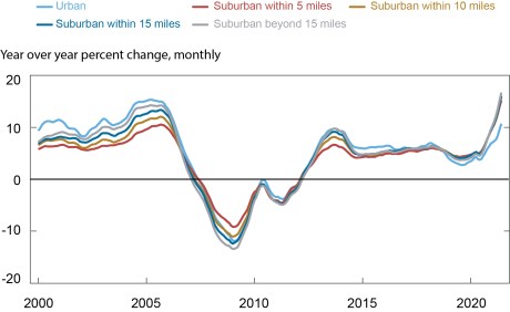
Source: CoreLogic Home Price Index.
There are also regional differences within urban areas. The northeast is not growing as rapidly as the midwest, west, and the south. Up until the end of 2020, all regional lines were following similar trends throughout the pandemic. At the beginning 2021 the west, south, and midwest continued to grow rapidly while the northeast began to see a slight stagnation in growth. These regional differences may have to do with the different rates of growth of cities in these areas compared to cities in other areas, and this shows how the urban classification can manifest differently depending on the region.
Urban Zip Codes Have Slower Home Price Growth in the Northeast
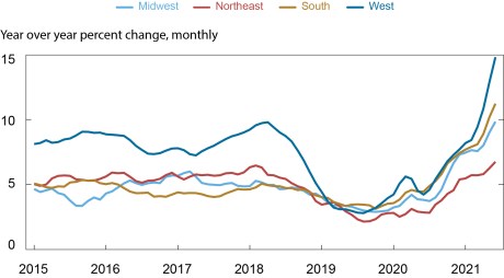
Source: CoreLogic Home Price Index.
Although prices are increasing rapidly nationwide, the data show we are not simply repeating the housing market bubble of the early 2000s during the pandemic. This boom is taking place in different metro areas and in different locations within metros. Still, home price growth in excess of 15 percent per year can’t be sustained forever, so a remaining question is how price growth will normalize and what the consequences of a decline in prices could be. We turn to this question in our next post.

Andrew Haughwout is a senior vice president in the Federal Reserve Bank of New York’s Research and Statistics Group.

Belicia Rodriguez is a senior research analyst in the Bank’s Communications and Outreach Group.
How to cite this post:
Andrew Haughwout and Belicia Rodriguez, “Does the Rise in Housing Prices Suggest a Housing Bubble?,” Federal Reserve Bank of New York Liberty Street Economics, September 8, 2021, https://libertystreeteconomics.newyorkfed.org/2021/09/does-the-rise-in-housing-prices-suggest-a-housing-bubble.
Related Reading
Mapping Home Price Changes (interactive)
Keeping Borrowers Current in a Pandemic (May 2021)
Do People View Housing as a Good Investment and Why? (April 2021)
Disclaimer
The views expressed in this post are those of the authors and do not necessarily reflect the position of the Federal Reserve Bank of New York or the Federal Reserve System. Any errors or omissions are the responsibility of the authors.
 RSS Feed
 Follow Liberty Street Economics