John Sporn* and Andrea Tambalotti
Inflation has picked up in the last few months. Between June and November 2010, the twelve-month change in the seasonally adjusted consumer price index (CPI) was stable, at slightly above 1 percent, but it jumped to 3.1 percent as of last April. Higher food and energy prices have been an important factor behind this pickup in “headline” inflation. However, core inflation has also increased; the year-over-year core CPI (excluding volatile food and energy prices) moved from a record low of 0.6 percent in October 2010 to 1.3 percent in April.
In this post, we take a closer look at the sources of this acceleration in prices. We divide the “basket” of goods and services that make up the CPI into twenty-three items—such as medical care, motor fuel (or gas), apparel, education, and rent—and examine the change in each item’s inflation rate over the last seven months. This exercise reveals whether the increase in inflation since last fall is due primarily to a few outliers—food and energy, for instance—or whether it reflects a broader acceleration in prices.
A “Heat-Map” View of Inflation
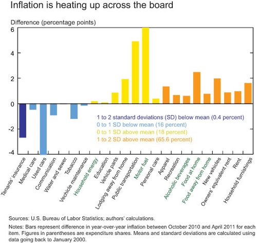
To conduct our analysis, we rely on the inflation “heat map” shown below, which uses color coding similar to that of weather maps to distinguish the items with the most significant increases or decreases in inflation from those with less notable changes.
The map’s horizontal axis displays the twenty-three goods and services into which we have divided the overall CPI basket. In green are the food and energy items excluded from core inflation; in black are the core items. The bars corresponding to each item represent the change in the inflation rate for that item in the seven-month period between October 2010 and April 2011. This change is measured on the vertical axis, but its range has been limited to -4 percent to 6 percent to prevent large changes (most notably that of motor fuel) from making the other bars appear too small. The colors of the bars denote the size of the inflation change in each item relative to its historical norm, measured by the standard deviation of the seven-month change in the inflation series for that item since 2000. (We go back only to 2000 because price indexes for some of the twenty-three items are not available before then.) Bars of the same color are ordered from left to right from the smallest to the biggest standardized change. For example, the orange bars denote items whose inflation changes in the last seven months were more than 1 but less than 2 standard deviations above the mean for that item since 2000. Within the orange items, rent had a larger standardized increase than new vehicles did.
What’s Hot, What’s Not
The heat map prompts several interesting observations. First, most of the bars are yellow or orange. This is true by count, but even more so by relative importance, as shown in the key. Two-thirds of expenditures by 2010 relative weights are in the orange category and 18 percent are in the yellow one. Summing these two, we see that 84 percent of all expenditures in the CPI basket were on items that experienced above-average increases in inflation in the last seven months. No bar is red, however, which would indicate inflation increases of more than 2 standard deviations above the mean. This suggests that the recent pickup in inflation is indeed quite widespread across a broad swath of CPI goods and services, but no one item has registered inflation increases that are clearly outside the norm of the last decade, not even among the volatile food and energy categories. In fact, the noncore items, indicated in green, do not show the largest standardized inflation increases, but they are closer to the middle of the pack, with higher increases in food than in energy.
Second, except for household furnishings, the items with the most notable standardized increases are rent and owners’ equivalent rent, which is a measure of the opportunity cost for homeowners of living in their own house. Ordinarily, the inflation rates of these two items are among the most stable components of the CPI. Following the housing bust, however, rent inflation fell from above 4 percent in 2007 all the way into negative territory in mid-2010. Both rent price indexes have recovered quite briskly from these historical lows in the past year, in conjunction with the improvement in the economy.
The implications of our inflation analysis for monetary policy and the evolution of inflation are not clear cut. On the one hand, the broad-based pickup in inflation shown in our heat map—coupled with the absence of obvious outliers that might suggest rampant pricing pressures in some sectors—can be seen as a reversal of the unusually widespread disinflation that occurred during and immediately following the recent recession (Hobijn and Gardiner document the breadth of that disinflation). The fact that the disinflationary forces operating last fall were of concern to policymakers, then, might suggest that the recent reversal in inflation could be viewed favorably as a return to more normal pricing patterns, rather than as the first step in a prolonged reflationary episode. On the other hand, the fact that the traditionally more stable components of inflation, such as rents, are the ones driving its increase could be a source of concern, since the movements in these components tend to be harder to slow down and might therefore continue to drive overall inflation higher in the months to come.
*John Sporn is an assistant economist in the Federal Reserve Bank of New York’s Research and Statistics Group.
Disclaimer
The views expressed in this blog are those of the author(s) and do not necessarily reflect the position of the Federal Reserve Bank of New York or the Federal Reserve System. Any errors or omissions are the responsibility of the author(s).


 RSS Feed
 Follow Liberty Street Economics