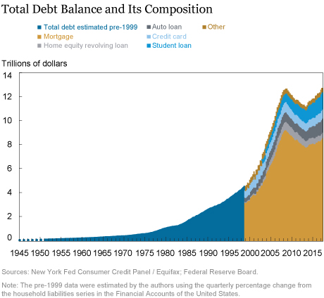
Today, the New York Fed’s Center for Microeconomic Data released its Quarterly Report on Household Debt and Credit for the first quarter of 2017. The report shows a rise in household debt balances in the quarter of $149 billion, the eleventh consecutive quarterly increase since the long period of deleveraging following the Great Recession. As of March 31, 2017, household debt balances stood at $12.73 trillion, surpassing the previous 2008 peak and hitting a level 14 percent above the trough seen in the second quarter of 2013. With this report’s release, we’re adding two new charts which show both early and severe delinquency trends by loan product type. The report and the analyses presented here are based on the New York Fed’s Consumer Credit Panel (CCP), which is sourced from Equifax credit report data.
Some news outlets have been eager to report that total debt is about to pass the 2008 peak, as if it’s a sign of either economic doom or economic strength. However, before bringing out the confetti (or sounding the warning bells), it’s important to get some historical perspective. Note first that our data are in nominal, aggregate terms, diminishing the significance of “reachieving” the previous peak.
The CCP data begin in 1999, so we’re now able to picture—in great detail—eighteen years of household borrowing behavior. The data cover an interesting economic period, including the 2001 recession, the Great Recession, and the developments around the sharp expansion and contraction in household credit. But the period that CCP data covers is somewhat unusual when we view American household borrowing over its entire post-war history. In the chart below, we show post-1998 debt balances from the CCP together with the much longer pre-1999 time series for aggregate household debt available in the Federal Reserve Board’s Financial Accounts of the United States (formerly known as the Flow of Funds), which has data on household borrowing beginning in 1945. Although the levels are somewhat different (due to the Board data’s inclusion of debts owed by nonprofits and some other types of firms in the household estimates), the trends in the two estimates of household debt have been nearly identical since 1999. We append the longer household liabilities time series from the Flow of Funds together with the detailed data from the CCP to create a seventy-two-year picture of household borrowing. One thing that’s immediately evident in this chart is that the decline in debt between 2008 and 2013 was an aberration from what had been a sixty-three-year upward trend reflecting the depth, duration, and aftermath of the Great Recession. In all, it took almost nine years for total debt to catch up with its 2008 level.

In addition, while comparable in nominal aggregate size, the composition of current household debt is very different from that in 2008. We pointed out in a recent press briefing that debt balances are evolving; mortgages now have a much smaller share than in 2008, auto and student loans have increased in their share, and balances are increasingly shifting towards more creditworthy and older borrowers. These shifts in borrowing patterns and characteristics of borrowers, paired with the long economic recovery and a strong labor market, have resulted in very low delinquency rates for most types of debts except for student loans. Our report’s primary chart on this subject, “Serious Delinquency Rates by Product,” tracks a stock delinquency rate—the total reported delinquent and defaulted balance divided by the total outstanding balance. This metric is one that can be used to assess the health of the household sector since it captures the total debt balances on which individuals are past due and have defaulted. However, these delinquency rates can be lagged, especially as foreclosure timelines lengthened and those stagnant balances associated with foreclosure remained in the numerator for extended periods in states with long foreclosure processes.
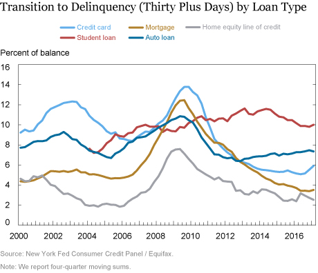
While we continue to include the stock delinquency rate in our data releases, today’s report introduces two new charts. The first chart, shown below, depicts an annualized share of balances transitioning into delinquency. We calculate this as the balances that have newly become at least thirty days late in the reference quarter divided by the balances that were current in the previous quarter. This rate can be interpreted as the percentage of balances that were current in the previous quarter that borrowers have missed a payment on since then. There are a few things to note in this chart. First, delinquency transitions all peaked in the midst of the Great Recession. And second, for the most part, flow delinquency rates on all products currently are similar to or lower than they’ve been at any point since 2000. Also significant are the upward trend in the delinquency transition rate for auto loans in recent years and a recent uptick in new credit card delinquencies. Note that we only show the delinquency flow series for student loans starting from 2004, due to an earlier credit reporting issue.

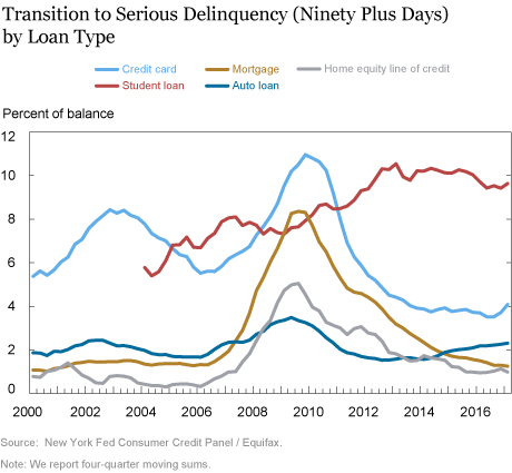
Our second chart shows the flow into serious delinquency, defined as balances that have newly become ninety or more days delinquent in the reference quarter divided by the balances that were either current or less than ninety days past due during the previous quarter. Flows into serious delinquency for all loan types except for student loans peaked during the Great Recession and are currently low or very low compared with historical levels. The chart also reveals a rise in flows into serious delinquency between 2001 and 2003, during the recession and “jobless recovery” for credit cards, for auto loans, and somewhat less so for mortgages. More recently, performance on mortgages has continued to improve, while auto loan delinquency flows have been trending upward since 2012. Credit card transitions have also ticked up. The standout, however, has been student loans—with new serious delinquency flows that deteriorated steadily between 2004 and 2014 and have remained stubbornly high since then.

The Great Recession led to a household borrowing situation in America that was very different from what we’d seen historically, but in 2007 when the financial crisis began to unfold, there was much less data available to economists on the state of household balance sheets. With better information now, we will continue to share new developments and analysis in the area of household debt.
Disclaimer
The views expressed in this post are those of the authors and do not necessarily reflect the position of the Federal Reserve Bank of New York or the Federal Reserve System. Any errors or omissions are the responsibility of the authors.
 Andrew F. Haughwout is a senior vice president in the Federal Research Bank of New York’s Research and Statistics Group.
 Donghoon Lee is an officer in the Bank’s Research and Statistics Group.
 Joelle Scally is the administrator of the Center for Microeconomic Data in the Bank’s Research and Statistics Group.
 Wilbert van der Klaauw is a senior vice president in the Bank’s Research and Statistics Group.
How to cite this blog post:
Andrew F. Haughwout, Donghoon Lee, Joelle Scally, and Wilbert van der Klaauw, “Household Borrowing in Historical Perspective,” Federal Reserve Bank of New York Liberty Street Economics (blog), May 17, 2017, http://libertystreeteconomics.newyorkfed.org/2017/05/household-borrowing-in-historical-perspective.html.


 RSS Feed
 Follow Liberty Street Economics