On December 9, 2015, Third Avenue Focused Credit Fund (FCF) announced a “Plan of Liquidation,” effectively halting investor redemptions. This announcement followed a period of poor performance and large outflows. Assets at the fund had declined from a peak of $2.5 billion in May of 2015 to $942 million in November. Investors had redeemed more than $1.1 billion in shares since April 2015, and the fund’s year-to-date performance as of November had fallen below -21 percent. The FCF “run” highlights the need to quantify the potential for systemic risk among open-end mutual funds and the potential for contagion in the event of more widespread runs on other vulnerable funds. In this post, we first characterize open-end mutual funds that seem vulnerable to redemptions in much the same way as FCF. We then analyze the potential for fire-sale spillovers to other mutual funds if large redemptions in “at-risk” funds were to occur.
Identifying At-Risk Funds
We focus on a sample of funds similar to FCF, consisting of high-yield, corporate bond, and multisector funds (we term these funds “high-yield [HY] funds”). The left panel in the chart below shows the distribution of six-month cumulative returns for these funds ending in September 2015 (blue line) and compares it with the distribution for the same set of funds calculated for the six months ending in March 2014 (red line).
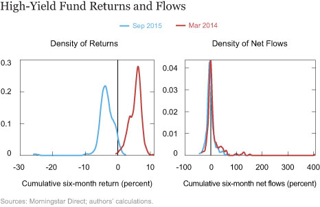
The panel illustrates the deterioration in performance between those months. This deterioration may indicate heightened vulnerability to redemptions. However, bad performance, per se, does not necessarily drive outflows. The right panel in the chart above shows the distribution of net flows over the six months ending in September 2015 and ending in March 2014. While outflows have increased recently, the difference in outflows is considerably less stark than the difference in returns.
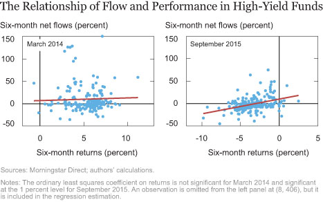
This finding may indicate that investors react to situations in which their fund is outperformed by others—that is, investors increase or decrease their investment based on their fund’s performance relative to its peers. In fact, flows are positively related to returns in the cross section of the data (see chart below). Indeed, this relationship appears stronger since early 2014. This confirms our expectation that funds with worse relative performance are at risk of greater outflows.
The Potential for Fire-Sale Spillovers
In “Are Asset Managers Vulnerable to Fire Sales?” we show that funds can be vulnerable to runs because of a first-mover advantage held by investors that redeem early. When facing small redemptions, a fund will pay out using its liquidity buffer to avoid liquidation losses, but when redemptions exceed the liquidity buffer, the fund will have to fire-sell assets to pay investors. When a fund holds relatively illiquid assets, such as the distressed corporate bonds held by FCF, the marketwide price impact of liquidation can spill over significantly to other funds holding the same assets.
To quantify spillover effects, we consider a hypothetical scenario in which redemptions spread progressively, starting with the most at-risk funds. For each affected fund, we assume that 50 percent of its investors redeem their shares so that it has to liquidate 50 percent of its assets. We rank at-risk funds using three criteria:
- poor cumulative absolute returns over the past six months,
- large net outflows over the past six months, and
- illiquid portfolios as measured by the average coupon on the fund’s holdings.
We shock funds progressively according to their rankings by those metrics. Each metric is intended to capture fund characteristics that, in light of the FCF run, might lead investors to try to exit before everyone else. Investors commonly track funds’ returns and flows, so their attention will be focused on the worst fund by these metrics, making coordination more likely. The illiquidity metric directly captures funds where the benefit to an investor of exiting first should be greatest since it implies that an investor exiting early imposes higher liquidation costs on investors remaining in the fund.
For each additional fund shocked, we compute the amount of liquidations required to meet the triggered withdrawals. The exercise is similar to the one described in the post cited at the beginning of this section. We assume that funds liquidate assets in proportion to their share in the portfolio; we then calculate the resulting impact of the fire sales on prices, and to make our stress test macroprudential, we aggregate the spillover losses calculated for all U.S. open-end funds holding any of the fire-sold assets. The chart below shows the results of our progressive redemption shock to HY funds.
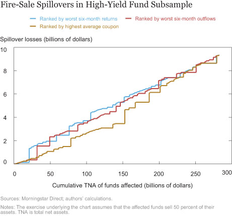
The aggregate total net assets (TNA) of funds that eventually become subject to the redemption shock is approximately $280 billion. The lines are step functions, depicting the marginal contribution of each additional fund (measured by total net assets) to aggregate spillover losses. Of the high-yield funds in our sample, FCF had the worst six-month return and the fourth largest six-month outflows, and was the most illiquid (highest coupon)—all factors that may explain its demise.
Spillover losses accumulate roughly linearly as more funds are shocked, meaning that each additional dollar of TNA shocked yields an approximately constant dollar amount of spillovers on the broader population of mutual funds. Irrespective of which ranking is used to define the at-risk group, the simulation indicates that for each dollar of TNA shocked, the spillover to the broader population of funds is around six to seven cents. If all $280 billion of funds in our sample suffered the 50 percent redemption shock, spillover losses would amount to almost $9 billion for the whole open-end mutual fund sector. In this set of funds, no particular fund seems capable—by virtue of its size or asset holdings—to impose significant large fire-sale spillovers on its own.
Who Suffers from the Spillovers?
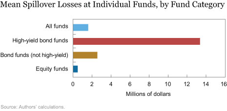
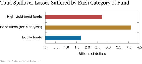
The charts below show the distribution of the spillover losses across types of mutual funds. They reveal that, in the most extreme redemption shock scenario (in which the entire sample of HY bond funds are shocked), the funds that suffer the most severe spillover losses are the HY funds that receive the shock themselves. It is important to note that the spillover losses at these funds do not include the losses due to the initial shock. High-yield funds suffer spillover losses amounting to $13 million per fund on average. Other fixed-income funds lose about $2.5 million on average, and equity funds lose $500,000 on average. In our model, fixed-income funds are more vulnerable to spillover losses than equity funds because their asset holdings overlap more with those of the high-yield funds that are fire-selling. Interestingly, even though individual high-yield funds suffer the largest average losses, fixed-income funds other than high-yield funds as a group suffer the greatest total losses—slightly more than $4 billion. The reason is that high-yield funds as a group are much smaller than other fixed-income funds.
To sum up, our analysis shows that high-yield mutual funds, which share some common features with Third Avenue FCF, hold approximately $280 billion in assets. If these funds experienced a run, forcing each fund to liquidate half its assets, we estimate that the associated fire-sale spillover losses in the entire universe of mutual funds would be about $9 billion. These fire-sale spillovers amount to six to seven cents for each dollar of shocked TNA. These numbers seem relatively small and nonsystemic, although they reflect the specific set of assumptions illustrated above. Under alternative scenarios—for example, allowing for larger or nonlinear price effects—the fire-sale consequences of run events for funds might be significantly more severe.
Disclaimer
The views expressed in this post are those of the authors and do not necessarily reflect the position of the Federal Reserve Bank of New York or the Federal Reserve System. Any errors or omissions are the responsibility of the authors.

Nicola Cetorelli is an assistant vice president in the Federal Reserve Bank of New York’s Research and Statistics Group.

Fernando M. Duarte is an economist in the Research and Statistics Group.

Thomas M. Eisenbach is an economist in the Research and Statistics Group.

Emily Eisner is a senior research analyst in the Research and Statistics Group.


 RSS Feed
 Follow Liberty Street Economics
Yesterday’s Fed blog assumed that spillover effects existed after bond mutual fund outflows, and was based solely on a theoretical “calibrated” model. The authors failed to look at actual experience during the “Taper Tantrum”, or at the historical data that demonstrate the absence of such spillover effects. Today’s blog is even further divorced from reality. This blog appears to assume a 50 percent outflow across high-yield bond mutual funds, to get spillover effects that the authors admit are “relatively small and nonsystemic.” ICI recently published data on weekly high-yield bond mutual fund flows going back to 2010, enabling policymakers to get a sense of how large those flows were relative to assets. For more information, see https://www.ici.org/viewpoints/view_15_hybf_flows. Simply put, the assumption of 50 percent outflows across high-yield bond funds is not supported by historical data. In fact, it is very rare for weekly inflows or outflows to exceed 2 percent of assets in any given week; for all of 2015, cumulative outflows from high-yield bond mutual funds, excluding floating-rate funds, were well under 10 percent of assets. Looking at annual flow data back to 2000, the blog’s shock assumption is about five times larger than any actual annual outflow experienced by high-yield bond mutual funds in aggregate. This makes us curious about other assumptions embedded in the analysis. -Sean Collins and Chris Plantier, Investment Company Institute