How much someone earns is an important determinant of many significant decisions over the course of a lifetime. Therefore, understanding how and why earnings are dispersed across individuals is central to understanding dispersion in a wide range of areas such as durable and non-durable consumption expenditures, debt, hours worked, and even health. Drawing on a recent New York Fed staff report “What Do Data on Millions of U.S. Workers Reveal about Life-Cycle Earnings Risks?”, this blog post investigates the nature of earnings inequality over a lifetime. It finds that earnings are subject to significant downside risk and that such risk contributes substantially to overall earnings dispersion.
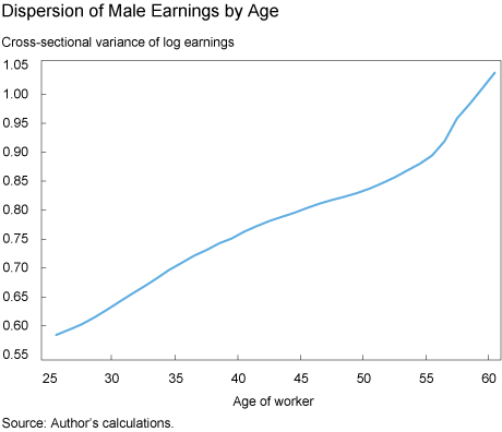
Salary and wage data from 33 years of W-2 forms (more than 200 million observations) show how much earnings inequality among men increases with age. (Here I focus on the earnings dynamics of men. My colleagues and I are currently undertaking a similar study that focuses on the earnings dynamics of women.) The chart below plots the variance of how much men earn from age twenty-five to sixty. While earnings are quite dispersed among twenty-five-year-olds, dispersion increases dramatically over the next thirty-five years.
What accounts for this fanning out? One potential explanation is that earnings trends differ across individuals, which leads to greater divergence as a cohort ages. Another possibility is that certain events over the course of an individual’s career—some of which are largely unforeseeable, such as job losses and health shocks, and others more driven by circumstances, such as landing a dream job, or getting a promotion and salary raise—accumulate and cause earnings to diverge.
The first explanation may be interpreted as stemming from differences in permanent abilities and has to do with human capital investments before labor market entry. If this is the more important component affecting the dispersion of earnings quantitatively, this would call for policies related to human capital accumulation. The second explanation relates more to labor market risk, and may call for specific social policies that provide insurance against these types of risks.
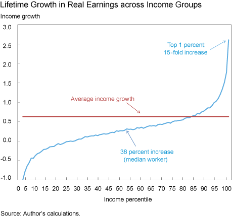
To investigate which factor is more important, I take a close look at how earnings growth over a career differs across people. In the chart below, men are grouped into percentiles of total lifetime income (income earned between ages twenty-five and sixty). The chart shows that the median worker in the income distribution experiences about a 38 percent rise in his real earnings between ages twenty-five and sixty. There is an impressive amount of heterogeneity: Workers below the 20th percentile actually experience a decline in earnings, while those in the top 1 percent experience a fifteenfold increase.
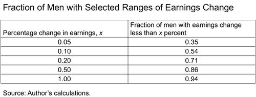
But what happens to earnings from one year to the next? The table below shows the segment of workers who experience a percent change in earnings that is less than some value x. Annual earnings changes are quite concentrated and small for most; about 50 percent of people experience a change in their earnings of less than 10 percentage points. But earnings changes can be quite dramatic for a small fraction: about 6 percent of the men in our sample have a change in labor earnings that is larger than 100 percentage points. Such huge changes can potentially explain why people end up with very different earnings profiles during their career.
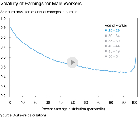
Is there systematic variation in the volatility of earnings across workers? The following interactive chart shows the standard deviation of changes in earnings against age and earnings over the past five years (recent earnings). Several striking features emerge. At all ages, earnings are most volatile at the bottom of the distribution and this volatility declines with earnings to a point. One explanation is that unemployment risk declines as earnings increase. Interestingly, volatility starts to rise toward the upper end of the earnings distribution and it ends up higher for top income earners than it is for median earners.
There is also important life-cycle variation in how much earnings fluctuate on an annual basis. Volatility of earnings tends to decrease between the ages of twenty-five and forty-five and to increase thereafter. This result is consistent with the view that younger workers change jobs frequently as they try to figure out the best fit for them. They also experience more unemployment spells, which contribute to earnings variability. An exception to the life-cycle variation described above is the top income earners. Their variability tends to be lower when young and increase with age.
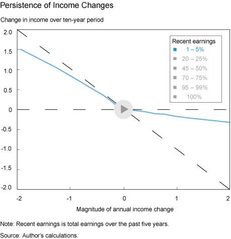
How persistent are earnings changes? If they are quite persistent, then they might accumulate over the course of a career and contribute to a wider dispersion of earnings. This possibility is explored in the interactive chart below, which shows changes in earnings for men at different income levels. More specifically, the chart below shows the change in income over a ten-year period following a group of individuals who experience an income change of a given magnitude. To illustrate differences in dynamics across the income distribution, these are shown for six income groups. If earnings changes were completely permanent, one would not expect a further change in earnings and the data would line up on the dashed horizontal line. If, on the other extreme, earnings changes are completely transitory, then one would expect these individuals to experience an opposing change in income, either positive or negative, of the same magnitude and reach a similar income level. In this case, the data would line up on the negative 45-degree line.
Data show that negative shocks to those in the lowest income group (solid blue line) are quite transitory, with a mean reversion of about 80 percent, whereas positive shocks are quite persistent, with only about a 20 percent reversion to the mean after 10 years. As we move up the earnings distribution, the positive and negative branches of the line for each income group rotate in opposite directions, so that for those in the highest earnings group, we have the opposite pattern: negative changes to income tend to be almost permanent, while positive changes tend to be quite transitory.
Overall, these findings show that earnings are quite volatile, and that the nature of earnings risk varies for different groups of male workers, contributing to the level of earnings dispersion.
Disclaimer
The views expressed in this post are those of the author and do not necessarily reflect the position of the Federal Reserve Bank of New York or the Federal Reserve System. Any errors or omissions are the responsibility of the author.

Fatih Karahan is an economist in the Federal Reserve Bank of New York’s Research and Statistics Group.


 RSS Feed
 Follow Liberty Street Economics