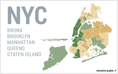
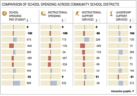
This morning, the Federal Reserve Bank of New York released a set of interactive visuals that present data on school spending and its various components—such as instructional spending, instructional support, leadership support, and building services spending—across all thirty-two community school districts (CSD) in New York City and map their progression over time. A key feature of these interactive visuals is that they present the data in two forms: as adjusted data, which control for student categories that receive differential funding from the City based on their needs, and as raw data that do not include this adjustment. The interactive features allow the user to easily view (and compare) the adjusted and raw data, to observe trends for different spending categories, and to compare spending profiles across community school districts for each form of data. Demographic and socioeconomic characteristics of each CSD can be viewed by clicking on the district of interest. Our purpose is to make data on education finance and education indicators more accessible to a broader audience, including education researchers.
The adjusted data control for many of the student groups that receive differential funding under New York City’s Fair Student Funding (FSF) formula, which was proposed by Chancellor Joel I. Klein nearly a decade ago. Among the many factors that contribute to funding allocation are the percentage of students eligible for free or reduced-price lunch, the percentage of special education students, the percentage of English language learners, the percentage of students with individualized education programs, and the grade distribution of a CSD’s student population (in other words, the percentage of students in grade ranges K-5, 6-8, and 9-12), and our adjusted data control for these. Other formula components include larger weights for low-performing students and differential weights for high schools with special missions, such as career and technical education schools. All figures in the adjusted data are presented relative to New York City as a whole.
We built the data set using information obtained from the New York City Department of Education for the 2004-2012 school years. These numbers reflect current spending, and thus exclude capital spending (which accounts for approximately 8 percent of total spending). All spending figures are expressed in real 2012 dollars. We refer to school years by the year corresponding to the spring semester (for example, 2012 refers to the 2011-2012 school year). Below, we offer a few quick insights that are revealed in the interactive graphics.
1. A large share of the spending differences across CSDs and boroughs is explained by differences in student groups.
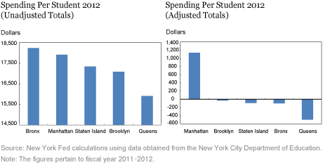
The adjusted data reveal a more equal distribution than the unadjusted figures suggest. In each year, the difference between the two CSDs with the lowest and highest relative funding levels is smaller in the adjusted data set: For instance, in 2012, this gap was roughly $5,000 in the unadjusted data but just over $3,000 after adjustments. A similar trend is also borne out at the borough level. In 2012, the unadjusted gap between the highest-funded and lowest-funded boroughs (Manhattan and Queens, respectively) was $2,300, while the difference between the corresponding adjusted figures was $1,600. A tabular view into our data is available by clicking on the Comparative View tab of the interactive.
The fact that adjusted totals are more closely grouped than their raw counterparts suggests that a portion of the variance in spending across CSDs and boroughs is attributable to geographic differences in composition of these student groups, exactly as would be expected under the FSF guidelines. In contrast to the raw totals, which increase steadily over our time period (except in post-stimulus years), the adjusted spending figures are fairly stable over time, which is largely attributable to the fact that the proportions of the various needs-based student populations increased over time. For more insight from the raw data, please see our previous post in this series.
2. Between-CSD differences in adjusted spending have remained relatively flat over time.
One might expect that adjusted district-level funding would become more homogeneous in the later years, because the FSF allocation formula was not used during the earliest years of our data and the formula was phased in over time. However, the interquartile range (IQR)—the difference between the CSD that is in the 75th percentile in terms of funding and the CSD in the 25th percentile—in the adjusted data does not uniformly decline after the implementation of the formula. The IQR reaches its nadir in 2008 and then rises until 2010 before falling over the next two school years. These patterns are in part a reflection of the decline in funding during the initial recession years, the inflow of American Recovery and Reinvestment Act (ARRA) stimulus money in 2010, and subsequent budget pressures as the stimulus funding dried up. Throughout our data span, the IQR lies in the $500-$1,500 range for adjusted data and in the $1,500-$2,000 range for the raw data.
3. Some geographic variation in school spending persists even after we adjust for compositional effects.
We find that the geography of differential spending is ameliorated but not eliminated by our adjustment measures. Taking 2012 as an example, we see below that borough-level dissimilarities remain (although they are less prominent). Interestingly, the relative ordering of spending by borough changes when we compare the adjusted and unadjusted totals. In the unadjusted figures, the Bronx has the highest per pupil spending, but in the adjusted totals, Manhattan is the clear winner. In each case, Queens has the lowest per pupil spending.

There are many potential reasons for the post-adjustment geographic differences. One factor contributing to the persistent variation between districts is that the Fair Student Funding formula was never fully implemented, largely because of recessionary pressures on school funding. Funding reductions that were mandated in the wake of the downturn cut across need levels and did not fully take FSF adjustments into account. Because the recession of 2007-09 hit just as FSF was getting started, the recession acted as a counterweight to the goals of the program. In 2012, 94 percent of schools did not receive the full funding that the formula suggested. Additionally, some external sources of funding were grandfathered in to the system, and these sources were not generally allocated based on student need. Instead, these sources tended to be based on teacher salary levels at a school prior to 2008, meaning that wealthier school districts reaped many of the benefits from these sources. Though the original mandate for FSF guaranteed these additional disbursements for only two years after implementation, as of 2013, these non-formula-driven sources remained in place. Finally, owing to data limitations, we are not able to adjust for all factors considered in the FSF formula. Speaking broadly though, our findings show that adjusting for differential needs-based populations does serve to mitigate the differences in spending across geographies. Understanding the remaining differences would be an important subject of future study.
Disclaimer
The views expressed in this post are those of the authors and do not necessarily reflect the position of the Federal Reserve Bank of New York or the Federal Reserve System. Any errors or omissions are the responsibility of the authors.

Rajashri Chakrabarti is a senior economist in the Federal Reserve Bank of New York’s Research and Statistics Group.
 Michael Stewart is a former senior research analyst in the Research and Statistics Group.
How to cite this blog post:
Rajashri Chakrabarti and Michael Stewart, “Just Released: Mapping the Differences in School Spending in New York City,” Federal Reserve Bank of New York Liberty Street Economics (blog), June 6, 2016, http://libertystreeteconomics.newyorkfed.org/2016/05/just-released-mapping-the-differences-in-school-spending-in-new-york-city.html.


 RSS Feed
 Follow Liberty Street Economics