In yesterday’s post, we discussed the extreme swings that household leverage has taken since 2005, using combined loan-to-value (CLTV) ratios for housing as our metric. We also explored the risks that current household leverage presents in the event of a significant downturn in prices. Today we reverse the perspective, and consider housing equity—the value of housing net of all debt for which it serves as collateral. For the majority of households, housing equity is the principal form of wealth, other than human capital, and it thus represents an important form of potential collateral for borrowing. In that sense, housing equity is an opportunity in the same way that housing leverage is a risk. It turns out that aggregate housing equity at the end of 2015 was very close, in nominal terms, to its pre-crisis (2005) level. But housing wealth has moved to a different group of people—made up of people who are older and have higher credit scores than a decade ago. In today’s post, we look at the evolution of housing equity and its owners.
Before we begin, we want to carefully distinguish between home ownership and equity ownership. When homeowners are asked, “What is your house worth?,” they naturally reply with the (gross) sales value they think their home would command in the marketplace. Essentially all homeowners would answer this question with a positive number. Housing equity, by contrast, is a more complex concept: it tells us what the owner would get after selling the house and paying off all the debts it collateralizes—typically a first-lien mortgage and sometimes one or more junior liens as well. (Of course, to actually sell a house, an owner will probably have to pay additional amounts like taxes and broker fees, but we ignore those costs here.) So we note that it is possible—and in recent years has been quite common—for a homeowner to have little or negative equity in the property to which their name is attached, because the value of the debt equals or exceeds the value of the home. We’ll discuss this distinction much more in Thursday’s post.
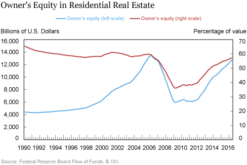
Since leverage and equity are closely related concepts, it’s not surprising that aggregate equity has changed in ways that mirror changes in leverage. The red line in the chart below shows aggregate owner’s equity in residential real estate, in billions of dollars, from 1990 to the present. The extreme housing price cycle that took place over the last twenty years is very evident in the picture. Between 1995 and 2006, the net value of residential real estate rose very quickly, peaking at nearly $13.5 trillion in the first quarter of 2006. At that level, housing equity comprises a very major part of the wealth held by American households—over 20 percent of the $64 trillion total reported in the Federal Reserve Board’s Flow of Funds for 2006:Q1.
Equally important, however, is the distribution of different kinds of wealth. Most of the non-housing wealth is in financial assets whose ownership is concentrated in a relatively small share of the households. In fact, previous research indicates that for the great majority of households—probably over 90 percent—housing equity is the main store of wealth and dominates the asset side of the balance sheet.

Equity Rising Again
Much of the gain in housing equity evaporated quickly after 2006: rapid price declines outpaced slow reductions in housing debt, erasing almost $7.5 trillion of aggregate owner’s equity by early 2009. Between 2009 and 2011, equity was little changed as prices leveled off and mortgage debt continued to decline. Starting in 2012, prices began to rise, yet unlike the first part of the 2000s, housing debt has remained subdued, so equity again has been rising. By mid-2016, homeowner’s equity was very close to where it had been in late 2005, just prior to the bust.
These dynamics are themselves interesting, but looking at averages and aggregates can be misleading, as yesterday’s post emphasized. And it turns out that there have been interesting changes in the distribution of home equity over the last decade.
Before describing those changes, it’s worthwhile to distinguish between two forms of homeownership (and two groups of housing equity holders). First are people who own their homes free and clear, without debt of any kind. According to 2015 American Community Survey (ACS) data, about one-third of owner-occupied homes corresponding to 44 percent of total net housing wealth is held free and clear. The ACS relies on self-reported house values, but has the advantage of also revealing the owner’s age and (self-reported) income. Like a recent Urban Institute analysis, we find that properties owned free and clear tend to be held by older people—64 percent of this wealth is held by people over 60 years of age, a figure which has held basically constant since 2005. The value of housing owned free and clear has become somewhat more concentrated at the top of the income distribution over that period.
An Increasing Divide
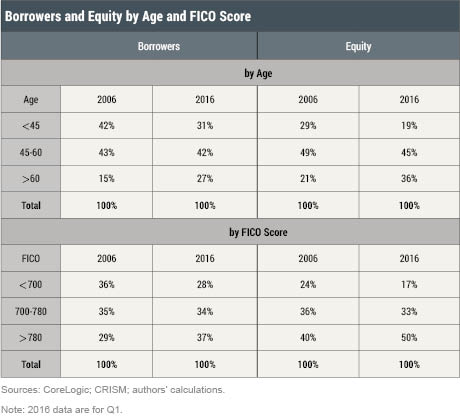
For homeowners who have debt, we can use the novel combination of CoreLogic and CRISM data that we discussed in yesterday’s post. We find that for this population, equity has shifted more substantially over time, as shown in the two tables below. On the left, we see that while mortgage borrowers have gotten older (the share of borrowers over 60 has risen from 15 percent to 27 percent since 2006), older borrowers’ share of housing equity has increased even more. By early 2016, older borrowers held over one-third of the housing equity, up from one-fifth in 2006. Equity held by young borrowers (below 45 years of age) slipped from 29 percent to 19 percent of the total. At the same time, housing equity has become increasingly concentrated in the hands of people with high credit scores. The 37 percent of mortgage borrowers with current FICO scores above 780—these are very highly creditworthy borrowers—now hold half of all borrowers’ housing equity, up from about 40 percent a decade ago.

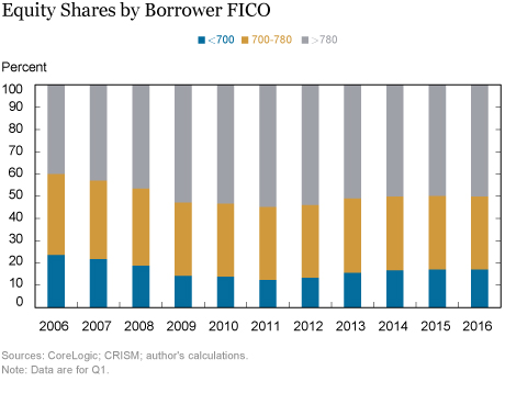
What happened? The chart below shows that the relationship between the borrower’s FICO score and equity changed the most while prices were falling, between 2006 and 2011. By the first quarter of 2011, borrowers with FICO scores over 780 controlled almost 55 percent of all the equity held by borrowers. This share actually declined a little after 2012, closing the period, as noted above, at 50 percent. The age chart looks similar, with most of the action occurring by 2011.

This might suggest that differential exposure to price declines can explain the changes over the decade. But this story is a little too simple. In fact, even if everyone had experienced the same price differences rather than the differences we actually observe in the data, the same shifts would have taken place and 2016 shares would all be within one percentage point of the levels we report above. Rather, it is differences in the pace at which debt is paid down that is probably behind these shifts. Higher credit score borrowers who are farther along in their mortgage contracts are paying considerably more principal for every dollar of mortgage payment, an effect that has become very important in the last several years.
Whatever its source, this shift of equity toward older and more creditworthy borrowers is interesting for several reasons. First, it is consistent with a more general increase in wealth inequality over the last decade or more. Housing wealth is traditionally more evenly spread across the population than is financial wealth. About 60 percent of households hold wealth in the form of a primary residence, while less than half have any kind of financial asset other than a checking account. Thus, changes in the distribution of housing wealth have important implications for the overall distribution of wealth in the nation.
Second, housing equity is the major form of collateral for borrowing by most households. So shifts in its ownership away from those who likely have a high demand for credit (the young and those with lower incomes and credit scores) will likely restrain credit growth used to finance consumption expenditures. Tomorrow, we’ll look at this dimension and what it portends for economic growth and financial stability.
Disclaimer
The views expressed in this post are those of the authors and do not necessarily reflect the position of the Federal Reserve Bank of New York or the Federal Reserve System. Any errors or omissions are the responsibility of the authors.
 Andreas Fuster is a research officer in the Federal Reserve Bank of New York’s Research and Statistics Group.
Eilidh Geddes is a senior research analyst in the Bank’s Research and Statistics Group.
 Andrew F. Haughwout is a senior vice president in the Bank’s Research and Statistics Group.
How to cite this blog post:
Andreas Fuster, Eilidh Geddes, and Andrew F. Haughwout, , “The Evolution of Home Equity Ownership,” Federal Reserve Bank of New York Liberty Street Economics (blog), February 14, 2017, http://libertystreeteconomics.newyorkfed.org/2017/02/the-evolution-of-home-equity-ownership.html.


 RSS Feed
 Follow Liberty Street Economics