However important income inequality is, it is only a partial representation of the inequality in well-being among individuals, households, counties, and other communities. At a minimum, we need to consider other crucial measures such as consumption, leisure, and health. The reason for looking at other measures is that the inequality in income per se might not translate directly into a deeper and more important concept of inequality in welfare terms. For example, Jones and Klenow state that if we were to look at GDP only, France’s living standards would be only about 60 percent those of the United States. However, once we factor in leisure and life expectancy, that figure gets closer to 85 percent, a substantial change. In essence, monetary income, and therefore income inequality, is only a part of what individuals and countries value. We apply exactly this concept to highlight the substantial amount of health inequality across counties in the United States.
It seems rather obvious that health is a fundamental component of welfare, yet more work needs to be done on analyzing the evolution of health inequality and its relationship with income inequality in a consistent framework that would allow us to draw welfare conclusions, as we do later in this blog.
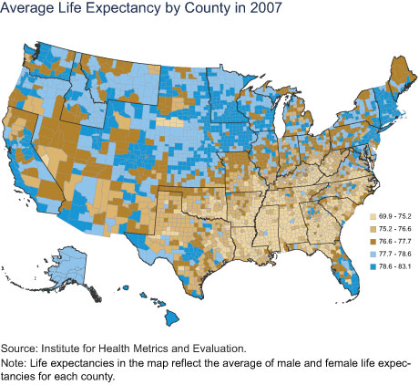
First, we document, and map below, a large dispersion in life expectancy across counties.

While we note that quality of life and morbidity are also important aspects of welfare, we focus on life expectancy as our primary measure of health. We define county life expectancy as the average number of years a person born in the reference year would live at those age-specific mortality rates that prevail in that county in that year. We draw a map of life expectancy calculated in this fashion for all the counties in the United States, grouping the data into quintiles of the life expectancy distribution, with lighter colors indicating lower life expectancy. For example, the counties in the bottom 20 percent of the life expectancy distribution, which ranges from 69.9 years to 75.2 years, are colored light gold.
From the map’s legend, we can immediately notice a very large dispersion: the top 20 percent of life expectancy is about a decade longer than the bottom 20 percent. Looking at the map also immediately tells us that the Southeast has a substantially lower life expectancy. We note that this is partly owing to differences in demography and income across counties.
Life Expectancy Has Increased but Less So in the Southeast
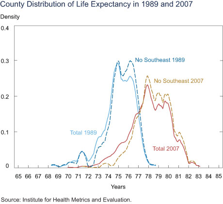
The chart below shows the distribution of life expectancy across counties in 1989 and 2007, in which counties are weighted by their population size. In less than twenty years, the average life expectancy grew by 3.1 years. However, the left tail of the longevity distribution shows much less improvement, with the lowest life expectancy growing by only 1.6 years. It is noticeable that the right tail of the distribution increased by much more, with the highest county life expectancy growing by 4.4 years. The between-county dispersion in life expectancy increased by 21 percent from 1989 to 2007.

Importantly, the differential life expectancy at the lower end dramatically diverged between the Southeast and the rest of the country between 1989 and 2007. While in 1989, the lower tail of the life expectancy distribution had many people outside the Southeast (as shown by the blue dashed curve), by 2007, there were very few people outside the Southeast in the lower tail of the life expectancy distribution (the gold dashed curve). Of course, not all Southeastern counties have low life expectancy; some parts of the Southeast (such as the Raleigh-Durham area, Nashville, Atlanta, and most of Florida, among others) are in the top quintile of the life expectancy distribution.
Income Gradient of Health over Time
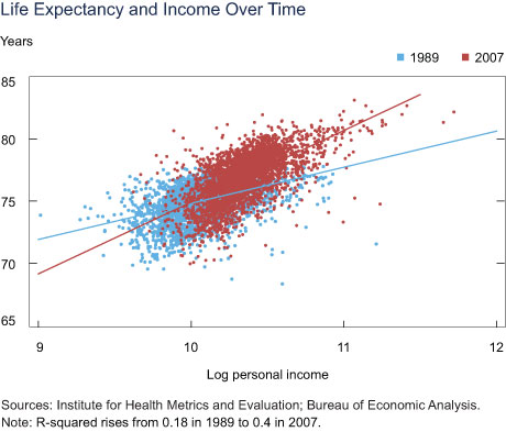
The chart below plots data on county life expectancy, computed as explained earlier, against data on real personal income, measured in 2007 U. S. dollars, for the years 1989 (in blue) and 2007 (in red). It is evident that the income gradient of health is increasing over the time period considered: in 1989, a 10 percent increase in personal income (at the county level) would be associated with an increase in life expectancy of about 0.29 years; the same association increases to 0.57 years in 2007.

Welfare Analysis
How important are these large health inequalities for welfare? To answer this question, we need to incorporate both income and life expectancy in a consistent framework for welfare analysis. We follow Jones and Klenow for this exercise and compute the welfare gains or losses resulting from income and life-expectancy changes. We imagine a decision maker who will randomly be assigned a year in the life of a random person in the United States. All people are assumed to have the mean income and life expectancy of their county (which obviously reduces inequality in both life expectancy and in income, but which is still an interesting case to consider because of the large cross-county differences in both variables). The decision maker will enjoy the consumption (or income, if savings are assumed to be low, as they typically are) of this randomly selected person but only if that person happens to stay alive for that year. So the decision maker’s utility will depend on both the person’s consumption and the person’s life expectancy (which is closely related to his or her death probability). This thought experiment provides us a way to measure the welfare associated with any particular income and life expectancy distribution and therefore the welfare gains or losses associated with some specific counterfactual distribution.
As standard, we assume diminishing marginal utility of consumption; in other words, an additional unit of consumption is worth less than the preceding unit of consumption. So the decision maker would strictly prefer to face a consumption distribution in which everyone has equal consumption. However, in the thought experiment above, it turns out that an additional year of life expectancy increases the probability of staying alive to enjoy this consumption by exactly as much as the previous year of life expectancy, which means that people do not have diminishing marginal utility for life expectancy (we abstract from possible deterioration in quality of life as people age).
We can then use this framework to ask what the decision maker would prefer more: fully equalizing consumption or increasing low life expectancies to some benchmark. We have seen that a large part of the lower tail of life expectancy (below age 77 in 2007) is accounted for by counties in the Southeast. We also know that this wasn’t always the case; as late as 1989, the lower tail of life expectancy had many people outside the Southeast, but by 2007, most of the areas in which these people lived had increased their life expectancy to be outside this tail. So it does not seem unreasonable to ask what would be the welfare consequences if the life expectancies in all counties in the lower tail were increased at least up to 77. We can compute that the decision maker would agree to lower all consumption levels by 4.88 percent (in perpetuity) in exchange for this increase in average life expectancy for these counties. However, while the decision maker would value full equalization of average consumption across counties because of diminishing marginal utility, she would be willing to lower all consumption levels only by 3.07 percent (in perpetuity) in exchange for such an equalization of consumption.
From this result, we conclude that raising life expectancy out of the lower tail would be a much more welfare-improving intervention than fully equalizing consumpt
ion. (We get analogous results if we ask by how much the decision maker would need to have all consumption levels raised in order to be indifferent between the current consumption and life expectancy distribution and the proposed intervention).
Health is a Key Component of Inequality
In terms of welfare (under standard assumptions on the welfare function), the elimination of the left tail of mortality would have a beneficial impact that is about 60 percent larger than full consumption equalization.
What are the policies that might eliminate the lower tail of the life-expectancy distribution? This remains a topic for further discussion. However, we observe that the increase in life expectancy that we need to achieve the elimination of the lower tail is not unprecedented. Over a span of twenty years, life expectancy increased on average by three years across U.S. counties, which would be sufficient to raise the lower tail substantially.
Disclaimer
The views expressed in this post are those of the authors and do not necessarily reflect the position of the Federal Reserve Bank of New York or the Federal Reserve System. Any errors or omissions are the responsibility of the authors.

Giacomo De Giorgi is a senior economist in the Federal Reserve Bank of New York’s Research and Statistics Group.

Maxim Pinkovskiy is an economist in the Group.


 RSS Feed
 Follow Liberty Street Economics
The mobility of healthy wealthy people into increasingly economically segregated counties could confound this analysis. If nobody ever moved, I’d be more inclined to accept your assessment. Since there has been a substantial movement towards living in income-segregated neighborhoods / counties over the last 20 years, I suspect this may explain the increased R-squared in the Life Expectancy and Income Over Time Chart. I’m always skeptical of analyses on summarized data. Simpson’s Paradox sometimes confounds such studies. One way to verify some of these claims would be to plot individual lifetimes against income for those who died this year and compare it to those who died 20 years ago. Do this without regard to places lived or died. If healthy, wealthy, elderly “snowbird” Ohioans tend to congregate in south Florida for retirement, you might expect to see brown on the Ohio map and blue in south Florida. I’m not saying that your analysis isn’t true – you just haven’t convinced me.
It would be interesting to see an analysis of the impact of the 2008 credit crisis, perhaps starting earlier with the increase in foreclosures, and a comparison of states that provide health insurance through ACA or Medicare with those that do not do so.