The introduction of numerous social distancing policies across the United States, combined with voluntary pullbacks in activity as responses to the COVID-19 outbreak, resulted in differences emerging in the types of work that were done from home and those that were not. Workers at businesses more likely to require in-person work—for example, some, but not all, workers in healthcare, retail, agriculture and construction—continued to come in on a regular basis. In contrast, workers in many other businesses, such as IT and finance, were generally better able to switch to working from home rather than commuting daily to work. In this post, we aim to understand whether following the onset of the pandemic there was a wedge in the incidence of commuting for work across income and race. And how did this difference, if any, change as the economy slowly recovered? We take advantage of a unique data source, SafeGraph cell phone data, to identify workers who continued to commute to work in low income versus higher income and majority-minority (MM) versus other counties.
Data and Background
In line with an earlier Liberty Street Economics post, we use data on race and income composition at the county level from the 2014-18 waves of the American Community Survey to differentiate between low-income and higher income counties, and MM and other counties. We define low-income counties as those that fall in the lowest quartile of the population weighted distribution of median household income. We define MM counties as those in which at least half the population is Hispanic and/or non-Hispanic Black.
In order to capture differences in commuting to work behavior across counties, we make use of SafeGraph’s aggregated and anonymized cell phone mobility data. This data determines the typical nighttime location of each mobile device, which is referred to as the device’s “home.” The subsequent mobility that shows time spent away from home is then used to determine the full-time and part-time work behavior. For example, a device that leaves home at 8 a.m. on weekdays, goes to the same location each weekday and returns home at 6 p.m. is typically coded as belonging to a full-time worker, while a device that is seen to spend 3-4 hours during the workday at a location other than the home location is coded as belonging to a part-time worker. We look at variations in these measures across the different counties using data through January 9, 2021.
In the time leading up to the pandemic, we see that SafeGraph captures people going to work both full time and part time. This would include all types of work, both work that needed to be done in the workplace and work that could be done at home if needed. However, when COVID-19 struck, most U.S. states issued shelter-in-place and stay-at-home orders. Almost all occupations and industries that had the ability to work from home, switched immediately to such work-from-home postures. Industries that required in-person engagement, or had a very low work-from-home ability continued to have workers coming in for full-time or part-time work. SafeGraph’s cell phone data enables us to identify the work-from-home and commuting-to-work patterns across counties both before and after the onset of the pandemic. We leverage the differences of these patterns across low-income versus higher income and MM versus other counties in the analysis below.
Differences in Commuting to Work by Income
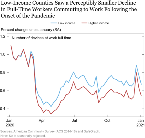
We now turn to look at the differences in commuting to work as captured by number of devices at work full time and part time, by income. In the graph below, we see no difference in number of devices at work full time between low-income and higher income counties in the pre-COVID period, and a drastic decline in all devices going to work starting in the week of March 15, 2020. However, we see that this decline is much higher for higher income counties, implying that more workers in such counties were able to shift to working from home. In contrast, lower income counties saw a perceptibly smaller decline in the devices at work, suggesting that these counties had a higher incidence of workers who could not transition to working from home and continued to travel to work.
Since our data draws on mobile data, workers voluntarily or involuntarily leaving jobs and staying at home are reflected in the dip in number of devices at home full time. It is noteworthy that high-wage employment declined considerably less than low-wage employment. So if this was the major factor driving the patterns we see below, we would see an opposite pattern. This suggests that the differences in the commuting-to-work patterns between low income and high income counties are more likely to be contributed by differences in abilities to transition to working from home.
Toward the end of April, as states started to reopen (beginning from April 24), we see a recovery in full-time workers who commuted to work, which is faster in the low-income counties. This suggests that workers residing in low-income counties are more dependent on occupations that required commuting to work. From late June onward, we see a slightly downward trend for both low income and higher income counties, before a sharp uptick near the holiday season. While we do not have definitive evidence, a potential explanation for this is that increased demand for retail and services during the holidays required more employees to be physically at work. Under this hypothesis, the larger uptick experienced in the higher income counties could have reflected a greater increase in demand in those counties. The subsequent drop corresponds to the return from the increased pace of activity during the holidays.
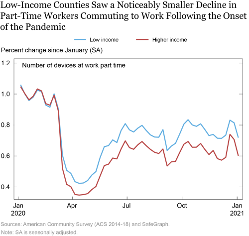
Looking at part-time work behavior, we see a similar trend. The differences between low-income counties and other counties only show up as the pandemic hits, with workers in higher income counties more likely to be able to work from home. It is interesting to note that there is a slight upward trend post recovery in both types of counties in part-time work, while the full-time work showed a slight downward trend from July onward. This may suggest a shift from commuting for full-time work to commuting for part-time jobs for some workers in the second half of the year. Relative to the full-time chart, the uptick and subsequent decline around the holiday season in part-time work are not as pronounced.
Difference in Commuting to Work by Race
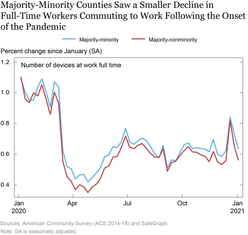
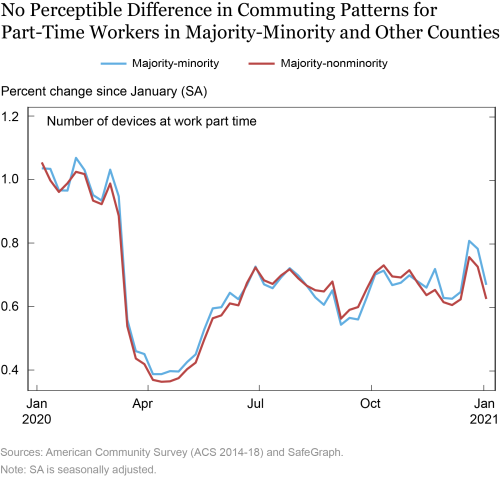
Turning to the racial differences as shown below, we see less of an overall difference between both MM and other counties across the course of the pandemic. Even before the plunge in full-time work, we see a small gap between MM and other counties in the beginning of March, which is possibly attributable to the fact a lot of firms in majority-nonminority counties started transitioning into work from home even before the shutdowns were announced. MM counties are less likely to have seen such transitioning, and as the chart depicts, also show a smaller decline in the devices at work full-time. Both MM and other counties showed a similar pattern of recovery, although the return to work is higher for MM counties suggesting that jobs held by workers in these counties are more likely to be occupations that required commuting to work and less amenable to remote work. Similar to the chart earlier based on income, we see a sharp uptick and subsequent drop around the holidays that is starker for majority-nonminority counties. The holiday uptick temporarily reduces the gap between the two types of counties, with the gap reopening subsequently.
In comparison to the full-time results presented above, the part-time work shows much smaller differences between MM and other counties throughout the course of the pandemic.
Conclusion
This post aimed to provide a high-frequency analysis of differences in full-time and part-time work commuting behavior. We found important differences in these behaviors across counties that differ by income and demographics. Although all counties experienced a sharp decline in mobility consistent with a sharp decline in commuting to work at the onset of the pandemic, followed by a subsequent partial recovery, low-income and, to a smaller extent, MM counties experienced greater commuting for work in the pandemic period. The difference in commuting between these areas and the rest of the country temporarily narrowed during peak demand times of the year, such as the holiday season. Our results are consistent with low-income and Black and Hispanic-majority communities being less able to substitute work at home for work away from home, contributing to their very high levels of vulnerability to COVID 19.
Ruchi Avtar is a senior research analyst in the Federal Reserve Bank of New York’s Research and Statistics Group.
 Rajashri Chakrabarti is a senior economist in the Bank’s Research and Statistics Group.
 Maxim Pinkovskiy is a senior economist in the Bank’s Research and Statistics Group.
How to cite this post:
Ruchi Avtar, Rajashri Chakrabarti, and Maxim Pinkovskiy, “Understanding the Racial and Income Gap in Commuting for Work Following COVID-19,” Federal Reserve Bank of New York Liberty Street Economics, February 9, 2021, https://libertystreeteconomics.newyorkfed.org/2021/02/understanding-the-racial-and-income-gap-in-commuting-for-work-following-covid-19.html.
Disclaimer
The views expressed in this post are those of the authors and do not necessarily reflect the position of the Federal Reserve Bank of New York or the Federal Reserve System. Any errors or omissions are the responsibility of the authors.


 RSS Feed
 Follow Liberty Street Economics