


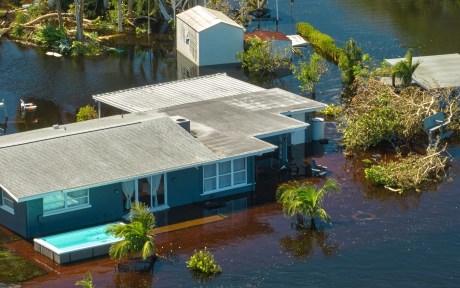
An often-overlooked aspect of flood-plain mapping is the fact that these maps designate stark boundaries, with households falling either inside or outside of areas designated as “flood zones.” Households inside flood zones must insure themselves against the possibility of disasters. However, costly insurance may have pushed lower-income households out of areas officially designated a flood risk and into physically adjacent areas. While not designated an official flood risk, Federal Emergency Management Agency (FEMA) and disaster data shows that these areas are still at considerable risk of flooding. In this post, we examine whether flood maps may have inadvertently clustered those households financially less able to bear the consequences of a disaster into areas that may still pose a significant flood risk.
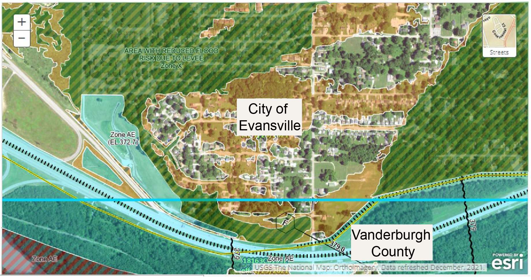
The Discrete Boundaries of FEMA Maps
The National Flood Insurance Program (NFIP) was established in 1968, following devastating floods in the Mississippi Valley. The program was intended to help minimize public exposure to possible losses resulting from disastrous floods. While the program had many other aspects, a key component was the creation of a Flood Insurance Rate Map (FIRM). These maps of U.S. communities designated regions that FEMA considered to be at risk of flooding “at least once every 100 years.” Households in these areas would be required to buy special flood insurance if they wanted to qualify for an FHA/FHFA mortgage or any mortgage from a supervised financial entity. We have discussed the program itself—as well as the possibly unintended consequences of costly insurance contracts limiting water-adjacent living to the very wealthy—in a previous post.
By their construction, FEMA’s FIRM maps must designate regions as being either inside a “special hazard” zone—and therefore at risk of flooding—or not. True flood risk, however, may not follow the same discrete steps as the maps themselves do. Of course, FEMA both designates some regions as being in a “500-year” flood zone, which are areas liable to flood once in 500 years, and provides detailed risk assessment scores of individual census tracts. However, these designations or risk scores are for information purposes only and do not require potential home buyers to purchase expensive insurance contracts. While some households do buy flood insurance even in the absence of an official mandate (NFIP data suggests that 20 percent of all payouts are to households outside of official flood zones), most do not.
In a recently updated version of our paper on the “Unintended Consequences of Mandatory Flood Insurance,” we digitize FEMA maps—current as well as historical vintages—and assess the degree to which any census tract in the U.S. is covered by a special flood hazard layer. We further create a spatial database that details the flood risk faced by neighboring and geographically proximate census tracts with similar characteristics, before merging the combined data with detailed information on individual mortgage applicants from the Home Mortgage Disclosure Act data (HMDA).
Buying in a Flood Zone
We show that mortgage applicants are, all else equal, more likely to be accepted by a lender outside of flood zones. This result holds independently of the true risk of flooding in an area, as measured by both past disasters and third-party risk scores for the neighborhood. An average applicant is 2 percentage points less likely to be accepted by a lender if applying in a flood zone. This difference is sizeable, given that we can account for all manner of borrower characteristics including credit score, income, race, and self-reported gender as well as county and census tract characteristics. However, a mortgage applicant with below-average income (relative to the county average) will be 5 percent less likely to be accepted in a flood zone compared to the same applicant in an adjacent region that is not so designated.
Given that flood maps have hard boundaries, neighborhoods adjacent to areas covered by a flood map may still be at risk of flooding. Using FEMA’s own risk scores for individual census tracts in the United States, we can see that a large number of regions without flood maps (or designated a 500-year flood zone) would still fall into the highest category of actual “flood risk.” In the chart below, we show that mortgage borrowers in these regions have on average 8 percent lower incomes than their counterparts in neighboring regions with flood maps—despite living with ostensibly the same level of risk.
Average Income in Census Tracts with Flood Risk
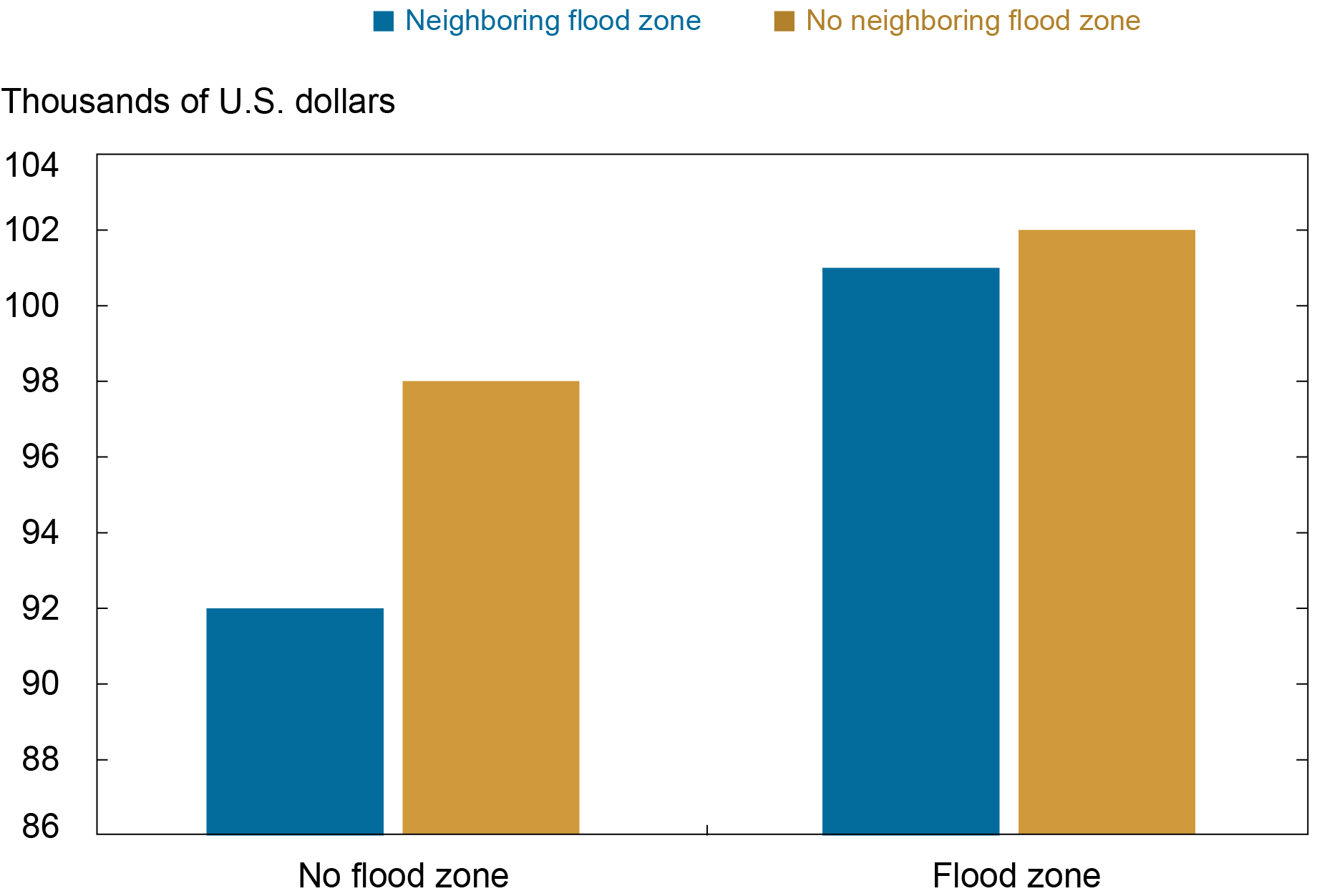
Notes: This chart depicts average incomes (winsorized to remove extremes) of accepted loan applicants in thousands of U.S. dollars in census tracts with medium or high flood risk. All applicants in tracts with designated a flood zone (that is, covered by 100-year flood maps) have higher incomes than their counterparts in the rest of the country. However, households not covered by a flood zone which are adjacent to areas with a flood map see the lowest average income of census tracts in this group of regions with flood risk. This implies a reshuffling of households may have taken place, with lower income households pushed from regions mapped into flood zones into neighboring regions without flood zones.
By looking more specifically at individual applicants—and their characteristics as well as their desired homes—in adjacent neighborhoods through the lens of a regression framework, we show that this problem is statistically significant. We find that the average income of borrowers in the unmapped regions is still 6 percent lower than the income of borrowers in the immediately adjacent neighborhoods with a flood map, even when we account for regional and borrower-specific factors. Given that these similar borrowers are often only a few hundred feet apart and face almost identical risks, this finding is worrying. Importantly, our analysis based on changes to these maps suggests these differences in income are likely related to the mandatory flood insurance that comes with the flood-zone designation and not the result of longstanding differences between neighboring regions.
Conclusion
Our findings indicate that flood mapping is associated with higher borrower income in regions that are designated a special flood hazard zone. This is likely a mechanical response to the necessity of paying for relatively expensive insurance. However, we also find that applicant income in neighboring regions is lower than in mapped regions, despite these regions often being equally risky. Moreover, changes to flood maps cause changes in the pool of applicants in mapped and neighboring regions, indicating that this is a response to the mapping itself. These results suggest that flood zone maps may cluster poorer households into risky regions that are (as yet) unmapped. This represents a considerable risk as these (uninsured) households may be economically less able to deal with the negative consequences of a disastrous flood.

Kristian Blickle is a financial research economist in Climate Risk Studies in the Federal Reserve Bank of New York’s Research and Statistics Group.

João A.C. Santos is the director of Financial Intermediation Policy Research in the Federal Reserve Bank of New York’s Research and Statistics Group.

Katherine Engelman is a data scientist in the Data and Analytics Office in the Bank’s Technology Group.

Theo Linnemann is a data scientist in the Data and Analytics Office in the Bank’s Technology Group.
How to cite this post:
Kristian Blickle, Katherine Engelman, Theo Linnemann, and João A.C. Santos, “Moving Out of a Flood Zone? That May Be Risky!,” Federal Reserve Bank of New York Liberty Street Economics, April 20, 2023, https://libertystreeteconomics.newyorkfed.org/2023/04/moving-out-of-a-flood-zone-that-may-be-risky/
BibTeX: View |

Disclaimer
The views expressed in this post are those of the author(s) and do not necessarily reflect the position of the Federal Reserve Bank of New York or the Federal Reserve System. Any errors or omissions are the responsibility of the author(s).
 RSS Feed
 Follow Liberty Street Economics