
Standard metrics point to an improvement in Treasury market liquidity in 2024 to levels last seen before the start of the current monetary policy tightening cycle. Volatility has also trended down, consistent with the improved liquidity. While at least one market functioning metric has worsened in recent months, that measure is an indirect gauge of market liquidity and suggests a level of current functioning that is far better than at the peak seen during the global financial crisis (GFC).
Why Treasury Market Liquidity Matters
The U.S. Treasury securities market is the largest and most liquid government securities market in the world, with more than $27 trillion in marketable debt outstanding (as of August 31, 2024). The securities are used by the Treasury Department to finance the U.S. government, by financial institutions to manage interest rate risk and price other financial instruments, and by the Federal Reserve to implement monetary policy. Having a liquid market is important for all of these purposes and is thus of keen interest to market participants and policymakers alike.
How Treasury Market Liquidity Is Measured
Market liquidity can be defined as the cost of quickly converting an asset into cash (or vice versa) and is measured in various ways. As in past work, I look at three common measures, estimated using high-frequency data from the interdealer market: the bid-ask spread, order book depth, and price impact. The measures are calculated for the most recently auctioned (on-the-run) two-, five-, and ten-year notes (the three most actively traded Treasury securities, as shown in this post) over New York trading hours (defined as 7 a.m. to 5 p.m., eastern time).
Treasury Market Liquidity Continues to Improve
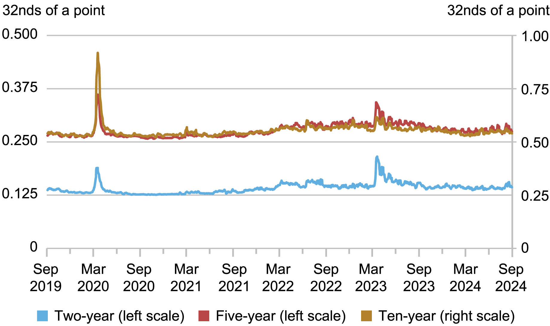
The bid-ask spread—the difference between the highest bid price and the lowest ask price for a security—is one of the most popular liquidity measures, with wider spreads implying worse liquidity. As shown in the chart below, bid-ask spreads widened during the COVID-related disruptions of March 2020 (examined in this post) and again around the banking failures of March 2023, but narrowed quickly after both episodes. Since mid-2023, spreads have been narrow and stable.
Bid-Ask Spreads Remain Narrow
Source: Author’s calculations, based on data from BrokerTec.
Notes: The chart plots five-day moving averages of average daily bid-ask spreads for the on-the-run two-, five-, and ten-year notes in the interdealer market from September 1, 2019 to August 31, 2024. Spreads are measured in 32nds of a point, where a point equals one percent of par.
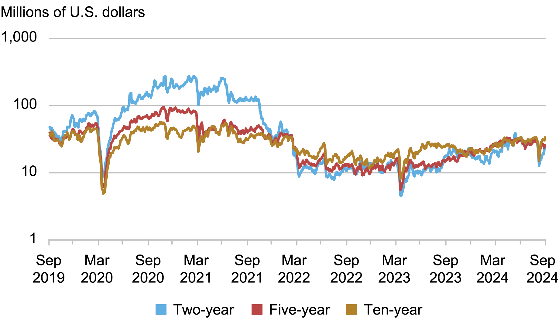
The next chart plots order book depth, measured as the average quantity of securities available for sale or purchase at the best bid and offer prices. Lower depth implies worse liquidity. Depth plunged in March 2020, recovered thereafter, and then declined again in the months around the start of the current policy rate tightening cycle in March 2022 and around the banking failures in March 2023. Depth has generally been rising since March 2023, hitting levels comparable to those of early 2022, but declined temporarily in early August 2024 around a weaker-than-expected employment report and global equity market declines.
Order Book Depth Is Increasing
Source: Author’s calculations, based on data from BrokerTec.
Notes: The chart plots five-day moving averages of average daily depth for the on-the-run two-, five-, and ten-year notes in the interdealer market from September 1, 2019 to August 31, 2024. Data are for order book depth at the inside tier, averaged across the bid and offer sides. Depth is measured in millions of U.S. dollars par and plotted on a logarithmic scale.
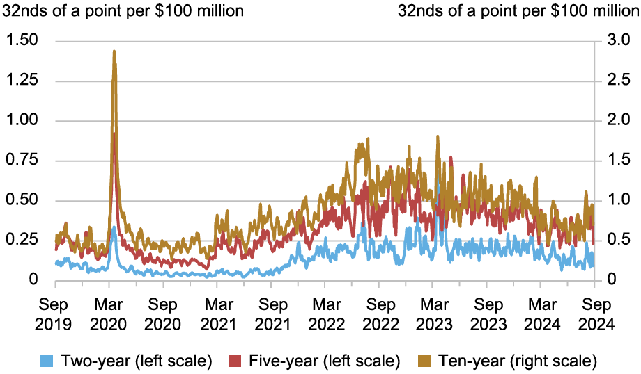
Measures of the price impact of trades also suggest an improvement in liquidity. The next chart plots the estimated price impact per $100 million in net order flow (that is, buyer-initiated trading volume less seller-initiated trading volume). A higher price impact indicates worse liquidity. Price impact rose sharply in March 2020, declined thereafter, and then increased again in the months preceding and following the start of the current tightening cycle. Price impact rose sharply again in March 2023, and then trended down to levels last seen in late 2021 or early 2022, before rising temporarily in early August 2024.
Price Impact Is Declining
Source: Author’s calculations, based on data from BrokerTec.
Notes: The chart plots five-day moving averages of slope coefficients from daily regressions of one-minute price changes on one-minute net order flow (buyer-initiated trading volume less seller-initiated trading volume) for the on-the-run two-, five-, and ten-year notes in the interdealer market from September 1, 2019 to August 31, 2024. Price impact is measured in 32nds of a point per $100 million, where a point equals one percent of par.
Treasury Volatility Continues to Moderate
Posts in 2022 and 2023 emphasized the negative relationship between liquidity and volatility. Volatility causes market makers to widen their bid-ask spreads and post less depth at any given price and for the price impact of trades to increase. It is then not surprising to find that the improvement in liquidity over the past eighteen months has been accompanied by a decrease in price volatility. Moreover, the current level of liquidity is consistent with the current level of volatility, as implied by the historical relationship between the variables.
A Conflicting Measure?
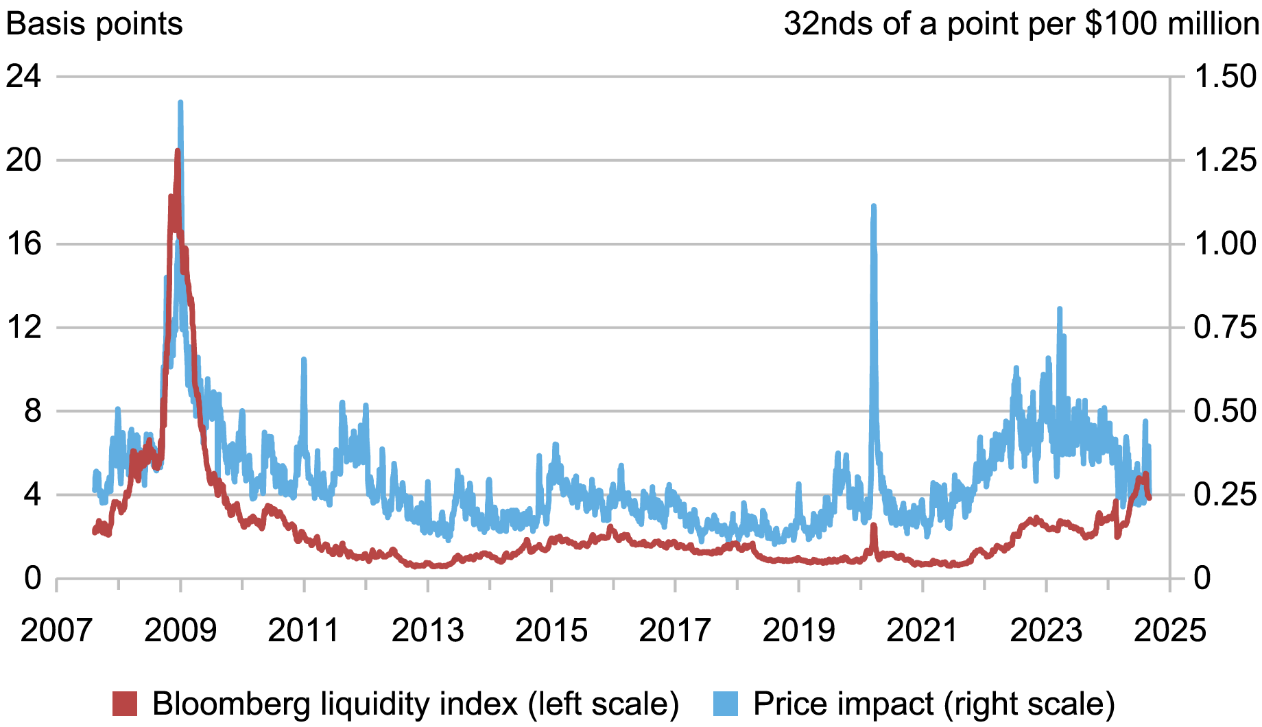
While the measures discussed so far point to liquidity that is improving and far better than it was in March 2020, this is not true for all measures. So-called yield curve “noise” measures, which gauge the dispersion of individual Treasury security yields around a smoothed yield curve, have recently risen, suggesting decreased liquidity. While dispersion does not measure liquidity directly, it is thought to reflect the amount of arbitrage capital in the market and hence serve as a proxy for liquidity (as explained in this paper). The chart below plots one such version of the measure, the Bloomberg U.S. Government Securities Liquidity Index, against our price impact measure since 2007.
Different Measures Evolve Differently
Sources: Author’s calculations, based on data from Bloomberg and BrokerTec.
Notes: The chart plots five-day moving averages of the Bloomberg U.S. Government Securities Liquidity Index and average price impact for the on-the-run two-, five-, ten-, and thirty-year securities. Price impact is calculated for each security as described in the preceding chart’s note, with each security’s price impact then weighted by the inverse of its standard deviation in calculating the cross-security average. The sample period is August 7, 2007 to August 31, 2024.
While the Bloomberg measure has recently risen, it remains far below its peak during the GFC. Moreover, it remained far below its GFC peak in March 2020 even when direct liquidity measures approached GFC levels and the Fed unleashed massive asset purchases to address the dysfunction then roiling the market (described in this paper). It follows that the recent behavior of the Bloomberg index seems less notable when examined in a longer historical context. The reasons behind the disparate performances of the different measures are an interesting area for future research.
Continued Watchfulness
While Treasury market liquidity continues to improve, continued watchfulness remains prudent. The market’s capacity to smoothly handle large trading flows has been of ongoing concern since March 2020 (as discussed in this paper), debt outstanding continues to grow, and recent empirical work shows how constraints on intermediation capacity can worsen illiquidity. Close monitoring of Treasury market liquidity, and continued efforts to improve the market’s resilience, remain appropriate.

Michael J. Fleming is the head of Capital Markets Studies in the Federal Reserve Bank of New York’s Research and Statistics Group.
How to cite this post:
Michael Fleming, “Has Treasury Market Liquidity Improved in 2024?,” Federal Reserve Bank of New York Liberty Street Economics, September 23, 2024, https://libertystreeteconomics.newyorkfed.org/2024/09/has-treasury-market-liquidity-improved-in-2024/
BibTeX: View |
Disclaimer
The views expressed in this post are those of the author(s) and do not necessarily reflect the position of the Federal Reserve Bank of New York or the Federal Reserve System. Any errors or omissions are the responsibility of the author(s).



 RSS Feed
 Follow Liberty Street Economics