The issue of financial market liquidity has received tremendous attention lately. This partly arises from market participants’ concerns that regulatory and structural changes have reduced dealers’ market making abilities, but also from events such as the taper tantrum and the flash rally, in which Treasury prices fluctuated sharply amid seemingly little news. But is there really evidence of a sustained reduction in Treasury market liquidity?
Why Liquidity Matters
The U.S. Treasury securities market is the largest and most liquid government securities market in the world. Treasury securities are used to finance the U.S. government, as an investment and hedging instrument, as a risk-free benchmark for pricing other financial instruments, and, not least, by the Federal Reserve in implementing monetary policy. Having a liquid market matters for all of these purposes and is thus of keen interest to market participants and policymakers alike.
Measuring Liquidity
Liquidity typically refers to the cost of quickly converting an asset into cash (or vice versa) and is measured in a variety of ways. We consider four common measures, calculated using high frequency data from the interdealer market, as well as two additional measures calculated using daily data. Most measures are for the most recently issued (on-the-run or benchmark) two-, five-, and ten-year notes, the three most actively traded Treasury securities. Our sample runs from the beginning of 2005 through June 2015, so it covers the 2007-09 financial crisis, the taper tantrum, and the flash rally.
Bid-ask spreads suggest ample liquidity
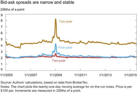
One of the most direct liquidity measures is the bid-ask spread: the difference between the highest bid price and the lowest ask price for a security. As shown in the chart below, bid-ask spreads widened markedly during the crisis, but have been relatively narrow and stable since.
But other high-frequency measures point to some deterioration
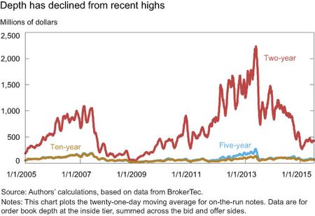
Other measures paint a less sanguine picture of Treasury market liquidity. The chart below plots order book depth, measured as the average quantity of securities available for sale or purchase at the best bid and offer prices. Depth rebounded healthily after the crisis, but declined markedly during the 2013 taper tantrum and around the October 15, 2014 flash rally. It is not unusually low at present by recent historical standards.
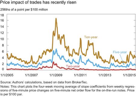
Measures of the price impact of trades also suggest some recent deterioration of liquidity. The next chart plots the estimated price impact per $100 million net order flow as calculated weekly over five-minute intervals; higher impacts suggest reduced liquidity. Price impact rose sharply during the crisis, declined markedly after, and then increased some during the taper tantrum and in the week including October 15, 2014. The measure remained somewhat elevated after October 15, but is not now especially high by recent historical standards.
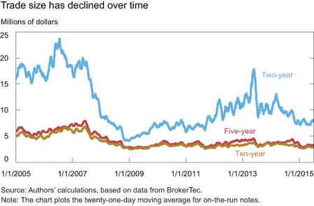
The pattern of trade size suggests a similar evolution of liquidity, as shown below. After declining during the crisis and then rebounding, trade size also declined during the taper tantrum and around the October 15 event. The decline in trade size compared with the precrisis period may merely reflect the increasing prevalence of high frequency trading in the interdealer market, so may be a less reliable indicator of reduced liquidity than the preceding measures.
Daily measures suggest normal liquidity conditions
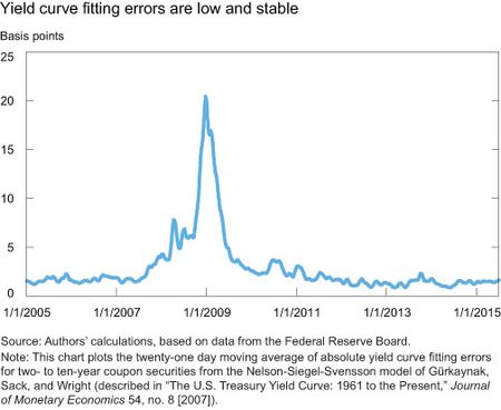
While the high-frequency liquidity measures provide a mixed message regarding the state of Treasury liquidity, the daily measures we consider next are more consistent. We first look at the dispersion of yields around a smoothed yield curve as estimated by the average absolute difference between actual yields and predicted yields (Hu, Pan, and Wang [2013] construct a similar measure). Large pricing differences indicate unexploited profit opportunities, which could in turn reflect constraints on market making capacity and/or poor liquidity. As shown in the chart below, such pricing differences spiked sharply during the crisis, but have been relatively low and stable since.
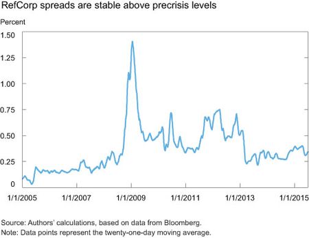
Our last measure is the Refcorp spread: the yield spread between bonds of the Resolution Funding Corporation and Treasury securities with similar cash flows. Longstaff (2004) argues that since Refcorp bonds and Treasury securities are equally creditworthy, but Refcorp bonds are much less liquid, the Refcorp spread solely reflects the value of the liquidity difference. As shown below, the Refcorp spread also spiked during the crisis, but is currently close to postcrisis lows, albeit somewhat above precrisis levels.
Summing Up
Overall, our evidence is fairly favorable about the current state of Treasury market liquidity. Direct measures such as the bid-ask spread point toward liquidity that is quite good by recent historical standards. Other measures such as quote depth and price impact imply some recent deterioration in liquidity, albeit from unusually liquid conditions. The evidence suggests that market participants’ liquidity concerns are not emanating from average levels of liquidity in the benchmark Treasury notes.
Assessing Liquidity Concerns
If average liquidity is generally good by historical standards, then why all the liquidity concerns? One possibility is that the unease is not so much about on-the-run Treasury securities, but about less liquid Treasury securities or other fixed-income securities such as corporate debt securities, which we have not examined here (and for which there is less detailed data to assess liquidity).
Or perhaps the concerns are not so much about average liquidity levels, as we examined, but about liquidity risk. Indeed the events of October 15 and similar episodes of sharp, seemingly unexplained price changes in the dollar-euro and German Bund markets have heightened worry about tail events in which liquidity suddenly evaporates. Liquidity risk, or really illiquidity risk, is harder to measure than liquidity itself, but we attempt to do so in a future post.
Finally, it might be that liquidity concerns reflect anxiety about future liquidity conditions, with a possible imbalance between liquidity supply and demand. On the demand side, the share of Treasuries owned by mutual funds, which may demand daily liquidity, has increased. On the supply side, the primary dealers have pared their financing activities sharply since the crisis and shown no growth in their gross positions despite the sharp increase in Treasury debt outstanding. Market commentators point to these factors and the current environment of low volatility and worry about what will happen when monetary policy is normalized and volatility rises.
Disclaimer
The views expressed in this post are those of the authors and do not necessarily reflect the position of the Federal Reserve Bank of New York or the Federal Reserve System. Any errors or omissions are the responsibility of the authors.

Tobias Adrian is the associate director of research and a senior vice president in the Federal Reserve Bank of New York’s Research and Statistics Group.

Michael J. Fleming is a vice president in the Bank’s Research and Statistics Group.

Daniel Stackman is a senior research analyst in the Bank’s Research and Statistics Group.

Erik Vogt is an economist in the Bank’s Research and Statistics Group.


 RSS Feed
 Follow Liberty Street Economics
Thanks so much for the suggestion. We are always working on new ways of measuring liquidity, including duration-adjusted depth, and trade size. We’ll continue to look into these types of issues and hope to do more with them at some point down the line.
Dear Authors, Thank you for this interesting read! I think that your measures of trade size and market depth would be more illuminating if they were adjusted for the respective durations of the securities. Ultimately most market participants who are concerned with bond market liquidity will be thinking about how much risk they can move. Take this over simplified example: $ 10 million notional of 10y => 10,000 DV01, while 10,000 DV01 => $ 20 million notional of 5y or $ 50 million notional of 2y. I’d be very interested to see what your liquidity gauges look like if adjusted for this. Warm regards, T
Thank you both for your comments. To macro’s comment, we think it’s difficult to draw too many conclusions from a single Treasury market event (the October 15 flash rally), although we do point out in our post that similar episodes have recently been observed in other markets. We also link to an earlier post highlighting the cross-agency staff report on October 15, which discusses how the market has evolved and some of the policy issues this raises. To Philip’s point, our focus here is on whether liquidity has declined (in the Treasury market). We don’t formally explore why liquidity may have changed, but do note that recent declines in liquidity by some measures came with the 2013 taper tantrum and around October 15. An analysis of underlying drivers of changes in market liquidity is planned for future blog posts.
Have you considered the possibility that the fall in liquidity is a consequence of monetary contraction? See the graph on http://www.philipji.com/item/2015-05-15/the-monetary-contraction-continues-at-a-slower-clip The YoY growth has fallen a little more since the above post. To compare with the previous cycle we are somewhere around June 2006, though the contraction is slower now than it was then. The data are two months old, of necessity.
When Eurodollar and 10year and 30year yields, as in 10/14 rates flash crash, move aproximately 20 to 30percent of their base yield…for example if Eurodollars are 9800(2per cent) and move , peak to trough 65 bps, and the same for a 10yr yield, something is seriously wrong with liquidity and market structure. The same behavior can be observed in the use/chf, commodity futures…any complex. No doubt, just as in the equity flash crash, systematic trading , which is here to stay, need safeguards and should be strictly enforced by the cftc and nfa sec. There are stop bots, banging the bee hive programs, spoofing….all illegal for individuals but are they enforced for systematic programs? Are they even recognized? Who(dark pools, information…down to the nanosecond … Has this access?) what lines do dealers, brokers, exchanges provide to who when)..for example .. If I put a electronic stop in thru a broker, or execute an electronic buy/sell…who sees this and when? The exchanges want to make money and love volume(biggest volume are systematic traders) outside agencies need to look at this…..here’s a must read: it’s no mystery what’s going on: http://www.amazon.com/Flash-Boys-Wall-Street-Revolt/dp/0393351599