Today, the New York Fed released the Quarterly Report on Household Debt and Credit for the first quarter of 2016. Overall debt saw one of its larger increases since deleveraging ended, while delinquency rates for the United States continued to improve and remain at very low levels. Although the overall picture of Americans’ liabilities has continued to improve since the financial crisis, we wondered what the variation looks like at local levels. One advantage of our Consumer Credit Panel (CCP), which is based on Equifax credit data, is that we can examine geographic variation in debt and delinquency rates. Here, we use the CCP to examine the borrowing and delinquency in oil-producing geographies in the United States, where the economic trends since the Great Recession have been very different from those in the rest of the country.
The Energy Cycle and Household Debt: A First Look
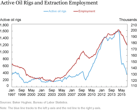
Between 2004 and 2013, the United States surpassed Saudi Arabia and Russia to become the world’s largest producer of oil, but in 2014, oil prices fell sharply, causing a decline in oil and gas extraction employment. The chart below depicts the number of active oil rigs in blue. We see a relatively low number until about 2010, when the American oil boom begins. The number of rigs rises sharply until the end of 2014, yet then drops precipitously. The red line depicts the number of employees in oil and gas extraction (NAICS code 211); its dynamics correspond with the oil rig counts, although employment appears to respond somewhat more gradually. Although overall employment has been quite strong in the United States, jobs in oil and gas extraction are concentrated in a small number of geographies. This concentration creates relatively well-defined areas whose local economies are experiencing a sudden downturn after a boom, while the rest of the United States has, on average, experienced relatively steady improvements in employment.

To assess whether oil- and gas-producing areas have experienced a different economic cycle than others, we first calculate, at the county level, the share of employment in mining, quarrying, and oil and gas extraction (NAICS 21) using data from the Bureau of Labor Statistics. Nationally, the share of employment in this sector is quite small—about 0.6 percent of all employees. We focus on counties whose employment comprises at least 6 percent jobs in oil and gas employment (as of the end of 2014)—a level that is at least ten times the national share (and met by about 10 percent of all U.S. counties). We end up with 327 counties representing just 1.7 percent of total U.S. employment.
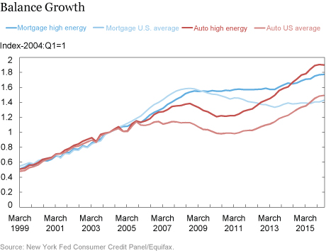
We then examine debt trends. In the chart below, we show aggregate mortgage (darker blue line) and auto loan (darker red line) balances for these “high energy counties” versus the national averages (lighter blue and red lines). To make the series comparable, we set them all at an index equal to 1 in 2004:Q1, which loosely corresponds to when the oil boom begins. It’s easy to see that their rates of growth before 2004:Q1 were quite similar. After 2004, though, the indexes diverge: auto balances in the energy counties grew much faster than the rest of the country, especially until the financial crisis in 2008, and the difference continues to grow slowly until early 2016. It’s a bit difficult to discern in the chart, but the last reading—for 2016:Q1—registers a decline in auto balances in high energy counties, the first since 2011. Mortgage debt in the energy counties, by contrast, grew somewhat more slowly than the national average until the onset of the deleveraging period, but it never fell.

The Delinquency Picture
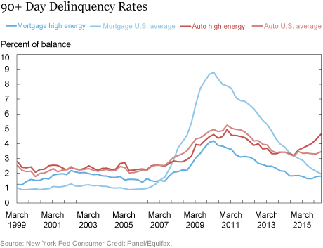
It’s also interesting to look at delinquency rates. Has the recent reversal of fortune in these areas been reflected in an uptick in late payments? In the chart below, we look at serious (90+ day) delinquency rates in energy-producing counties relative to the United States as a whole. Let’s start with mortgages. It’s easy to see a difference between the oil counties and the rest of the United States in every quarter. Before the financial crisis, mortgage delinquencies in these small, rural counties exceeded the national average, but the pattern reversed after 2006. The housing bust had much less pronounced effects on delinquencies in the oil patch, but toward the end of the period we see the difference shrinking as delinquencies in the energy counties tick up. Auto loan delinquency rates were very similar in energy-producing counties to the U.S. average between 1999 and 2007. Beginning with the financial crisis, though, the energy counties began to perform persistently better. Since mid-2014, though, energy-county delinquencies have risen sharply in both absolute and relative terms. While these effects are relevant in these counties, it’s important to remember that the affected areas are quite small relative to the nation.

This preliminary look at how energy counties have performed relative to the rest of the country doesn’t account for the counties’ many interesting features, such as the fact that they are concentrated in a few states and are overwhelmingly rural. A more complete analysis would control for these characteristics to identify the causal effect of the energy-price cycle on household borrowing and repayment. We hope to explore this issue in more detail in later work.
Disclaimer
The views expressed in this post are those of the authors and do not necessarily reflect the position of the Federal Reserve Bank of New York or the Federal Reserve System. Any errors or omissions are the responsibility of the authors.
 Andrew F. Haughwout is a senior vice president in the Federal Reserve Bank of New York’s Research and Statistics Group.

Donghoon Lee is a research officer in the Bank’s Research and Statistics Group.

Joelle Scally is the administrator of the Center for Microeconomic Data in the Bank’s Research and Statistics Group.
 Wilbert van der Klaauw is a senior vice president in the Bank’s Research and Statistics Group.
How to cite this blog post:
Andrew F. Haughwout, Donghoon Lee, Joelle Scally, and Wilbert van der Klauuw, “Just Released: Hints of Increased Hardship in America’s Oil-Producing Counties,” Federal Reserve Bank of New York Liberty Street Economics (blog), May 24, 2016, http://libertystreeteconomics.newyorkfed.org/2016/05/just-released-hints-of-increased-hardship-in-americas-oil-producing-counties.html.


 RSS Feed
 Follow Liberty Street Economics
Thanks, John, for the question (and for the kind words). We used the more aggregated “Natural Resources and Mining” industry because we didn’t have 3-digit NAICS employment available for all counties. (Many of these counties are quite small, and thus subject to data censoring.) As a robustness check we looked for counties with high (more on what we mean by “high” in a moment) mining employment in just those states that have significant oil and gas production. These results were quite similar to what we reported in the blog. We chose an employment share of 6% based on exactly what you reference: since total U.S. Natural Resources and Mining employment was, at its peak in 2014, about 0.6% of employment, we are using those counties with a location quotient of 10. That is, they have ten times the concentration of such workers as the nation as a whole. Of course, this is somewhat arbitrary: any location quotient over 1.0 could be taken to imply some degree of exporting, but we are intentionally focusing on the counties that are really heavily dependent on mining.
In addition to my previous post, I have another question if that’s alright. Is there a particular reason for using the 6% employment cut-off? Would you consider that percentage to be a better indicator than an employment quotient? Finally, how did you arrive at 6% rather than 5% or 7.5%? Thank you for your time. I’ve been visiting your website often and I appreciate your work.
Hello, I’ve been analyzing the performance of auto companies in counties that I have determined as “oil and gas” affected. I did a lot of research into choosing the factors for those counties and was wondering why you chose to use only NAICS 21, even though it includes all natural resource mining? Oil and gas extraction (211) makes up less than half the employment of support activities for mining (213). Also, oil and gas extraction employment is much less volatile than support activities employment. I decided to use NAICS 211, 213, 324 (petroleum and coal products manufacturing), 486 (Pipeline transportation). Although pipeline employment rises over the time period, it only makes up 6% of national oil and gas employment in my data and I felt it important to include in order to better identify potentially affected counties.
Thanks for the comment and question. The change in oil county household debt performance became visible only recently in mid-2015, so at this point, we don’t know whether or not credit cards will, in coming quarters, experience a similar performance decline to what we saw in auto loans. Three differences can be pointed out, however. First, we didn’t see much of an increase in oil county credit card balances (unlike auto and mortgage) relative to the rest of the country. Second, our national data indicate that credit cards and mortgages are typically originated to borrowers with higher credit scores than auto loans and we would thus expect them to be less vulnerable to economic hardships in the short-term. Finally, the minimum payment on credit card is quite lower than the payments on auto loans and mortgages and credit card delinquencies can be avoided for a considerable span of time, a phenomenon that characterized HELOC performance during the housing bust during 2007-2011.
Do you have a perspective on why Credit Card does not show similar increase in DQ and Loss?