The New York Fed’s Center for Microeconomic Data today released our Quarterly Report on Household Debt and Credit for the fourth quarter of 2017. Along with this report, we have posted an update of state-level data on balances and delinquencies for 2017. Overall aggregate debt balances increased again, with growth in all types of balances except for home equity lines of credit. In our post on the first quarter of 2017 we reported that overall balances had surpassed their peak set in the third quarter of 2008—the result of a slow but steady climb from several years of sharp deleveraging during the Great Recession.
Notably, however, mortgage balances remain 4.4 percent below their previous peak in nominal terms. The data also reveal considerable regional heterogeneity. Some regions of the country have long surpassed their earlier peak, while the areas hit hardest during the Great Recession—those with the largest home price declines and highest foreclosure rates—have aggregate mortgage balances far below their previous peaks, even as home prices have largely recovered. The Quarterly Report, state data, and this analysis are all based on the New York Fed’s Consumer Credit Panel, which is based on Equifax credit report data.
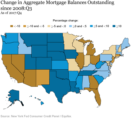
Mortgages are the largest form of household debt and have historically dominated the liability side of the household balance sheet. The map below depicts the percent change in aggregate mortgage balances by state since their peak in the third quarter of 2008. Although for the country as a whole mortgage balances remain slightly below their 2008:Q3 peak, on the state level the change in mortgage balances has been very mixed. Some states such as Texas, North Dakota, and Delaware, shown in dark blue below, have balances more than 10 percent above their previous peak. There are eight states with balances still at least 10 percent below their earlier peak. Most of these states—among them, Florida, Arizona, Nevada, and California—were severely impacted during the Great Recession.
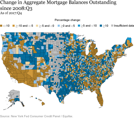
In the following map, we disaggregate down to the county level, which reveals some surprising within-state patterns. Although most states include both counties with positive growth and with negative growth, balances in the vast majority of counties within Florida, Arizona, California, and Nevada remain well below their 2008:Q3 peak. Meanwhile, states in the Northeast are more mixed, with some counties with significant gains, while others (including most of New Jersey) remaining well below their 2008:Q3 levels. Echoes of the Great Recession are clearly visible in the map, which looks well aligned with the state-level variation of the housing boom and bust cycle.
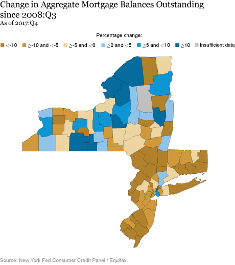
Zooming in on the states that are, in whole or in part, in the New York Fed’s region, we see counties with mortgage balance growth interspersed with those that have seen declines. With the exception of Manhattan and Brooklyn, the counties that have seen some growth since 2008:Q3 are the ones that did not experience large housing booms before the Great Recession.
To What Extent Do These Regional Patterns Reflect Different Home Price Changes?
The slow overall recovery of mortgage balances reflects a combination of the steep decline and slow recovery of the housing market (including both sales volumes and prices), tight underwriting, mortgage defaults and charge-offs, and more aggressive debt paydown with reduced home equity extraction. The latter changes in behavior are in part attributable to a housing crisis hangover effect felt by many Americans who observed or personally experienced home and personal wealth losses.
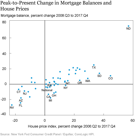
Differences across states in mortgage balance changes are likely to be associated with differences in home price changes in each state. In the chart below, we show a scatter plot of the 2008:Q3 peak-to-present changes in mortgage balances along the vertical axis, with the 2006:Q2 house price peak-to-present change in house prices along the horizontal axis. We see a clear positive relationship between the changes in house prices and the changes in mortgage balances.
Focusing first on the lower left corner we see that home prices in Florida, Arizona, and Nevada have partially recovered from their declines but remain well below their peaks, while California’s prices have only just caught up. These are states that experienced the largest house price boom-bust cycle. Other states in this lower left quadrant are like New Jersey and Connecticut, which did not experience an above-average housing boom but are places where home prices have remained somewhat stagnant since the downturn. Mortgage balances in this group of states remain well below 2008:Q3 levels. In part this is due to the high concentrations of foreclosures that reduced the balances through charge-offs. But it also reflects an active reduction in household debt through paydowns on existing balances, even as originations have roughly caught up with the national rate in the past two years.
Turning to the upper right quadrant of the chart, we see states that largely missed the housing boom-bust cycle, such as Texas and Colorado, which saw steady home price growth since 2006:Q2 with mortgage balances growing along in tandem. Notably, in the upper right corner, North Dakota’s placement reflects that it has benefited from an oil boom and consequential growth in mortgage balances and house prices.
Implications for Home Equity and Homeownership
This overall increase in house prices and decline in mortgage balances has implications for home equity. The mortgage research firm Black Knight reported that home equity was at an all-time high last month. Increasing house prices paired with stagnant mortgage balances have helped home-owning Americans rebuild their home equity and overall household wealth, contributing to stronger and more resilient household finances. However, for consumers who do not own their homes, the increase in house prices may make it more difficult to purchase a home, and in turn have negative implications for homeownership.
Coming Soon:
Finally, a note to readers—Puerto Rico and the U.S. Virgin Islands are part of the New York Fed’s region, and we’ve previously made data available. We plan to publish an update on Puerto Rico’s household debt balances and performance separately in the coming months.
Disclaimer
The views expressed in this post are those of the authors and do not necessarily reflect the position of the Federal Reserve Bank of New York or the Federal Reserve System. Any errors or omissions are the responsibility of the authors.

Andrew F. Haughwout is a senior vice president in the Federal Reserve Bank of New York’s Research and Statistics Group.

Donghoon Lee is an officer in the Bank’s Research and Statistics Group.

Joelle Scally is the administrator of the Center for Microeconomic Data in the Bank’s Research and Statistics Group.

Wilbert van der Klaauw is a senior vice president in the Bank’s Research and Statistics Group.
How to cite this blog post:
Andrew F. Haughwout, Donghoon Lee, Joelle Scally, and Wilbert van der Klaauw, “Just Released: Great Recession’s Impact Lingers in Hardest-Hit Regions,” Federal Reserve Bank of New York Liberty Street Economics (blog), February 13, 2018, http://libertystreeteconomics.newyorkfed.org/2018/02/just-released-great-recessions-impact-lingers-in-hardest-hit-regions.html.





 RSS Feed
 Follow Liberty Street Economics
Thanks for your comment, and interesting question. HELOCs are the only type of debt that have persistently declined since the recession. However, a close look at the HELOC balances in North Dakota reveals that the pattern is indeed different – HELOC balances have increased in North Dakota since the last peak, and ND is among only a small handful of states (including ND, SD, PA, & WV) that have HELOC balances that are more than 10% higher than their previous peak. By contrast, there are 40 states that are still more than 5% below their 2008Q3 peak. We hope to release some new analysis on HELOC use in the coming months, so please keep an eye out for it!
North Dakota is an interesting case; good news for existing homeowners, but bad news for new residents. I would like to see the growth in home equity line of credits for homeowners in North Dakota to see if they are behaving the same way as homeowners pre housing crises with similar increases in housing values.