


Treasury yields have risen sharply in recent months. The yield on the most recently issued ten-year note, for example, rose from 1.73 percent on March 4 to 3.48 percent on June 14, reaching its highest level since April 2011. Increasing yields result in realized or mark-to-market losses for fixed-income investors. In this post, we put these losses in historical perspective and investigate whether longer-term yield changes are better explained by expectations of higher short-term rates or by investors demanding greater compensation for holding Treasury securities.
Increase in Yields = Decrease in Returns
As yields and prices move inversely, the recent sharp rise in yields has resulted in losses to the owners of Treasury securities. The chart below shows that returns based on the ten-year, zero-coupon yield were -12.4 percent for the two-month (forty-two-day) period ending May 5. (All yields and returns in this post are nominal and hence don’t account for inflation). The decline is the largest since August 2003 (-14.6 percent), and April 1994 before that (-13.0 percent).
Recent Treasury Returns Are Highly Negative
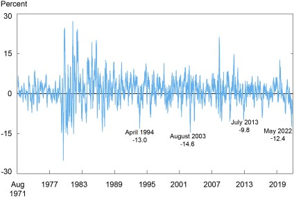
Note: The chart plots the rolling, cumulative, two-month (forty-two trading day) returns on a hypothetical ten-year, zero-coupon Treasury bond from August 16, 1971 to June 17, 2022.
Selloffs Defined
Because the length of a bond market selloff may be shorter or longer than two months, we adopt a flexible approach to defining selloffs. We first cumulate returns for a hypothetical ten-year, zero-coupon Treasury security from August 1971, identifying each time cumulative returns reach a maximum for the period-to-date. We then go through the data a second time, cumulating returns from the maximum-to-date. Whenever a cumulative return drops below the maximum, we say that a selloff has started. When the cumulative return later reaches a new maximum, so that the losses are recovered, we say the selloff has ended. We used a similar approach in our post looking at the 2013 selloff in historical perspective.
Our algorithm identifies forty-two selloffs in which the cumulative return for the ten-year, zero-coupon bond drops below -5 percent. The average maximum cumulative loss for such selloffs is 11.1 percent, and the worst selloff resulted in a 38.4 percent loss (for an episode between June 1980 and August 1982). The average length of a selloff of 5 percent or larger is 214 trading days (excluding the current selloff, for which the end date isn’t yet known), the minimum is 21 days (for an episode between August and September 1982), and the maximum is 722 days (for an episode between July 2016 and May 2019).
Current Selloff Largest in 40 Years
The chart below plots the selloffs, showing that the current one is the largest in 40 years, exceeding those seen in 1994, 2003, and 2013. As of publication date, the trough of the current selloff occurred on June 14, with a cumulative return of -26.9 percent, versus -14.1 percent in September 2013, -14.6 percent in August 2003, and -18.0 percent in November 1994. None of these episodes compares with the steep losses seen in the two Volcker-era selloffs of 1979-80 (-36.0 percent) and 1980-82 (-38.4 percent).
Current Selloff Is Greater than Those Seen in 1994, 2003, and 2013
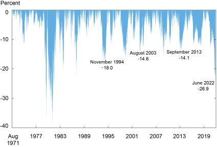
Note: The chart plots the cumulative returns on a hypothetical ten-year, zero-coupon Treasury bond during bond market selloffs, as defined in the text, between August 16, 1971 and June 17, 2022.
Pace of Selloff Comparable to Others until Recently
The next chart plots the cumulative returns of the current selloff over time, relative to the distribution of returns for all preceding selloffs over time. It shows that the current selloff tracks the median for past selloffs at a comparable stage for the first 400 days, but then diverges. The recent divergence reflects the sharp rise in yields, and decline in returns, between March 4 and June 14.
Pace of Selloff Comparable to Historical Median until Recently
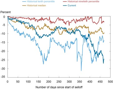
Notes: The chart compares the cumulative returns in event time for the current selloff with the distribution of cumulative returns for all selloffs (conditional on a selloff lasting that many days) between August 16, 1971 and June 17, 2022. At 450 days, the historical distribution is based on five selloffs.
Length of Selloff Longer than Most
The chart below plots the cumulative returns of the current selloff over time, relative to the selloffs in 1994, 2003, and 2013. The current selloff again diverges most notably from the others after day 400. The chart also shows that the 1994 and 2003 selloffs ended around day 400, whereas the current one was quickly worsening at that stage. In fact, of the forty-one other selloffs since 1971 with cumulative returns below -5 percent, only five have lasted 450 days, the length of the current selloff as of May 20.
Current Selloff Running Longer than 1994 and 2003 Selloffs
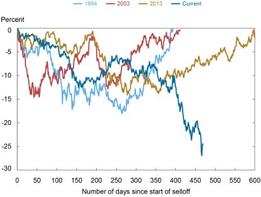
Note: The chart compares the cumulative returns in event time for the current selloff with the 1994, 2003, and 2013 selloffs.
What Explains the Selloff?
What explains the current selloff? Are investors expecting higher short-term rates than just a short time ago? Or can some, or all, of the rise in yields be explained by an increase in term premia, so that investors are demanding greater compensation for the risk of holding longer-term Treasuries? To answer these questions, we use ten-year, zero-coupon term premia estimates from Adrian, Crump, and Moench (2008) and—for each selloff—cumulate the returns that can be explained by changes in the term premium alone.
Our findings, reported in the chart below, suggest that the increase in yields over the first year or so of the current selloff (starting in August 2020) can be explained by a rising term premium. That is, the cumulative returns based on the term premium alone (the red line) are of similar magnitude as the cumulative returns based on the raw yields (the blue area). In contrast, the mounting negative returns since late 2021, amidst increasing prospects of tighter monetary policy, can be explained by expectations of higher short-term rates. The finding that the term premium changed only modestly once policy started tightening in early 2022 is consistent with the evidence from past monetary tightenings reported in this 2013 post.
Higher Short-Term Rate Expectations and Term Premia Explain Current Selloff

Note: The chart plots the cumulative returns on a hypothetical ten-year, zero-coupon Treasury bond during bond market selloffs against the cumulative returns during the selloff attributable to changes in term premia for the August 16, 1971 to June 17, 2022 sample period.
Selloffs Compared
We list the attributes of the ten largest bond market selloffs since 1971 in the table below. The four selloffs highlighted in this post—1994, 2003, 2013, and 2022—are ranked sixth, ninth, tenth, and third, respectively, and highlighted with shading. Most of the selloffs, including the current one, have a term premium component, albeit one that is appreciably smaller than the selloff as a whole. In contrast, the 2013 selloff stands out as having been driven entirely by changes in the term premium.
Current Selloff Is Third Largest since 1971
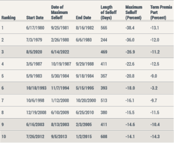
Notes: The table reports characteristics for the ten largest bond market selloffs between August 16, 1971 and June 17, 2022. Figures in the last two columns reflect the period between the start date and the maximum selloff date. The 1994, 2003, 2013, and current selloffs are highlighted with shading.
When Might the Selloff End?
Following our definition of selloffs, the current selloff will end when cumulative returns from the start of the selloff rise back to zero. Given that the selloff recently reached a new nadir of -26.9 percent, a large decline in yields would be necessary to end the selloff anytime soon. This seems unlikely, in part given recent inflation readings and expectations of higher short-term rates among both policymakers and market participants. The selloff would also eventually end even if yields did not change, as the yield from holding Treasury securities ultimately offsets past capital losses. At the current level of interest rates (as of June 17, 2022), and assuming no further rate increases, and no rate decreases, our algorithm suggests that it would take about seven years for investors to recapture losses accrued since the start of the selloff.
Tobias Adrian is financial counsellor and director of the Monetary and Capital Markets Department at the International Monetary Fund.

Michael J. Fleming is the head of Capital Markets Studies in the Federal Reserve Bank of New York’s Research and Statistics Group.
How to cite this post:
Tobias Adrian and Michael Fleming, “The Bond Market Selloff in Historical Perspective,” Federal Reserve Bank of New York Liberty Street Economics, July 14, 2022, https://libertystreeteconomics.newyorkfed.org/2022/07/the-bond-market-selloff-in-historical-perspective/
BibTeX: View |
Disclaimer
The views expressed in this post are those of the author(s) and do not necessarily reflect the position of the Federal Reserve Bank of New York or the Federal Reserve System. In addition, the views expressed in this presentation are those of the authors and do not necessarily reflect the views of the International Monetary Fund, its Management, or its Executive Directors. Any errors or omissions are the responsibility of the author(s).
 RSS Feed
 Follow Liberty Street Economics
An excellent summary of the historical context for this selloff, carefully illustrated and diagnosed. Nice work!