


379 posts on "Liberty Street Economics"
March 26, 2024
What Happens to U.S. Activity and Inflation if China’s Property Sector Leads to a Crisis?

A previous post explored the potential implications for U.S. growth and inflation of a manufacturing-led boom in China. This post considers spillovers to the U.S. from a downside scenario, one in which China’s ongoing property sector slump takes another leg down and precipitates an economic hard landing and financial crisis.
March 8, 2024
Stablecoins and Crypto Shocks

In a previous post, we described the rapid growth of the stablecoin market over the past few years and then discussed the TerraUSD stablecoin run of May 2022. The TerraUSD run, however, is not the only episode of instability experienced by a stablecoin. Other noteworthy incidents include the June 2021 run on IRON and, more recently, the de-pegging of USD Coin’s secondary market price from $1.00 to $0.88 upon the failure of Silicon Valley Bank in March 2023. In this post, based on our recent staff report, we consider the following questions: Do stablecoin investors react to broad-based shocks in the crypto asset industry? Do the investors run from the entire stablecoin industry, or do they engage in a flight to safer stablecoins? We conclude with some high-level discussion points on potential regulations of stablecoins.
March 7, 2024
Will the Moderation in Wage Growth Continue?

Wage growth has moderated notably following its post-pandemic surge, but it remains strong compared to the wage growth prevailing during the low-inflation pre-COVID years. Will the moderation continue, or will it stall? And what does it say about the current state of the labor market? In this post, we use our own measure of wage growth persistence – called Trend Wage Inflation (TWIn in short) – to look at these questions. Our main finding is that, after a rapid decline from 7 percent at its peak in late 2021 to around 5 percent in early 2023, TWin has changed little in recent months, indicating that the moderation in nominal wage growth may have stalled. We also show that our measure of trend wage inflation and labor market tightness comove very closely. Hence, the recent behavior of TWIn is consistent with a still-tight labor market.
March 4, 2024
Global Supply Chains and U.S. Import Price Inflation

Inflation around the world increased dramatically with the reopening of economies following COVID-19. After reaching a peak of 11 percent in the second quarter of 2021, world trade prices dropped by more than five percentage points by the middle of 2023. U.S. import prices followed a similar pattern, albeit with a lower peak and a deeper trough. In a new study, we investigate what drove these price movements by using information on the prices charged for products shipped from fifty-two exporters to fifty-two importers, comprising more than twenty-five million trade flows. We uncover several patterns in the data: (i) From 2021:Q1 to 2022:Q2, almost all of the growth in U.S. import prices can be attributed to global factors, that is, trends present in most countries; (ii) at the end of 2022, U.S. import price inflation started to be driven by U.S. demand factors; (iii) in 2023, foreign suppliers to the U.S. market caught up with demand and account for the decline in import price inflation, with a significant role played by China.
February 12, 2024
Measuring Treasury Market Depth

A commonly used measure of market liquidity is market depth, which refers to the quantity of securities market participants are willing to buy or sell at particular prices. The market depth of U.S. Treasury securities, in particular, is assessed in many analyses of market functioning, including this Liberty Street Economics post on liquidity in 2023, this article on market functioning in March 2020, and this paper on liquidity after the Global Financial Crisis. In this post, we review the many measurement decisions that go into depth calculations and show that inferences about the evolution of Treasury market depth, and hence liquidity, are largely invariant with respect to these decisions.
February 7, 2024
Racial and Ethnic Wealth Inequality in the Post‑Pandemic Era
Editor’s note: Since this post was first published, the authors updated their analysis to focus on the household level of wealth rather than the aggregate level. Please refer to the new blog post and findings here Racial and Ethnic Inequalities in Household Wealth Persist. (June 28, @ 7:19am)
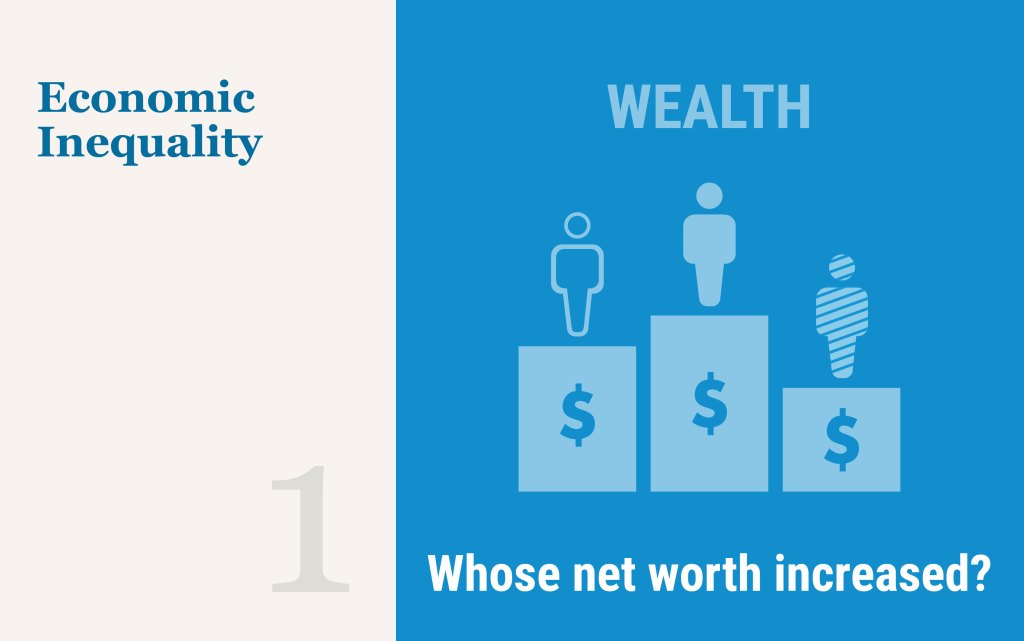
Wealth is unevenly distributed across racial and ethnic groups in the United States. In this first post in a two-part series on wealth inequality, we use the Distributional Financial Accounts (DFA) to document these disparities between Black, Hispanic, and white households from the first quarter of 2019 to the third quarter of 2023 for wealth and a variety of asset and liability categories. We find that these disparities have been exacerbated since the pandemic, likely due to rapid growth in the financial assets more often held by white individuals.
Posted at 10:00 am in Demographics, Financial Markets, Inequality, Pandemic | Permalink | Comments (2)
January 18, 2024
The Power of Proximity: How Working beside Colleagues Affects Training and Productivity

Firms remain divided about the value of the office for “office” workers. Some firms think that their employees are more productive when working from home. Others believe that the office is a key place for investing in workers’ skills. In this post, which is based on a recent working paper, we examine whether both sides could be right: Could working in the office facilitate investments in workers’ skills for tomorrow that diminish productivity today?
January 11, 2024
Towards Increasing Complexity: The Evolution of the FX Market
Editor’s note: Since this post was first published, the first paragraph under the “Looking Forward” subhead has been updated to clarify the expected increase in the speed of FX transaction settlements. (Jan. 25, 2:30 p.m.)

The foreign exchange market has evolved extensively over time, undergoing important shifts in the types of market participants and the mix of instruments traded, within a trading ecosystem that has become increasingly complex. In this post, we discuss fundamental changes in this market over the past twenty-five years and highlight some of the implications for its future evolution. Our analysis suggests that maintaining a healthy price discovery process and fostering a level playing field among participants are areas to watch for challenges. The consequences of the evolution of the FX market—well beyond those anticipated twenty-five years ago—remain active areas of research and policy consideration.
January 10, 2024
An Overlooked Factor in Banks’ Lending to Minorities
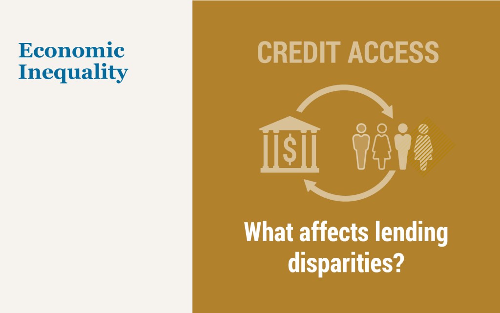
In the second quarter of 2022, the homeownership rate for white households was 75 percent, compared to 45 percent for Black households and 48 percent for Hispanic households. One reason for these differences, virtually unchanged in the last few decades, is uneven access to credit. Studies have documented that minorities are more likely to be denied credit, pay higher rates, be charged higher fees, and face longer turnaround times compared to similar non-minority borrowers. In this post, which is based on a related Staff Report, we show that banks vary substantially in their lending to minorities, and we document an overlooked factor in this difference—the inequality aversion of banks’ stakeholders.
January 8, 2024
Measuring Price Inflation and Growth in Economic Well‑Being with Income‑Dependent Preferences

How can we accurately measure changes in living standards over time in the presence of price inflation? In this post, I discuss a novel and simple methodology that uses the cross-sectional relationship between income and household-level inflation to construct accurate measures of changes in living standards that account for the dependence of consumption preferences on income. Applying this method to data from the U.S. suggests potentially substantial mismeasurements in our available proxies of average growth in consumer welfare in the U.S.
 RSS Feed
 Follow Liberty Street Economics