


In our previous post, we identified the degree to which flood maps in the Federal Reserve’s Second District are inaccurate. In this post, we use our data on the accuracy of flood maps to examine how banks lend in “inaccurately mapped” areas, again focusing on the Second District in particular. We find that banks are seemingly aware of poor-quality flood maps and are generally less likely to lend in such regions, thereby demonstrating a degree of flood risk management or risk aversion. This propensity to avoid lending in inaccurately mapped areas can be seen in jumbo as well as non-jumbo loans, once we account for a series of confounding effects. The results for the Second District largely mirror those for the rest of the nation, with inaccuracies leading to similar reductions in lending, especially among non-jumbo loans.
Inaccurate Flood Maps
As manager of the National Flood Insurance Program (NFIP), the Federal Emergency Management Agency (FEMA) works with communities to draw maps that denote the risk of a catastrophic flood occurring at least once in 100 years. Areas that are at risk of such flooding are considered to have a 1 percent (or more) annual flood risk. An important implication of being in a flood zone is the insurance requirement for mortgage borrowers. Specifically, any mortgage applicant in a flood zone whose mortgage meets certain criteria—such as being eligible for securitization or being made by a financial institution—must buy flood insurance. The program—as well as the implications for the mortgage market—are discussed in previous Liberty Street Economics posts in this series (see here or here).
In our previous post, we discussed the fact that certain flood maps may be inaccurate. These inaccuracies arise partly because it takes time to update the maps in the face of climate change, and partly because of improvements and other changes made to local infrastructure and building materials that take time to be reflected in official flood maps. We use property-level information on flood damage exposure from CoreLogic as well as digitized flood maps for 2022 to define inaccuracies (as described in our previous post).
Maps can be inaccurate in one of two ways: either they designate too much of an area as being a “flood risk,” or they designate too little. For the purposes of this post, we focus only on the latter issue and define two categories of inaccuracy. If a property faces significant flooding damage (highest damage quartile) but is not “mapped” into a flood zone, its map is “very inaccurate.” If a property faces moderate damage but is not covered by a flood zone, its map is simply “inaccurate.” All other properties are either accurately mapped or correctly excluded from a flood map because they face no flood risk. We collapse this data at the census-tract level and then calculate the share of each census tract that is “very inaccurate” and “inaccurate” in the analyses below. This somewhat coarse analysis is necessary as we cannot use address-specific mortgage data. As before, we focus on properties in the Second District as well as the nation as a whole for mortgage applications in 2019 and 2020.
A key question is whether lenders are aware of—and responsive to—these inaccuracies. To this end, we make use of Home Mortgage Disclosure Act (HMDA) mortgage data at the census tract level. We first look at simple correlations between the share of a census tract that is “very inaccurate” and the acceptance rate of loan applications. In the left panel of the chart below, we see that for non-jumbo (“conforming”) loans, there is very little relationship between the two variables. This is possibly a consequence of many of these loans moving off of a bank’s balance sheet in the near term. However, jumbo loans, which are more likely to be retained by banks, show a much more negative correlation, as shown in the right panel. In other words, census tracts in which a greater proportion of homes are inaccurately mapped see a lower acceptance rate for jumbo applications, on average.
Lending in Areas with Inaccurate Flood Maps
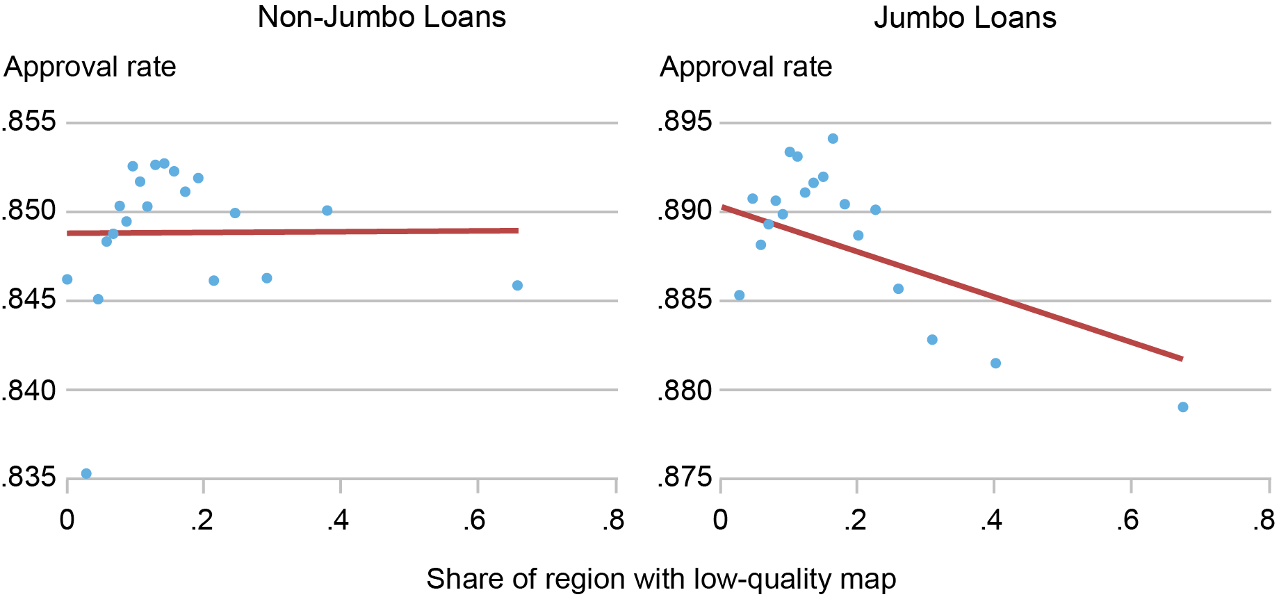
Sources: Authors’ calculations; Federal Emergency Management Agency (FEMA); Home Mortgage Disclosure Act (HMDA) data; CoreLogic.
Notes: This chart shows binscatter plots that relate the share of a census tract that is “very inaccurately” mapped to the loan acceptance rate. It includes time controls but no other adjustments. Data cover the Second District excluding Puerto Rico and the U.S. Virgin Islands and are split into conforming (non-jumbo) and non-conforming (jumbo) loans.
This result is possibly a reflection of bank risk management. Retaining a loan that is subject to flood risk but that may not have flood insurance (or may even be ineligible for insurance from the NFIP if the community does not participate) may represent too risky a proposition. However, since a whole host of other factors go into a mortgage application decision, we use regression analysis to control for these other factors.
The Effect of Flood Map Accuracy on Lending
Our outcome variable is the loan acceptance probability as measured by a variable that takes the value of “1” if an application is accepted. We regress the loan acceptance probability on application amounts in dollars, borrower characteristics (income, gender, race, and loan-to-income ratio), the county where the property is located interacted with time, the average census tract income, past flood damages, and a host of other characteristics. We also include a variable that denotes the share of properties in a census tract that are (1) “inaccurately mapped” or (2) “very inaccurately mapped.” Results are shown in the chart below.
Effect of Inaccurate Maps, after Accounting for Borrower and Region Characteristics
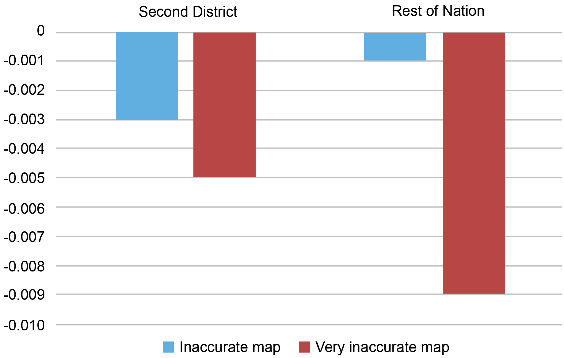
Sources: Authors’ calculations; Federal Emergency Management Agency (FEMA); Home Mortgage Disclosure Act (HMDA) data; CoreLogic.
Notes: This chart shows the key coefficients for a linear probability regression that relates loan acceptance rates (1= accepted by borrower and bank) to a host of loan, region, and borrower characteristics, as well as key variables that denote the share of properties in a census tract that are “inaccurately mapped” or “very inaccurately mapped.” It shows the Second District (excluding Puerto Rico and the U.S. Virgin Islands) and the rest of the nation separately and focuses only on the coefficients of interest for non-jumbo loans.
We find that bank loans in areas that have inaccurate maps have a somewhat lower acceptance rate, all else equal. Areas that have very inaccurate maps see a more pronounced reduction in acceptances. If we include borrower characteristics—especially borrower income and loan-to-value ratios—the relationship between the share of inaccurately mapped properties and loan acceptance rates becomes less negative among jumbo loans than in the raw correlation. This may be a reflection of the ability of these borrowers to make a larger down payment to help offset the bank’s perceived risk.
It is worth mentioning that while these reductions in the acceptance rates are statistically significant, they are small relative to the effects of applicant income or wealth. A Second District community in which 10 percent of all properties are inaccurately mapped may see a reduction of 3 percent in acceptance rates. A 10 percent drop in income would see a rejection response that is fourfold larger. Our results likely reflect some residual bank risk aversion—not all conforming loans are securitized, after all. Moreover, banks that are aware of the inaccurate mapping likely expect maps to change following future updates. Since lenders/servicers have to ensure that pre-existing borrowers who are newly mapped into flood zones buy insurance after a grace period expires, they may be ex ante unwilling to lend to these inaccurately mapped households. Alternatively, banks may be worried about the ability of the marginal borrower to make the required insurance payments.
The reaction of lenders to inaccurate maps in the Second District is comparable to that in the nation as a whole, especially among non-jumbo borrowers. The response to very inaccurate maps is somewhat stronger in southern states, which may reflect increased risk of catastrophic flooding. While we do not fully account for a wide range of region-specific factors that may differ between the Second District and the rest of the nation, we still find that bank responses to inaccuracies are broadly comparable—that is to say, they reduce lending. This suggests that bank reactions to inaccurate maps are not state-specific but are more likely to be a reflection of general risk aversion.
Concluding Remarks
We find that banks are somewhat responsive to inaccurately mapped areas. They are less willing to lend in regions with poor flood maps, even if these loans can be securitized. In this regard, the Second District is no different than the rest of the nation. While bank reactions to inaccurate maps are small, the presence of statistically meaningful lending differences implies that banks manage and are aware of flood risk, at least to some degree. The next post in this series exploits the newly updated maps to examine whether firms take flood risk into account when choosing their business locations.

Kristian Blickle is a financial research economist in Climate Risk Studies in the Federal Reserve Bank of New York’s Research and Statistics Group.
Katherine Engelman is a former data scientist in the Data and Analytics Office in the Bank’s Technology Group.

Theo Linnemann is a data scientist in the Data and Analytics Office in the Bank’s Technology Group.

João A.C. Santos is the director of Financial Intermediation Policy Research in the Federal Reserve Bank of New York’s Research and Statistics Group.
How to cite this post:
Kristian S. Blickle, Katherine Engelman, Theo Linnemann, and João A. C. Santos, “How Do Banks Lend in Inaccurate Flood Zones in the Fed’s Second District?,” Federal Reserve Bank of New York Liberty Street Economics, November 13, 2023, https://libertystreeteconomics.newyorkfed.org/2023/11/how-do-banks-lend-in-inaccurate-flood-zones-in-the-feds-second-district/
BibTeX: View |
Disclaimer
The views expressed in this post are those of the author(s) and do not necessarily reflect the position of the Federal Reserve Bank of New York or the Federal Reserve System. Any errors or omissions are the responsibility of the author(s).
 RSS Feed
 Follow Liberty Street Economics