


102 posts on "Housing"
March 26, 2024
What Happens to U.S. Activity and Inflation if China’s Property Sector Leads to a Crisis?

A previous post explored the potential implications for U.S. growth and inflation of a manufacturing-led boom in China. This post considers spillovers to the U.S. from a downside scenario, one in which China’s ongoing property sector slump takes another leg down and precipitates an economic hard landing and financial crisis.
January 10, 2024
An Overlooked Factor in Banks’ Lending to Minorities
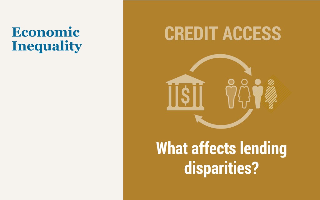
In the second quarter of 2022, the homeownership rate for white households was 75 percent, compared to 45 percent for Black households and 48 percent for Hispanic households. One reason for these differences, virtually unchanged in the last few decades, is uneven access to credit. Studies have documented that minorities are more likely to be denied credit, pay higher rates, be charged higher fees, and face longer turnaround times compared to similar non-minority borrowers. In this post, which is based on a related Staff Report, we show that banks vary substantially in their lending to minorities, and we document an overlooked factor in this difference—the inequality aversion of banks’ stakeholders.
November 30, 2023
FHA First‑Time Buyer Homeownership Sustainability: An Update

An important part of the mission of the Federal Housing Administration (FHA) is to provide affordable mortgages that both promote the transition from renting to owning and create “sustainable” homeownership. The FHA has never defined what it means by sustainability. However, we developed a scorecard in 2018 that tracks the long-term outcomes of FHA first-time buyers (FTBs) and update it again in this post. The data show that from 2011 to 2016 roughly
21.8 percent of FHA FTBs failed to sustain their homeownership.
November 13, 2023
How Do Banks Lend in Inaccurate Flood Zones in the Fed’s Second District?
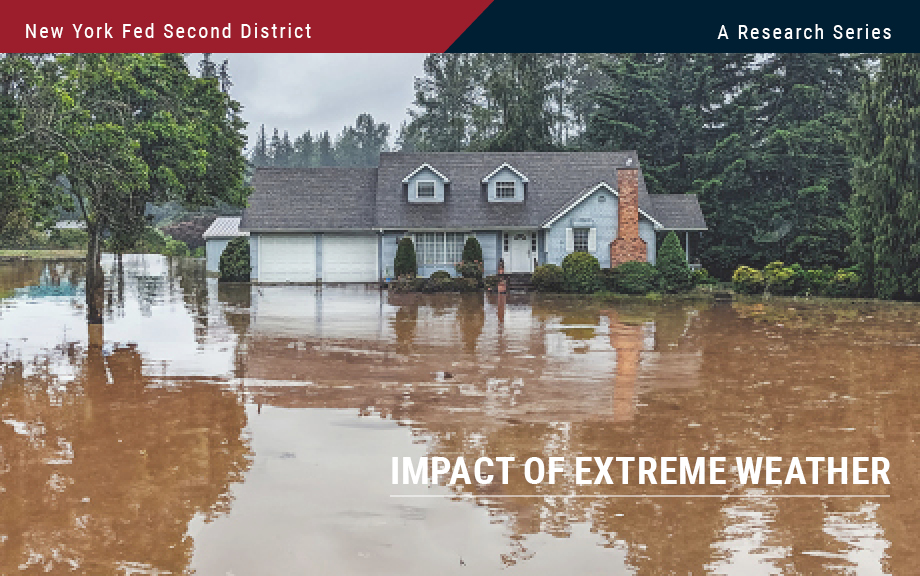
In our previous post, we identified the degree to which flood maps in the Federal Reserve’s Second District are inaccurate. In this post, we use our data on the accuracy of flood maps to examine how banks lend in “inaccurately mapped” areas, again focusing on the Second District in particular. We find that banks are seemingly aware of poor-quality flood maps and are generally less likely to lend in such regions, thereby demonstrating a degree of flood risk management or risk aversion. This propensity to avoid lending in inaccurately mapped areas can be seen in jumbo as well as non-jumbo loans, once we account for a series of confounding effects. The results for the Second District largely mirror those for the rest of the nation, with inaccuracies leading to similar reductions in lending, especially among non-jumbo loans.
June 22, 2023
Elevated Rent Expectations Continue to Pressure Low‑Income Households

The Federal Reserve Bank of New York’s 2023 SCE Housing Survey, released in April, reported some novel data about expectations for home prices, interest rates, and mortgage refinancing. While the data showed a sharp drop in home price expectations, some of the most notable findings concern renters. In this post, we take a deeper dive into how renters’ expectations and financial situations have evolved over the past year. We find that both owners and renters expect rents to rise rapidly over the next year, albeit at a slower pace than last year. Furthermore, we also show that eviction expectations rose sharply over the past twelve months, and that this increase was most pronounced for those in the lowest quartile of the income distribution.
May 25, 2023
Do Veterans Face Disparities in Higher Education, Health, and Housing?
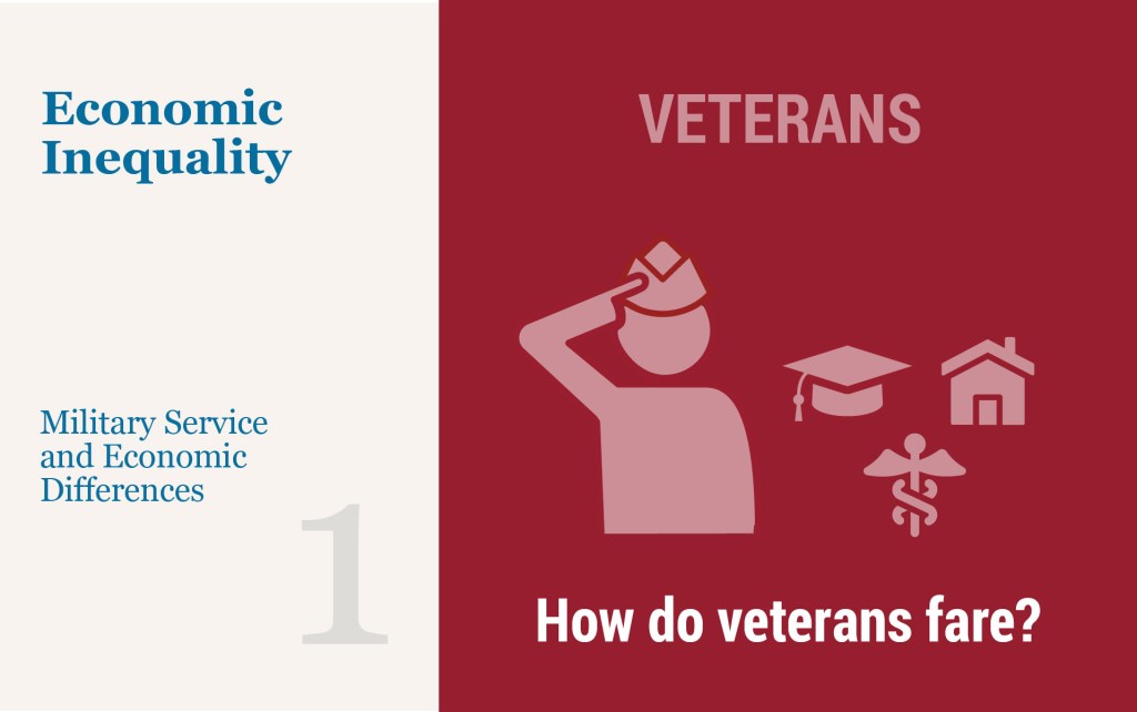
Veterans are an understudied group that forms an important part of the fabric of American society and that constitutes a significant segment of the population. In the first post of this two-part series, we will investigate how the outcomes of veteran men–in educational attainment, health, and housing–differ from those of comparable men who did not serve in the military. Looking only at men, for reasons described below, we find that relative to nonveteran men with a high school degree and a similar distribution of demographic and geographic characteristics, veterans are 7 percentage points less likely to have a college degree and are over 50 percent more likely to experience a disability. Veterans are also somewhat likelier to rent a home than to own and, as renters, pay a lower average rent, suggesting they experience lower quality housing or live in worse neighborhoods.
May 15, 2023
The Great Pandemic Mortgage Refinance Boom

Total debt balances grew by $148 billion in the first quarter of 2023, a modest increase after 2022’s record growth. Mortgages, the largest form of household debt, grew by only $121 billion, according to the latest Quarterly Report on Household Debt and Credit from the New York Fed’s Center for Microeconomic Data. The increase was tempered by a sharp reduction in both purchase and refinance mortgage originations. The pandemic boom in purchase originations was driven by many factors – low mortgage rates, strong household balance sheets, and an increased demand for housing. Homeowners who refinanced in 2020 and 2021 benefitted from historically low interest rates and will be enjoying low financing costs for decades to come. These “rate refinance” borrowers have lowered their monthly mortgage payments, improving their cash flow, while other “cash-out” borrowers extracted equity from their real estate assets, making more cash available for consumption. Here, we explore the refi boom of 2020-21–who refinanced, who took out cash, and how much potential consumption support these transactions provided. In this analysis, as well as the Quarterly Report, we use our Consumer Credit Panel (CCP), which is based on anonymized credit reports from Equifax.
First‑Time Buyers Did Not Drive Strong House Price Appreciation in 2021

In May 2022, Sam Khater—chief economist for Freddie Mac—argued that a surge in first-time buyers had been an important driver of the housing market the previous year. In contrast, using data from the New York Fed Consumer Credit Panel, we find that the share of home purchases by first-time buyers fell in 2021. This suggests that other factors were important to the rapid increase in house prices in 2021.
April 20, 2023
Moving Out of a Flood Zone? That May Be Risky!

An often-overlooked aspect of flood-plain mapping is the fact that these maps designate stark boundaries, with households falling either inside or outside of areas designated as “flood zones.” Households inside flood zones must insure themselves against the possibility of disasters. However, costly insurance may have pushed lower-income households out of areas officially designated a flood risk and into physically adjacent areas. While not designated an official flood risk, Federal Emergency Management Agency (FEMA) and disaster data shows that these areas are still at considerable risk of flooding. In this post, we examine whether flood maps may have inadvertently clustered those households financially less able to bear the consequences of a disaster into areas that may still pose a significant flood risk.
March 10, 2023
Is Your Apartment Breaking because Your Landlord Is Broke?

Thirty-one percent of housing units in the United States are rental units, and rental housing is unique because unlike in the case of homeownership, renters rely on the property owner for maintenance spending. From the property owner’s perspective, building maintenance is an important investment necessary to keep the asset in good condition. However, like all investments, it is only possible to maintain a building with sufficient financial resources. In a recent staff report, I examine the relationship between a building’s financing constraints and its maintenance. I find that financially constrained buildings, colloquially “broke,” tend to be less well maintained.
 RSS Feed
 Follow Liberty Street Economics